Munyaporn Pooripanyakun, Andrew Wodehouse, Jorn Mehnen (2022). The Design and Evaluation of an Eyes-Free Touchscreen Interface. In: Human Interaction & Emerging Technologies (IHIET-AI 2022): Artificial Intelligence & Future Applications. AHFE Open Access, vol. 23. https://doi.org/10.54941/ahfe100915
The eyes-free touchscreen interface is a category of interfaces for controlling devices with minimal visual attention. We apply a design framework for the generation of imaginary interface layouts and propose a series of eyes-free input interfaces for menu selection, arrow control, and data entry. These are oriented around U-shaped and diagonal layouts for optimized one-handed thumb interaction. The experiment tests the participants’ cognitive performance toward the specified layouts. In addition to examining the input accuracy of eyes-free interfaces for discrete and serial tasks, interviews are conducted for more qualitative feedback on user perception. The results demonstrate that the new formats are viable for eyes-free interaction and are in line with the previous design practices of the eyes-free interface. Spatial layouts in the straight alignment (1D) placed closely to object reference frames within the functional thumb area and unified frame, enhance eyes-free performance accuracy.
Eye-free interaction on touchscreen mobile devices has been desired in many situations, such as under extreme lighting conditions, under multitasking, for social etiquette, and for lower perceived effort (Yi et al. 2012). Many interface designs or interaction techniques were devoted to designing support for eyes-free interaction (Gustafson et al. 2013; Chen et al. 2014). However, reactive audio feedback is often indispensable to enable this interaction.
Adapting to new technologies should not require too much effort from the users (Abascal. 2021). Yi et al. (2012) suggested that the design should be able to adapt and customize to various personal intentions. Moreover, subtle interaction on the mobile in an eyes-free manner should seamlessly integrate into social life. The interface might offer users to apply spatial knowledge transferred from the familiar menu layouts (Gustafson et al. 2011). The effective spatial layout design could facilitate eyes-free interaction in both evoking the mind and guiding the body. The authors (Pooripanyakun et al. 2020) claim that interaction on the fixed interface eases the task since users could learn, memorize, and interact easily. As a result, they propose the design framework of the imaginary eyes-free input interface (Pooripanyakun et al. 2022). This study aims to examine the cognitive performance of the new format layouts and validates the eyes-free interface design practices, developed in the previous paper, on a mobile touchscreen. New insights from the evaluation of practical application could lead to the improvement and contribute to the success of design support.
The new input technique for controlling the mobile on a touchscreen carried out without visual attention was proposed for selecting menus, controlling arrows, and inputting data on calculator applications. The contribution of this paper is the feasibility of an eyes-free interface layout on a touchscreen under one-handed thumb interaction. We report on the study of interface performance as well as cognitive and affective responses from the participants. In the future, users will be able to apply the eyes-free input interface on their smartphones for controlling the AR/VR glasses such as the HTC Vive Flow (Schoon. 2021).
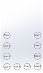
DESIGNING EYES-FREE INTERFACE PROTOTYPE The device works the way the user intends it to via an input interface. Therefore, the interface should be designed for ease of learning and ease of use. From an eyes-free interface design framework, we have developed three new input interfaces for controlling devices with minimal visual attention. As the proper number of categories for successive menus should not be more than ten items (Weiss. 2002), the first home screen menu designed consists of nine icons with the special button for more items as
Human Interaction & Emerging Technologies (IHIET-AI 2022) Artificial Intelligence & Future Applications https://openaccess.cms-conferences.org/#/publications/book/978-1-7923-8989-4 shown in Figure 1. We compared the new format Figure1(b), with a familiar 5x2 grid menu Figure1(a). The new U-shaped menu design actively employs six rules under an eyes-free interface design framework, exploiting the knowledge gained on spatial memory and proprioception (Pooripanyakun et al. 2022).
(a) Conventional (b) New format (c) Default menu
Figure 1. Home screen layouts designed for menu selection.
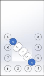
The second type of the proposed input interfaces is the arrow control. As opposed to a conventional arrow menu, the new format arrow buttons were put near the reference frame with a congruent arrow direction. This new format is designed by aligning the up and down arrows on the vertical axis and the left and right arrows on the horizontal axis. The OK button finally is placed at the lower-right corner with the reason of symmetrical feature. The last interface proposed for data entry is a basic calculator application with 10 numeric keys, 6 operators, and 2 functions. The U-shaped layout of the numeric keypad was integrated with the diagonal layout of 5 operator buttons for the eyes-free calculator. Because the area for putting targets is limited, we decided to assign one position with two operators for three center-diagonal buttons. It requires users one tap for the first operator and a double tap for the second operator. The participants see and perceive all of these 15 buttons in a unified frame. The larger operator buttons are aimed to highlight the button segmentation. Figure 2 shows the arrow control menus and calculator interfaces in a conventional and new format.
Figure 2. Input interfaces designed for arrow control and calculator application.
METHOD
To examine how the eyes-free interface works in a practical application, the experiment was conducted with task and interface layout as independent variables. The pre-test questionnaire on the perception of the three types of layouts was sent out to the participants. Six layouts were asked, concerning the mental demands and physical efforts to interact with each layout on a mobile device in eyes-free mode. Moreover, the Frequent Apps questionnaire was completed by participants as we asked them to choose preference apps and position apps themselves on our home screen layout. This custom menu was tested along with the default menu layout (Fig.1c). Upon the survey, the participants rated a lower mental and physical workload on the new formats than the conventional formats for the home screen menu and calculator layouts. However, the new format layout of the arrow control evoked more workload than the conventional format from the participants' perception. To shorten the duration of the experiment, we chose the new format of the home screen and calculator menu, and both two layouts of the arrow control menu for the tests.
The experiment was conducted remotely via the participants’ mobiles together with a Zoom meeting on the desktop. We adopted the mobile screen-recording app and experimental protocol from a previous study (Pooripanyakun et al. 2022). The experimenter presented a picture of the interface via a remote slide presentation. During each test, the picture of the layouts was removed from the desktop display; therefore, the participants must remember the spatial position and semantic relation of each button beforehand so as to respond to the task accurately on their touchscreen mobile. The participants must interact on the spatial location of the touchscreen interface in an eyes-free mode relying solely on their spatial memory and proprioception. The pointing tasks for a single target and a serial of targets (Parhi et al. 2006) were set up. The experiment is divided into 3 sessions. Firstly, we tested a discrete task on the custom menu, the default menu, and the calculator menu layout.
The participants must point to each target on menu selection. Each position was called randomly with the icon/button name by the experimenter. The sequence was pre- selected and identical across participants. Then, the two layouts of the arrow control were tested for 4 navigation tasks in the second session. The participants were faced with a map representation on the desktop screen and had to control the arrow from the start cell to the destination laid out in the grid block. Finally, three scenarios were issued to apply for the calculator data entry. To facilitate the participants, the input equation was shown on the desktop screen.
After finishing each session, the participants filled in online user experience questionnaires regarding the quickness, the difficulty of the interface, and the confidence to hit the target, using a 7-point scale, anchored at the endpoints with the terms “very low” for 1 and “very high” for 7. In the end, we interviewed the participants about the practicality of eyes-free interfaces. The experiment took around 90 minutes.
Measures To examine the input accuracy of all the control interfaces, the distance error was calculated from the touch position to the center point position of a target. This distance error was compared to the reference screen frame (90 units width and 160 units height). The target had a radius of 7 units. The higher the mean distance error, the poorer task performance. Then the response scores from the post-test questionnaires were analyzed. The higher the quickness and confidence scores, the better the user interface. The lower the difficulty score, the better the user interface.
Participants We recruited a random sample of smartphone users via university channels and social media. Eleven mobile enthusiasts voluntarily participated in the study (7 female, 4 male). Participants are between 26-42 years old (Mean: 34.1, SD: 5.2) and all are right-handed. Their native language is written from left to right. As, participants use their own mobile in the experiment, in this study, there are 9 different models of mobile phones. The screen width ranges from 67.3 mm to 78.1 mm. The screen height ranges from 138.4 mm to 162.6 mm. The aspect ratio of the participants’ mobile screens has ranged from 1:1.61 to 1:1.87.
RESULT AND EVALUATION This study was focused on the user experience of an eyes-free interface under one- handed thumb interaction. We analyzed merely descriptive statistics on the dependent variables. The following sections show the results of the performance accuracy, the questionnaire, and the interview.
Performance Accuracy There are 1,221 data points collected from 11 participants at 111 touch actions. We presented the performance accuracy on interface layouts for the tasks and on spatial positions. According to Table 1, it is found that the distance errors in the discrete menu selection tasks under the U-shaped layout are similar among the custom and default menus as well as the calculator menu. The results revealed that the mean distance error of the calculator layout increased on the serial data entry task. In the arrow control tasks, it is obvious that the new format provides a lower mean distance error than the conventional arrow format.
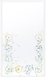
Table 1: Performance among tasks in units of distance errors Distance Error Session 1: discrete tasks Session 2: arrow control Session 3: serial data entry custom default calculator conventional new format calculator Mean 9.7 9.3 9.6 12.0 8.8 11.4 SD 6.6 6.2 6.2 8.9 6.8 7.2 Figure 3 shows the outcomes of the experiment. For the U-shaped menu, buttons aligned in the horizontal provide the smallest mean distance error, and buttons aligned in vertical right have a mean distance error lower than buttons aligned in vertical left. The participants can discriminate and hit targets on the new format layout. It is obvious that the hit rate on the new arrow format is higher than the conventional format.
U-shaped menu Conventional New format Calculator
Figure 3. Outcomes of the experiment.
As expected, the mean distance errors on the left, up, and OK buttons on the conventional arrow format are higher than those on the right and down buttons. On the other hand, the mean distance errors on the up and down buttons on the new arrow format are higher than those on the left, right and OK buttons. The performance accuracy on buttons aligned in diagonal in the calculator interface seems to be decreased by the distance from the anchor point at the lower-left corner of the device.
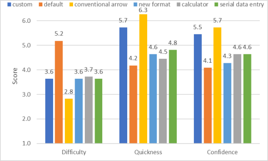
Figure 4 shows the participants’ feedback on the post-test questionnaire. The participants rate the default menu as the most difficult layout. For the quickness and confidence scores, the participants also perceive that they provide the quickest response and have the most assertiveness on the conventional arrow control. The custom menu gets the second rank, whereas the default menu gets the worst. It is found that the calculator response scores are similar between the discrete and serial tasks. Nevertheless, the performance accuracy in the serial data entry task appears to be poorer than the discrete task. Among the three layouts on the menu selection task, the custom U-shaped menu is superior, followed by the U-diagonal layout of the calculator menu. Participants could assign and arrange the custom menu voluntarily. Thus, they could recall spatial memory and relation easily. Though the default menu consists of 10 buttons and the buttons are also located at the same position as the custom menu layout, it gained poorer feedback than the calculator menu consisting of 15 buttons. We hypothesized that the default menu demanded much more mental effort as it involved semantic learning to relate and memorize each spatial icon. While the calculator interface was easier as the participants were able to use the numbers and operator symbols logic behind the menu to alleviate their mental workload. The visual-spatial display augments cognition and the good design affords for the cognitive task (Hegarty. 2011). The results suggest that assigning semantic relation is an important aspect to be considered other than the spatial position for the eyes-free interface as it lessens the burden of cognition on perception.
Figure 4. Outcomes of the experiment.
Despite the fact that the participants did not acknowledge the outcome on performance accuracy, they showed pleasant experience on the conventional arrow layout. The quickness score is significantly different between the conventional and
Human Interaction & Emerging Technologies (IHIET-AI 2022) Artificial Intelligence & Future Applications https://openaccess.cms-conferences.org/#/publications/book/978-1-7923-8989-4 new arrow layouts. However, the difficulty and confidence scores are comparable. Performance accuracy on the arrow control layout revealed the opposite of preference score. We hypothesized that the participants cannot estimate the spatial location exactly on the left, up, and OK buttons of the conventional layout as they have been placed inside the array with different rows and columns (2D). Moreover, these buttons are not close to the device reference frame. The previous research (Pooripanyakun et al. 2022) suggested that spatial layouts in the straight alignment (1D) placed closely to object reference frames within the functional thumb area and unified frame, could enhance eyes-free performance accuracy. In addition, the participants provided insights from their direct experience. Most participants commented that the conventional arrow format is intuitive and easy to understand, but it lessens their confidence when using it, whereas the new arrow format is mentioned as an easy-to-remember one but is a bit difficult to get accustomed to. One participant stated that the new format increases workload; therefore, he preferred the conventional format. Some participants gave suggestions on redesigning the new format. They indicated that it had better move the up-down arrows to the bottom line and move the OK button to the central part of the screen. On the calculator interface, they shared their opinions that the location of the numeric keypad is satisfying. However, the operator buttons were complained as too close. One participant stated that three buttons are optimal, and a swipe gesture design could be applied instead for the AC and % buttons. The other said that the interface is easily controlled because of using only one hand. Overall, they valued an eyes-free interaction. These eyes-free interfaces efficiently prevent distracting from the primary task.
DISCUSSION
Communication through product design involves the cognitive, affective, and behavioral response (Crilly et al. 2004). Moreover, the evaluation of a design is associated with utility under semantic interpretation. In the pre-test questions, the participants evaluated the design based on their visual perception. They felt that the new format of the eyes-free interface provides a lower mental and physical workload on the home screen menu and calculator layouts while the new format of the arrow control interface has the mental and physical demand higher than the conventional arrow layout. As a result, this new format cannot attract participant preference. However, the actual outcomes on the mean distance error prove conclusively the effectiveness of the new format of eyes-free interfaces. The participants imagined a target location in a screen frame with respect to others in their mental map. They can discriminate against the spatial positions of the target. We assert that the structured and symmetrical patterns, the object reference frames, the straight alignment, the comfortable area, the unified frame, and the segmentation contribute to the effective eyes-free interface design. In other words, eyes-free interface layouts within the previous basic design framework are valid. The good eyes-free touchscreen interfaces that harness innate human abilities and product affordances bring about effective eye-free interaction. To strengthen the existing
Human Interaction & Emerging Technologies (IHIET-AI 2022) Artificial Intelligence & Future Applications https://openaccess.cms-conferences.org/#/publications/book/978-1-7923-8989-4 design framework, more researches are needed on the proper sizes of targets and spacing for eyes-free use and on augmented responsive feedback.
CONCLUSION
The paper proposed the design and evaluation of an eyes-free interface under handheld touchscreen interaction. Usability testing is essential for developing a novel design. We introduced the design along the U-shaped and diagonal layouts for the eyes-free use and reported the input accuracy of the three types of eyes-free interfaces that are the home screen, arrow control, and calculator layouts. The tasks include both discrete and serial tapping. The post-test feedback and interview from the participants have strengthened our understanding toward their cognitive and affective responses. The actual outcomes on the mean distance error prove conclusively the effectiveness of the new format of eyes-free interfaces. We assert that the previous design framework is valid. In the future, this eyes-free input interface could be applied in general to a smartphone usage.
REFERENCES
Abascal, J. (2021). Learning from Errors Designing Assistive Technology. In Computer-Human Interaction Research and Applications. Communications in Computer and Information Science. Cham: Springer International Publishing, pp. 25–40. Chen, C., Chua, S., Chung, D., Perrault, S., Zhao, S. and Kei, W. (2014). Eyes-Free
Gesture Passwords - A Comparison of Various Eyes-Free Input Methods. Proceedings of the Second International Symposium of Chinese CHI, pp.89– 92. Crilly, N., Moultrie, J. and Clarkson, P.J., (2004). Seeing Things: Consumer Response to the Visual Domain in Product Design. Design studies, 25(6), pp.547–577. Gustafson, S., Holz, C. and Baudisch, P. (2011). Imaginary Phone: Learning
Imaginary Interfaces by Transferring Spatial Memory from a Familiar Device. Proceedings of the 24th annual ACM symposium on user interface software and technology, pp.283–292. Gustafson, S., Rabe, B. and Baudisch, P. (2013). Understanding Palm-Based Imaginary Interfaces : The Role of Visual and Tactile Cues when Browsing. Proceedings of the SIGCHI Conference on human factors in computing systems, pp.889–898. Hegarty, M. (2011). The Cognitive Science of Visual-Spatial Displays: Implications
for Design. Topics in cognitive science, 3(3), pp.446–474. Parhi, P. Karlson, A. and Bederson, B. (2006). Target Size Study for One-Handed Thumb Use on Small Touchscreen Devices. Proceedings of the 8th conference on human-computer interaction with mobile devices and services, 159, pp.203–210.
Pooripanyakun, M., Wodehouse, A. and Mehnen, J. (2020). The Effect of Time Pressure on the Performance of Dexterous Operations. Proceedings of the Design Society: DESIGN Conference, 1, pp.1521–1530. Pooripanyakun, M., Wodehouse, A. and Mehnen, J. (2022). The Role of Imaginary
Interface Configuration in Eyes-Free Performance Accuracy for Touchscreen Interaction. In: Proceedings of the ACM on Interactive, Mobile, Wearable and Ubiquitous Technologies (submitted). Schoon, Ben. (October 14, 2021) HTC’s New Vive Flow VR Headset Uses Your Phone as a Controller, and It Requires Android. The 9to5Google Website: https://9to5google.com/2021/10/14/htc-vive-flow-vr-headset-android Weiss, S. (2002). Handheld Usability. John Wiley & Sons, Chichester, UK Yi, B., Cao, X., Fjeld, M. and Zhao, S. (2012). Exploring User Motivations for
Eyes-Free Interaction on Mobile Devices. Proceedings of the SIGCHI Conference on human factors in computing systems, 1(1), pp.2789–2792.
Read this individual research paper free through the original publisher, or explore the full digital proceedings book.
ISBN 978-1-7923-8989-4
Explore this ISBN in the AHFE Bookstore ↗Listed in the July 2026 bookstore catalogue; search by ISBN to confirm current availability · Digital book purchase optional