Chenliang Gong, Wenyi Xu (2023). A Design Method of Subway Public Welfare Posters based on Visual Metaphor. In: Human-Centered Design and User Experience. AHFE Open Access, vol. 114, pp. 669–675. https://doi.org/10.54941/ahfe1004287
The purpose of this study is to explore a design method of subway public welfare posters based on visual metaphor. Through the analysis and evaluation of the existing public welfare posters of subway space, we found that many poster designs have problems such as outdated design style, poor communication effect and low passenger participation. In order to solve this problem, we proposed a design method of subway public welfare posters based on visual metaphor, and applied it to the design of subway public welfare posters. This method takes visual metaphor as the main design theory, and analyzes its relationship with subway space scenes and public welfare posters. By combining public welfare information with visual elements such as images and symbols, the posters can be conveyed more vividly and easily, so as to attract passengers' attention and resonance. In the poster design process, we first analyze and understand the theme of public welfare, and find the core issues or keywords related to the target group. Then, these core issues or keywords are transformed into specific images or symbols using visual metaphors to enhance the artistic expression and transmission effect of the poster. Through the clever use of color, composition, layout and other design elements, the poster is more attractive and recognizable, attracting the attention of passengers. However, due to the limitations of conditions, we can not conduct tests in real scenarios, and more reliable tests are needed in the future. To sum up, the design method of subway public welfare posters based on visual metaphor has certain theoretical and practical value. Through the use of visual metaphor design means, the communication effect of public welfare posters and the participation of passengers can be enhanced, and the effective communication of public welfare information in the subway space can be realized. In the future, the application potential of visual metaphor theory can be further explored to provide innovative ideas and methods for visual design of more scenes.
The subway space is one of the locations with the largest flow of people and the most concentrated crowd in the city, and the subway scene is the best choice for public welfare publicity. At present, the propaganda information in
the subway space is mainly commercial advertisements, which mostly convey commercial and aesthetic values, representing entertainment and consump- tion culture. Public service posters can promote positive social energy and call on people to pay attention to social problems, and their existence can inject positive energy into the cultural environment of subway space.
Through desktop research, we collected some subway public welfare posters in 11 cities, Beijing, Shanghai, Guangzhou, Chongqing, Shenzhen, Wuhan, Nanjing, Hangzhou, Chengdu, Changsha and Xiamen, and set up an expert group to evaluate them, and summarized the following problems (see Table 1).
Table 1. Domains of human systems integration (adapted from U.S Air Force, 2005).
Table available in the original PDF paper.
Layer Typical problems Visual representation The visual style is old, the visual image is mediocre, the visual language is straightforward, and the visual language is single. Medium of expression The medium of expression is monotonous and unattractive; The transmission mode is limited to static vision, which is very monotonous. Content anchoring The presentation content is monotonous, which can provide richer content under the premise of promoting social harmony and stability. Position setting Advertising information occupies too much of the main visual position, resulting in insufficient exposure of public service publicity posters.
Through the analysis of typical problems, we find that the public welfare poster is not paid enough attention, which leads to the single content and the lack of display position. We can consider studying it from the perspective of vision and expression.
At present, the design of subway public welfare posters is not enough to consider the cognitive characteristics of passengers in the subway scene. For passengers walking in the subway space, the visual language of the poster is too straightforward, although it is easy to understand, but it cannot attract passengers and create memory points.
The theory of visual metaphor has certain guiding significance for the upgrading of subway public welfare posters. Its application can change the visual language ways and techniques of subway public welfare posters, improve passengers’ curiosity, deepen their understanding and memory of public welfare information, and enhance their participation.
THE VISUAL LANGUAGE OF VISUAL METAPHOR ACTIVATES CURIOSITY People are not interested in content that meets or deviates from expecta- tions exactly. Developmental psychologist Jean Piaget believes that curiosity
A Design Method of Subway Public Welfare Posters Based on Visual Metaphor 671
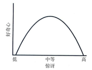
is more about people’s innate cognitive needs for the objective world. He pro- posed that curiosity is aroused when a person perceives a mismatch between expectations and reality. This inconsistency refers to the discrepancy between what he thinks he knows and what he sees. He believes that the relationship between curiosity and surprise follows an inverted “U” curve (see Figure 1).
Figure 1: The relationship between the degree of surprise and curiosity (Jie Ma, China Renmin University Press, 2017).
As can be seen from the curve, curiosity can reach its highest value when reality deviates from expectations neither weakly nor extremely strongly. If the degree is weak, it is easy to ignore curiosity; If it goes too far, we are likely to refuse to acknowledge reality because it conveys conclusions that we are afraid to accept.
Current subway public welfare posters often convey the main idea in a straightforward way, and even with summary or slogan-like text information, so that passengers can understand its meaning at a glance, but will not be more in-depth to understand it.
The use of visual metaphor as a visual language rhetoric in subway public welfare posters may arouse more passengers’ curiosity, encourage them to take the initiative to recognize their content, and improve their participation.
THE SUBWAY SCENE DETERMINES THE FORM AND POSITION OF THE VISUAL METAPHOR PUBLIC WELFARE POSTER Subway space is a closed underground space, in which passengers are in two states of walking and stagnation. Except for waiting on the platform and riding on the carriage, passengers are basically in a walking state and their attention is dominated. The posters on the side wall of the station hall floor are concise and easy to understand in order to meet the requirements of pas- sengers. It is precisely because of this default direction that the design of public welfare posters is homogenized at present, and their visual language is too straightforward. We may be able to ensure that the visual style is sim- ple and the appropriate use of visual metaphors can enhance the interest of posters and enhance their appeal to passengers.
In the empty position of the station floor, or on the platform floor and inside the train, because passengers’ attention is liberated while waiting, they also need some recreational information to reduce boredom, and they have
672 Gong and Xu
the opportunity to carry out more in-depth activities. At this time, the visual metaphor public service posters can be displayed through interactive screens. Some simple and clever forms of interaction are added to allow passengers to further interact when they want to explore the secret of metaphor, so that pas- sengers have the opportunity to have a deeper understanding of the content of the charity poster.
Since it is not easy for passengers to move back and forth and interact too much with the environment in the compartment, and the number of pas- sengers in the compartment may be too large, the interactive screen is not advisable. In this case, the poster with QR code can be used to make use of passengers’ habits of using mobile terminals to carry out online and offline linkage, so as to deepen passengers’ understanding of the content of public welfare posters through simple interaction. Care is even conveyed through the form of online “light community”, allowing passengers to fully partici- pate. As the entrance of the mobile terminal, the two-dimensional code can connect the entire passenger’s behavior and scene in the subway, and realize the public welfare theme coverage of the whole scene.
KEY POINTS OF DESIGN OF SUBWAY VISUAL METAPHOR PUBLIC WELFARE POSTER PICTURE CONTENT Visual metaphor applied to specific visual design can be roughly divided into color metaphor, graphic metaphor, composition metaphor and narra- tive metaphor. These are also the basic elements that make up an illustration or poster.
Color metaphor: Color has a strong expressive force in visual communi- cation, which can directly affect the audience’s emotions and associations. For the design of subway visual metaphor public welfare posters, it is very important to choose suitable colors. Common color metaphors include red representing passion, warning and urgency; Blue represents calm, safe and reliable; Green stands for environmental protection, health and hope. Through the use of these colors, the public welfare information can be intuitively conveyed without being self-evident.
Graphic metaphor: Graphics are an important element in poster design and can convey information in a concise and clear way. In the design of subway visual metaphor public welfare poster, the selection of graphics should be related to the theme of public welfare, and can quickly attract the attention of the audience. For example, by choosing a handshake icon to signify social solidarity, or using a bird to symbolize freedom and hope. Graphic metaphors need to be concise, unique and recognizable, so that the audience can quickly understand and remember.
Composition metaphor: Composition is very important in poster design, it determines the arrangement and organization between visual elements. In the design of subway visual metaphor public welfare posters, the composition should highlight the theme and guide the audience’s eye flow. Through the use of contrast, repetition, balance and other composition principles, can enhance the expression of public welfare information. For example, use size
A Design Method of Subway Public Welfare Posters Based on Visual Metaphor 673
contrast to highlight the main message, or use a diagonal composition to add movement and urgency.
Narrative metaphor: Narrative is an important means to convey informa- tion to the audience. In the design of subway visual metaphor public welfare posters, narrative metaphor can arouse the audience’s resonance through the presentation of story plots or scenes. For example, by depicting a scene in a city with severe environmental pollution, or showing a storyline that helps the disadvantaged, it can arouse the audience’s attention and reflection on public welfare issues. At the same time, narrative metaphor also needs to be concise and clear, so as to avoid information confusion caused by excessive details.
The visual design of the subway visual metaphor public welfare poster can effectively convey the theme of public welfare and arouse the resonance and attention of the audience through careful design and expression through the clever use of color, graphics, composition and narrative metaphor. In the design process, attention should be paid to the selection of appropriate colors, graphics and composition, as well as concise and clear narrative techniques, so as to make the poster recognizable, expressive and appealing, and thus achieve the goal of public welfare.
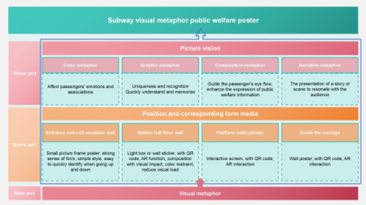
SUMMARY OF SUBWAY PUBLIC WELFARE POSTER DESIGN METHODS BASED ON VISUAL METAPHOR Based on the above analysis, we summarized the main points of the design method of subway visual metaphor public service posters based on the the- ory of visual metaphor, and obtained two parts: visual expression part and scene interaction part. The visual representation is divided into four main points: color metaphor, graphic metaphor, composition metaphor and narra- tive metaphor. The scene interaction part summarizes the poster expression media and interaction methods according to different scene locations (see Figure 2).
Figure 2: Subway public welfare poster design method based on visual metaphor (Wenyi Xu, 2023).
According to the methods summarized above, we designed the subway visual metaphor public service poster with the theme of “caring for depres- sion groups”, and designed the ladder public service advertisement (see
674 Gong and Xu
Figure 3) and the interactive screen public service advertisement (see Figure 4) respectively.
Among them, the Ladder public welfare poster selected high brightness, strong contrast color, strong sense of form composition, simple painting style to attract passengers in motion.
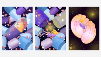
The interactive screen public welfare poster selected more advanced colors with a certain grayscale to enhance the texture of the picture, and designed three different storyboards for the subsequent interactive design. The pro- tagonist of the picture is a little girl with autism, she was trapped in a closed capsule at first, when the passenger found and touched the screen for the first time, the little girl fell out of the capsule and gradually disappeared into the depressed space, when the passenger touched it again, a pair of big hands would appear and catch the little girl. This narrative metaphor makes passen- gers pay more attention to the depressed group, and also makes the depressed group receive more care.
Figure 3: Ladder public welfare poster (Chenliang Gong, 2023).Figure 4: Interactive screen public welfare poster (Chenliang Gong, 2023).
CONCLUSION
The application of visual metaphor has innovative value for the design of subway public service posters. By analyzing the cognitive characteristics of passengers and grasping the subway scene, we summarized the design meth- ods and key points of subway public service visual metaphor posters, and carried out design practice. There are two main aspects that can be done in the future. On the one hand, we can further carry out more specific and
A Design Method of Subway Public Welfare Posters Based on Visual Metaphor 675
scenario-based interactive poster design, so that we can give full play to the role of such posters in the subway scene. On the other hand, resources are sought for the landing and testing of practical scenarios to further ensure the validity of the theory.
REFERENCES
Aldrich, V. C. (1968). Visual metaphor. Journal of Aesthetic Education, 2(1), 73–86. Fang Yuan. (2022). Application of visual metaphor in visual communication design from Different Perspectives. Popular Literature and Arts (19), 57–59. Huang Qing. (2020). Modern illustration in the design of optical illusion utiliza-
tion and performance study (a master’s degree thesis, shenyang normal university). https://kns.cnki.net/KCMS/detail/detail.aspx?dbname=CMFD202101&filename=1 020742582.nh Ian Leslie. (2017). Curiosity: Sustaining a Never-ending Passion for the Unknown.
Chinese and Foreign Management (Z1), 201. Li Xiaomei. (2021). Dynamics, Metaphor and Dimensionality: Narrative Design in Visual Communication. Decoration (09), 29-33. doi: 10.16272/j.cnki.cn11- 1392/j.2021.09.004. Liu Xinya. (2022). The graphic design of visual metaphors performance studies (mas-
ter’s degree thesis, lu xun academy of fine arts). https://kns.cnki.net/KCMS/detail/ detail.aspx?dbname=CMFD202301&filename=1022579 707.nh Luo Yanyan. (2019). A graphic commonweal advertisement of metaphorical studies (master’s degree thesis, xian building university of science and tech- nology). https://kns.cnki.net/KCMS/detail/detail.aspx?dbname=CMFD202001& filename=102080 3560.nh
LISTED IN THE AHFE DIGITAL BOOKSTORE CATALOGUE
Explore the complete digital volume
Human-Centered Design and User Experience
Read this individual research paper free through the original publisher, or explore the full digital proceedings book.
ISBN 978-1-958651-90-2
Explore this ISBN in the AHFE Bookstore ↗Listed in the July 2026 bookstore catalogue; search by ISBN to confirm current availability · Digital book purchase optional