Berna Ulutas, Firat Ozkan (2021). Assessing Medicine Labels to Improve Usability. In: Advances in Human Aspects of Healthcare. AHFE Open Access, vol. 13. https://doi.org/10.54941/ahfe100539
The information on how and when to take a prescribed medicine is provided to the patient by the doctor. Although different countries, even states may have different standards and regulations, it is a necessity for almost each drug to include medication labels. Medication labels refer to, Container Label, Consumer Medication Information (CMI), Package Insert, and Medication Guide. The labels are prepared based on health literacy and aim to improve patient safety. If people cannot understand the health information they need or receive inadequate/inaccurate knowledge of disease and treatment, this may cause serious problems. Therefore, to avoid costly urgent services and adverse effects; medication labels must be design for potential users. This study investigates how information is presented in several medical labels. To improve usability, factors to be considered are defined and assessed by a survey. A case study is provided to compare the current printed package insert and the redesigned one.
Information leaflets for medicines are brand specific and aim to provide the required information. On the other hand, Koo et al. (2002) state that consumers are becoming actively involved in healthcare decisions and need accurate and easy to use information on which to base their decisions. Therefore, the structure and layout and the wording of information leaflets should be studied in detail. Pharmaceutical manufacturers use principles of written health information design, giving consideration to both content and structure. However, the creation of a useable document may not always be satisfied. This study proposes a method to assess the usability of medicine labels by “user-testing”. Individuals answered to specific questions and the weakness in the document that could be improvement is determined. Woods (2001) presents an analysis of publications about the use of patient information leaflets. Krassa et al. (2002) report on two new instruments to assessment of patient information leaflets provided in US community pharmacy: the medication information design assessment scale, an indirect measure of design quality administered by the investigators, and the consumer information rating form a direct measure of comprehensibility, utility, and overall design quality applied by a consumer panel. Mansoor and Dowse (2003) design, develop, and evaluate a simple, understandable medicine label and patient information leaflet, and aim to assess the effect of incorporating pictograms on understanding in low-literate participants. Bawazir et al. (2003) aim to examine public opinion in Saudi Arabia regarding the technical drug package insert as a source of information and to assess the need for potential changes to the existing format in favor of a more patient-oriented package insert.
Davis et al. (2006) measured patient understanding of the instructions on each of the five prescription medication labels. Jenkings and Vaida (2007) state that inadequate drug information, such as outdated or limited references, is one of the most common causes of medication errors. Wolf et al. (2007) aim to examine the nature and cause of patients’ misunderstanding common dosage instructions on prescription drug container labels. Davis et al. (2008), aim to test whether the use of more explicit language to describe dose and frequency of use for prescribed drugs could improve comprehension, especially among patients with limited literacy. Webb et al. (2008) use a patient- centered approach to refine warning labels promoting the safe use of prescription drugs among patients, regardless of literacy level. Bailey et al. (2009) state that standardized, evidence-based medication labelling is needed. Health literacy and language concordance should be considered in designing an enhanced medication label. Peerson and Saunders (2009) discuss the distinction between the broader concept of “health literacy” (applicable to everyday life) and “medical literacy” (related to individuals as patients within heath care settings) also, highlight the importance of health literacy in relation to the health promotion and preventive health agenda. Goldsworth et al. (2009) examine a total of 11 warning labels: 4 new symbols plus the existing baseline symbol, each in versions with and without text, plus a text-only condition. Then, participant interpretation accuracy and preferences were assessed. Mayhorn1 et al. (2009) aim to determine whether prescription medication sharing, a common healthcare consumer behavior, leads to adverse outcomes, including inappropriate usage, delayed care, suboptimal patient- provider relationships, and exposure to side effects. Shrank et al. (2010) state that medication labels are variable, of poor quality, and not patient-centered. Therefore, an evidence based prescription label that addresses both content and format is proposed. Jaya et al. (2010) present an overview of the design and development of Australian CMI and discusses ‘user-testing’ as an iterative, formative process for CMI design. Maat and Lentz (2010) assess the usability of three patient information leaflets and attempts to improve them while complying with the EU regulations. Luk and Aslani (2011) aim to identify and review tools used to evaluate consumer-oriented written medicine and health information from a document and user perspective and readability, presentation, suitability, and quality criteria were reviewed.
ASSESSING THE WRITTEN MEDICINE INFORMATION Legislation for the medicine labels
The quality of written medicine information and the legislation during creation differs quite significantly between countries. Van Haecht et al. (1990) state that traditional physician- orientated inserts are gradually being replaced by patient package inserts in Belgium. Svarstad et al. (2003) state that use of written medicine information in the United States has been steadily increasing over the past 20 years. The European Union (EU) introduced legislation in 1999 requiring all medicines to contain a ‘Patient Information Leaflet’, normally in the form of a package insert (Raynor et al. (2005). Dickson et al. (2001) also state that comprehensive medicine information leaflets for patients are mandatory across EU. Jaya et al. (2010) focus on the legislation and templates that guide the creation of consumer medical information in Australia. Ved (2010) attract attention to the need for revising and improving the traditional concept of package inserts in India, to make it more effective in serving its purpose and state that it can be made more prescriber and patient-friendly by incorporation of some of the concepts, currently followed in the western world. Up to best knowledge there is no written legislation in Turkey to consider during design process of medication labels.
Requirements A good patient information leaflet should have desirable readability characteristics for easy comprehension and understanding the content. In order to assess the readability of designed patient information leaflets, about 40 formulas were recognized worldwide. Most of them are derived statistically and considers language variables such as word complexity and sentence length to calculate the readability (Mary et al., 1999).
During 1930s, several reseaches are held to assess readability. Cetinkaya (2010) introduces various available readability scores as; Dale-Chall formulation, Flesch reading ease score, SMOG readability score, Gunning readability formula, Fry graph readability score, Coleman readability score, and Bormuth grade level readability score. Except Fry graph readability formula, the formulas are presented as regression equation.
More commonly, FRE, Flesch KinKaid Grade Level (FKGL) and SMOG formulas are used to assess the readability. FRE and FKGL formulas are available in Microsoft word. To calculate FRE, FKGL using the computer, the text of the PIL should be typed in word document, and then using the tool bar click on readability, the calculated readability scores of the document appear on the screen. Any leaflet scores more than 70 out of 100 score is considered as fairly easy to read.
A readability formula is a simple method to predict the reading grade level required to comprehend the written materials and documents. Good readability, layout and design are the important factors in developing the information leaflets. Flesch reading ease (FRE) score is commonly used to assess readability of a written text.
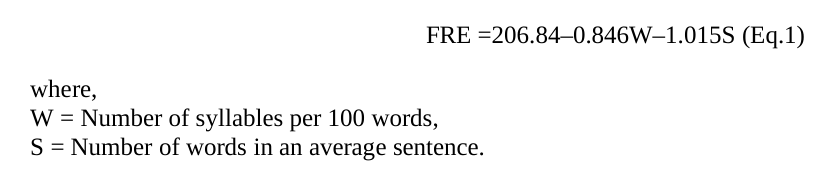
The readability of the prepared leaflets can be calculated using FRE formula given in Equation (1).
Equation reproduced from the original PDF.
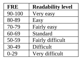
Reading ease scale for FRE is provided in Table 1. The reading ease scores on FRE scale are 0-100 (Flesch, 1949, p.149). If the score of a written text is less than 60, the document is considered to be difficult to read by the general public.
Table 1: FRE Reading ease scale FRE Readability level 90-100 Very easy 80-89 Easy 70-79 Fairly easy 60-69 Standard 50-59 Fairly difficult 30-49 Difficult 0-29 Very difficult
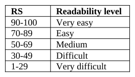
The literature in different languages differ in terms of sentence length, word count and various other grammatical issues. A single formula may not be valid for all language syntax. Cetinkaya (2010) presents a formula to assess the readability for Turkish texts. The readability score (RS) is defined in Equation 2. Table 2 provides the reading ease scale for RS.
RS = 198.825 - 40,175x1 - 2.610x2 (Eq.2) where, x1: Average word length in terms of syllabus x2: Average sentence length in terms of word
Table 2: RS Reading ease scale RS Readability level 90-100 Very easy 70-89 Easy 50-69 Medium 30-49 Difficult 1-29 Very difficult
Baker Able leaflet design (BALD) criterion can also be used for good design characteristics of an information leaflet. Layout and design of the information leaflets can be assessed by BALD criteria. Length of the line, space between the lines, letter type, font size, indenting, pictograms, box type text, use of colors, paper quality are the features used to assess the leaflet layout and design characteristics in BALD criteria.
Adepu and Swamy (2012) develop, validate, and assess the usefulness of the patient information leaflets for selected diseases among the patient population. Flesch readability ease score, Baker Able leaflet design criteria were applied to develop the patient information leaflets. Kaya and Kaya (2008) aim to explore readability of written patient education materials designed by nurses. Readability of 20 written patient education materials was examined with Flesch Reading Ease Score and SMOG Readability formulae. However, this approach was not used to assess the readability of medicine labels used in Turkey.
PROPOSED MEDICINE LABEL DESIGN The principles of effective design include information organization that presents most useful information first; a brief table of contents for longer medicine information; use of patient friendly subheadings; use of bullet points; sufficient white space surrounding the text; use of lower case letters; and a minimum of size 12 font. The principles for wording include using short sentences inclusive of one idea only; using simple alternatives for medical jargon; writing in the positive, imperative voice; using a conversational style and referring to the patient as ‘you’; using explanations to expand on instructions and to make them memorable (Jaya et al., 2010).
DuBay (2004) states that reading ease is influenced by four basic elements as summarized in Figure 1.
Figure 1: The four basic elements of reading ease
Figure available in the original PDF paper.
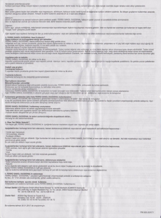
When considering medicine labels, content is the most important element. The information need to be given in brief coherence and free from the medical jargon as much as possible. The style of the leaflets should also be well designed in terms of semantic and syntactic. Layout of the leaflet, the spaces between the lines and the paragraphs should be proportional. On the other hand, several features can be introduced that impacts readability and usability. Figure 2 represents a part of a medicine label that has unnecessary/unused space.
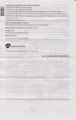
Figure 2: Example of a commercially available medication leaflet with unnecessary space The font sizes for the text and the headings should be different. Cautions or terms of use should be clearly separated from each other. Figure 3 represents two instruction labels that are have small fonts. It is clear that the fonts size itself influences readability. When font sized are small and the medication label is not folded properly to fit in the medication box, it may not be easy to read the required information.Figure 3: Examples of two commercially available instructions with small fonts
In this study, the FRE scores for 11 medicine labels are considered and related results are summarized in Table 3. Any leaflet scores more than 70 out of 100 score is considered as fairly easy to read. The ideal patient information leaflet should have a readability score of more than 80. However, the FRE scores provided in the last column suggest that, the readability of the information leaflet is very hard. This indicates that the score may not suitable for Turkish sentence structure. Based on Equation 2; RS for the same 11 medicine labels are calculated and presented in the right hand column of Table 3.
Table 3: Flesch Score and Readability Score for the medicine labels in concern Medicine Name Number of Number of Average FRE RS Human Aspects of Healthcare (2021)
Table available in the original PDF paper.
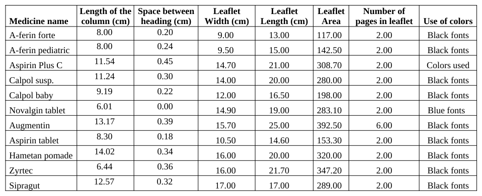
BALD criterion is adapted to assess the design characteristics leaflets. Table 4 summarizes the criteria in concern. Since there was not a considerable difference for paper quality, this criteria is not evaluated. To obtain good layout and design characteristics, a medicine label should be provided in a single favorable paper sheet. Authors think that it would be easier for the patients if they knew which information is assigned to which part of the leaflet.
Table 4: BALD criterion data for the medicine labels in concern Length of the Space between Leaflet
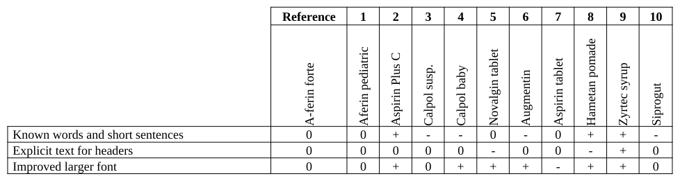
To determine the better design among the medicine labels; a reference is selected among them and various features are assessed based on the reference. Table 5 states concept screening for ten medicine labels.
Table 5: Concept screening for the medicine labels in concern Reference 1 2 3 4 5 6 7 8 9 10
The goal of concept screening is to narrow down many concepts into a manageable, promising set for further research, evaluation and eventually concept selection. The features that are superior to the reference are marked as “+”, “0” if no difference, and “-“ if worse. Then, total number of the comparison results are calculated. The outranking design is determined based on the total score. Based on the assessment, the medicine label that had the greatest total score, it was concluded that Zyrtec syrup has better features in terms of usability and readability.
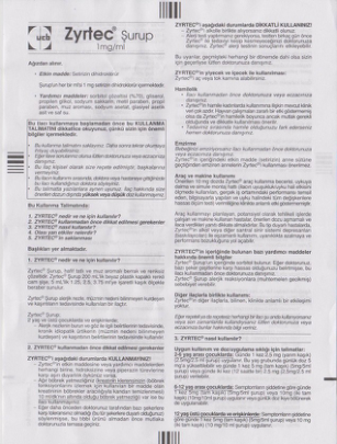
Based on the FRE, RS, and BALD criterion and main principles of readability, the medicine label for Zyrtec syrup is redesigned without any loss of information. Figure 4 provides the current design of a medicine label. Although this design outperforms other medicine labels in concern, some issues are open to improve.
Figure 4: Current outperforming medicine label design
Figure 5 provides a better design in terms of the space between lines, unnecessary and disturbing spaces. On the other hand, it is important to provide the name of the medicine in larger fonts in order to eliminate confusion. General caution should be provided in the first page of the leaflet.
Figure 5: Improved medicine label design
Figure available in the original PDF paper.
CONCLUSIONS
This study aims to attract attention to the medicine labels. After patients get inspection. MD generally prescribe medicine for the illness if needed. However, when the patients obtain the medicine from the pharmacy and need to revise the terms for use or need to review side effects they may not receive the right information quickly. On the other hand, since the information is usually presented with a medical jargon, it may not be possible to easily understand. To improve usability, several medical labels written in Turkish are evaluated. First, FRE score then RS is calculated for the medicine labels in concern. Assessment criteria used for BALD is utilized to compare the layout differences among the medicine labels. A reference medicine label is selected and other labels are compared based on various features. Based on the features related with usability and readability, a medicine label outperformed other labels. Then, an ideal medicine label is proposed.
Following studies may focus on conducting surveys for current and redesigned medicine labels. The experimental group can be formed to see the influence of education level, age, gender, knowledge background for the medicine, previous treatment for the same illness etc. On the other hand, cloze tests can be designed and results can be assessed to propose medicine label designs that have high score of readability.
The medicine labels for the same medicine from different countries, can also be studied to assess the readability scores. Further, the results from multilingual groups can be considered during the studies for better medicine labels.
REFERENCES
Adepu R., Swamy M.K. (2012). “Development and Evaluation of Patient Information Leaflets (PIL) Usefulness”. Indian Journal of Pharmaceutical Sciences. Vol.74 No.2. 174-178. Bailey S.C., Shrank W.H., Parker R.M., Davis T.C., Wolf M.S., (2009). “Medication label improvement: An issue at the
intersection of health literacy and patient safety”. Journal of Communication in Healthcare. Vol.2. No.3. 294-307. Bawazir S.A., Abou-Auda H.S., Gubara O.A., Al-Khamis K.I., Al-Yamani M.J., (2003). “Public Attitude Toward Drug Technical Package Inserts in Saudi Arabia”. Journal of Pharmacy Technology. Vol.19. 209-218. Cetinkaya G., 2010, “Türkçe metinlerin okunabilirlik düzeylerinin tanımlanması ve sınıflandırılması”. Doctoral Dissertation,
Ankara University Social Science Institue. 252 pages.
Davis T.C., Federman A.D., Bass P.F., Jackson R.H., Middlebrooks M., Pharm D., Parker R.M., Wolf M.S., (2008). “Improving patient understanding of prescription drug label instructions”. Journal of General Internal Medicine. Vol.24. No.1. 57-62. Davis T.C., Wolf M.S., Bass P.F., Thompson J.A., Tilson H.H., Neuberger M., Parker R.M., (2006). “Literacy and
misunderstanding prescription drug labels”. Annals of Internal Medicine. Vol.145. 887-894. Dickinson D., Raynor D.K., Duman M., (2001). “Patient information leaflets for medicines: using consumer testing to determine the most effective design”. Patient Education and Counseling. Vol.43. 147-159. DuBay W.H., (2004). “The principles of readability”. www.impact-information.com (last accessed on 1 March 2014). Flesch, R., (1949). “The art of readable writing”. New York: Harper. Goldsworthy1 R.C., Mayhorn C.B., (2009). “On warning symbols, text, and ‘getting it right’: The iterative refinement of a
teratogenic pharmaceutical label”. Proceedings of the Human Factors and Ergonomics Society 53rd Annual Meeting. 1603-1607. Jaya E., Aslania P., Raynor D.K., (2010). “User testing of consumer medicine information in Australia”. Health Education Journal. Vol.70 No.4. 420–427. Jenkins R.H., Vaida A.J., (2007). “Simple strategies to avoid medication errors”. Family practice management. Vol.February.
41-47. Kaya N., Kaya H., (2008). “Hemşireler tarafindan geliştirilen yazılı hasta eğitim materyallerinin okunabilirliğinin saptanması”.
Atatürk Üniversitesi Hemşirelik Yüksekokulu Dergisi. Vol.11. 1-6. Koo M. Krass I. Aslani P. (2002). “Consumer opinions on medicines information and factors affecting its use – an Australian experience”. International Journal of Pharmacy Practice Vol.10 No.2. 107–14. Krassa I. Svarstadb B.L., Bultmanc D., (2002). “Using alternative methodologies for evaluating patient medication leaflets”.
Patient Education and Counseling. Vol.47. 29–35. Luk A., Aslani P., (2011). “Tools Used to Evaluate Written Medicine and Health Information: Document and User Perspectives”. Health Education and Behavior. Vol.38 No.4. 389-403. Maat H.P., Lentz L., (2010). “Improving the usability of patient information leaflets”. Patient Education and Counseling. Vol.80.
113-119. Mansoor L.E., Dowse R., (2003). “Effect of Pictograms on Readability of Patient Information Materials”. The Annals of Pharmacotherapy. Vol.37. 1003-1009. Mary A. Kirkpatrick F. Cherri P. Mahler BS., (1999). “Using the readability assessment instrument to evaluate patient
medication leaflets”. Drug Information Journal. Vol.33. 557-63. Mayhorn1 C.B., Goldsworthy R.C., (2009). “Borrowing prescription medication: Implications for healthcare warnings and communications”. Proceedings of the Human Factors and Ergonomics Society 53rd Annual Meeting. 1608-1611. Peerson A., Saunders M., (2009). “Health literacy revisited: what do we mean and why does it matter”. Health Promotion
International. Vol.24 No.3. 285-296. Raynor D. Knapp P. Moody A. Young R., (2005). “Patient information leaflets – impact of European regulations on safe and effective use of medicines”. Pharmaceutical Journal Vol.275 No.7375. 609–611. Shrank W.H., Parker R., Davis T., Pandit A.U., Knox J.P., Moraras P., Rademaker A., (2010). “Wolf M.S., Rationale and design
of a randomized trial to evaluate an evidence-based prescription drug label on actual medication use”. Contemporary Clinical Trials. Vol.31. 564-571. Spadaro DC. Robinson LA. Smith LT. (1980). “Assessing readability of patient information materials”. American Journal of Hospital Pharmacy. Vol.37. 215-21. Svarstad B. Bultman D. Mount J. Tabak E., (2003). “Evaluation of written prescription information provided in community
pharmacies: A study in eight states”. Journal of the American Pharmacists Association Vol.43 No.3. 383–93. Van Haecht C.H., Vander S.R., Bogaert M.G., (1990). “Package inserts for antihypertensive drugs: use by the patients and impact on adverse drug reactions”. European Journal of Clinical Pharmacol. Vol.39 No.6. 551-554. Ved J.K., (2010). “Package Inserts in India: Need for a Revision”. International Journal of Pharma Sciences and Research. Vol.1
No.11. 454-456. Webb J., Davis T.C., Bernadella P., Clayman M.L., Parker R.M., Adler D., (2008). “Wolf M.S., Patient-centered approach for improving prescription drug warning labels”. Patient Education and Counseling. Vol.72. 443-449. Wolf M.S., Davis T.C., Shrank W., Rapp D.N., Bass P.F., Connor U.M., Clayman M., Parker R.M., (2007). “To err is human:
Patient misinterpretations of prescription drug label instructions”. Patient Education and Counseling. Vol.67. 293-300. Woods M.D., (2001). “Writing wrongs? An analysis of published discourses about the use of patient information leaflets”. Social Science & Medicine. Vol.52. 1417–1432.
LISTED IN THE AHFE DIGITAL BOOKSTORE CATALOGUE
Explore the complete digital volume
Advances in Human Aspects of Healthcare
Read this individual research paper free through the original publisher, or explore the full digital proceedings book.
ISBN 978-1-4951-2093-0
Explore this ISBN in the AHFE Bookstore ↗Listed in the July 2026 bookstore catalogue; search by ISBN to confirm current availability · Digital book purchase optional