Rossy CossyLeon-Pereza, Brenda Gallardo-Vazqueza, Marcelo Soaresb (2022). Usability Test for a Bank Service Website. In: Advances in Ergonomics In Design, Usability & Special Populations: Part II. AHFE Open Access, vol. 19. https://doi.org/10.54941/ahfe1001253
The purpose of this study is to analyze one of the biggest electronic banking products in México, from the usability point of view. Two kind of analysis were made: a heuristic analysis and a user test. The heuristic analysis was based on previously defined models by Eason (1984), Leventhal and Barnes (2007) and Bastien and Scapin (1993). The format of the site design has an adequate visual style and legibility, and provides some shortcuts. But the analysis showed some negative issues too, matching the user test results. 7 people, 23 to 37 years old, participated in the user test. It consisted on two on-line transactions on the web service, considered some of the most common transactions, complemented with two questionnaires. Although all of them finished the required tasks, 29% stated they had some problem to do it, and a high percentage (71%) said it was not easy to find the needed sections on the web service. The information they got from the service was understandable just for 43% of the users, and none of them expressed the design and organization of the web service made easier the tasks for them. Based on both analyses, some proposals were made for improving the service.
Usability is the effectiveness, efficiency and satisfaction necessary for a product to allow specific users in specific contexts, to achieve specific goals (ISO/IEC 9241-11). The rules related to usability can be categorized in: the prod- uct’s use (efficiency, effectiveness and satisfaction in a particular context), the user’s interface and its interaction, the process used to develop the product and the capability of an organization to apply the design centered in a user. Hence, a wrong designed interface may well obstruct the capability of a user in its interaction with the product. This is true even though if the functionality or such product is good. The page that we will analyze in this essay is the electronic page for one of the principal Mexican banks which is part of a big international corporation. To access, the client must sign a specific contract to obtain the service and receive an electronic key device, and the client is recommended to access in a secure computer and not in public networks. For these requirements and also for lack of acknowledgement or confidence, many clients do not use this resource; the ones that do use it recognize the benefits they get from the resource. An analysis of this website was made from the heuristic point of view and with a test with users, to determine the level of usability and the acceptation of the user, and also to offer some improvement recommendations.
HEURISTIC ANALYSIS ERGONOMIC CRITERIA FOR THE USER INTERFACE.
Guidance Prompting
According with the criteria established by Bastien and Scapin (1993), the Internet pages must favor the new users by orientation and guidance. Referring to the prompting, the sections of the evaluated page present clear titles and, broadly, the entrances required let know, with no doubt, the required data; nevertheless, the prompting function is not fully accomplished, because one of the first tasks a user has to do is to open an account and the necessary link is a bit difficult to find because of its localization and color; this may well cause frustration in the user. The HELP op- tion appears as an interrogation sign in most of the sections, excepting the one that refers to the electronic key de- vice, which unfolds using a small triangular symbol, not the conventional help sign, which may be not obvious to the new user.
Grouping and Distinction of Elements The group of the different themes in the superior menu is suitable; it comprehends the user’s possible actions and changes the background color of the one active at the moment. It also has a very good distinction toward other type of elements.
Legibility The page’s legibility has positive elements, such as the cleanness of the design and the contrast, a clear font over a dark background and vice versa, also an adequate use of capital and small letters (see Figure 1); although, in some menus that were not assigned a high hierarchy the font’s size is reduced, which may well increase the required time to find them.
Figure 1. Appropriate contrast of colors. (Image from the analyzed website)
Immediate Feedback The site basically has two types of feedback for the user: the first one when a process is taking place, the screen turns into slightly clearer tone until the process is finished. The second one is referred to the system’s respond when the process is finished, indicating that the process was successful and generating a register number for the operation or, indicating if the operation was not successfully realized. The inconvenient is in the response of the system when there was a problem caused by a user’s error, being this an error in the typing of the numerical passwords or client numbers, or in the activation of the caps lock button during the initial password entry, because it does not inform the user which was the problem, which makes the user repeat the process without knowledge of cause.
Workload Brevity, concision and minimal actions
The system allows the user to save information that saves him time in ulterior actions, like account numbers, alias or e-mail addresses of deposit beneficiaries, hence reducing the required mental effort. The numerical data format is corrected automatically by the system. On the opposite, the difficulty to find determined links can eliminate the Ergonomics In Design, Usability & Special Populations II brevity for a new user, by increasing the minimal actions.
Information density The information density presented is appropriate, without a visual saturation. It counts with elements that are exter- nal to the actions in process in the left side of the screen, but its design does not convert them in a distracter for the user.
Explicit user action and user control The site gives control of actions to the user requiring confirmation or cancellation of the given information, and also requiring the use of the device that interchanges passwords with the site. But there are some actions that do not de - pend on the user, like a possible failure on the Internet service that obligates the user to abandon the site without a correct log out process. In this case the user cannot log-in till the system generates the closure of the process.
Adaptability Flexibility
Because of the banking functions of the system, all of its actions require an indispensable minimal sequence, but to get to that sequence one may follow various routs, like in the case when the user opens an account; to access this ac- tion the user may do it in the menu “Otras Cuentas” (Other Accounts) or in the “Transferencias” (Transferences) one. To enter information, the system offers options depending on the kind of data: an amount may be entered by typing it, a message for a beneficiary can be typed, or an account number can be chosen from a previously charged list.
User experience In specific situations, like the use of the key device, the site offers simple instructions, that way making the task easy for a new user or to a user that has some time without using it. But the site seems not to consider a new user in the assignation of hierarchy to some commands for necessary actions, just like we can see while opening an account.
Use of shortcuts As an option to reduce time in afterwards actions, the user can define, when opening an account, if it will be marked as a frequent operation, making faster the introduction of the account’s data (see Figure 2); or some operations can be scheduled in advance.
Figure 2. Use of shortcuts in frequent operations (image from the analyzed website) Error management
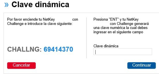
Error protection, quality of error messages and error corrections As a protection against errors, while entering an account number for its register, if the account is from the same bank, the system requires only the account number, does an internal search and offers the name of the beneficiary of the account, making it easy for the user to detect if it is the correct account. For any operation, the system requires the trading of passwords between the key device and the page after offering the user a screen display with the information which allows him to check it before proceeding (see Figure 3). But the system, in case of error, does not ex- plicit the cause of such error. So the user may well repeat the process without detecting, lets say, that the keyboard has activated the CAPS key when entering a password. There´s no error correction option; if the user makes a mis- take, the process should be done again.
Figure 3. Error possibility in the trading of passwords. (Image from the analyzed website) Consistency
The site’s design maintains a constant kind of answer and its location and color for each action.
Significance of codes The terminology used in the page is understandable for Mexican users, including words such as CLABE (bank swift code), physical person and moral person, RFC (Federal Register of Taxpayers), or CURP (Population Register Clue).
EASON'S USABILITY MODEL User’s characteristics
Knowledge and motivation The user for whom this site is directed is an adult that has one or more bank accounts and has access to internet. The user’s knowledge must cover, though not necessarily, experience in monetary online operations and confidence in this system. The user must understand the basic concepts of bank accounts and the motivation is the search of practi- cality and saving time and effort in monetary interchange.
Learning style and ability for problems resolution.
Because the user of this site is an internet user, he is accustomed to navigate in sites in which he finds specific links and he guides himself by the offered menus; but, some users may require help if the routes are not well enough clear or obvious.
Age The user must be over 18 years old to sign a contract for a bank account and also a contract for the site itself. There is no age limit.
Function of the system Task match
The level of the system’s adaptation to the tasks required by the user is considered adequate, because it only serves for the actions offered in the menus, and, when the user has a certain level of experience, one can work in the site in an easy and fast way.
Ease of use and ease of learning The initial level of learning the system’s functions may well be considered adequate or inadequate in relation to the time that the user needs to locate the sections required for its use. Even though the options may seem obvious as a part of the menus, in some cases the legibility of the tags is not appropriate, and, this leads to a major number of er- rors and, hence, to expend more time in the task. The easiness of the use is limited by concepts such as the descrip- tion of one’s accounts, because there are many types of bank sub-accounts, and if an error occurs while choosing the principal account for the transference the operation will not take place.
Characteristics of the tasks Frequency
The system does not limit the quantity of times that the user enters for any kind of transaction, but it has a restriction of time to inactivate itself; if the user does not realize any movement, the system terminates the session in 20 min- utes, making the user to re-enter.
Openness As a part of a bank system, the system only covers what itself offers, there are no possibilities of adding another kind of tasks required by the user.
User reaction The user’s reaction towards the system are generally positive because of the opportunity to realize transactions with- out having to go to a bank, but it also has negative reactions because of the frustration in some points of the learning process.
INTERACTION DESIGN Design centered in the system
Unlike the pages that have their design centered in the user, this page, for being a part of a bank service, has its de- sign centered in the system’s characteristics, because the options do not respond to what the user may require but to what the system can offer.
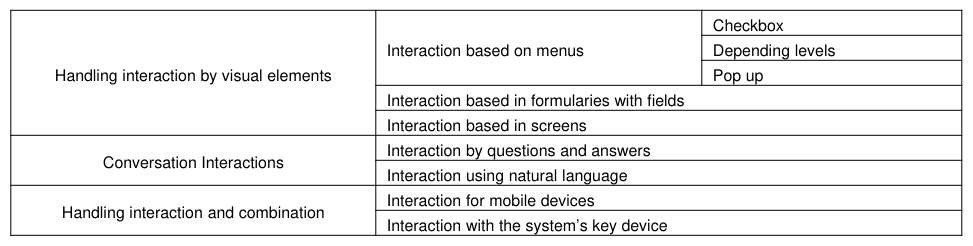
Interaction Design Interaction, defined as the way that the user interacts with the system, includes the interface and the objects of an ap- plication that the system offers to the user. Some ways of interaction in the analyzed page are described in Table 1.
Table 1: Interaction design options in the analyzed website Checkbox
GUIDELINES FOR THE DESIGN Facilitating development and use of viable mental models
In the case of this page, the actions and terminology are consistent when permitting the user to construct a mental model of the page, but it presents an important problem for new users when trying to locate the section to open an account; this link has a poor visibility.
Avoiding Anthropomorphism The page counts with an anthropomorphized image (the image of a finger with facial features), making allusion to the ease of doing transactions with ‘one only finger’, but this is not used in other sections of the page, so it is really not distracter for the user.
Use of metaphors Between the graphic elements of the page we can find a metaphor, the image of some hands, alluding to the idea of the user having the ‘bank in its hands’ (see Figure 4).
Figure 4. Use of metaphors (image from the analyzed website)
Reducing the user’s mental work The system offers a good option to reduce the mental work load of the user, by letting register data for ulterior uses.
Guidelines for the visual design The principal guidelines for the visual design for this page are the guidelines for commercial platforms, because the bank is a multinational enterprise with a corporative defined image. In Table 2 we will mention the principal visual elements that give a major effectiveness to page’s design.
Table 2: Visual elements in the website design.
USABILITY EVALUATION BY TESTS WITH USERS Objective
The context for the creation of this page is based in the necessity to offer the bank’s user the possibility to realize transaction without going to an actual bank. As a solution for this problem, the bank propones to its clients the use of an electronic bank web page. The objective of the evaluation is to analyze the characteristics of the electronic bank service from the point of view of its users, to know its real level of usability. The lapse of time of the user to realize two basic tasks, and the quantity of errors or alternative routes that took him to realize them were analyzed, so were the perception and opinion about the system.
The evaluation is summative, because we are dealing with a finished program, to analyze its efficiency and usability and determine if the resultant levels are acceptable for the real and the potential user, or if its limits distance them.
Participants
For the test the selection of participants was done by convenience, by an invitation to enterprise executive workers, from which 7 accepted to participate, considering men and women. The group of participant’s age oscillates be- tween 23 and 37 years old, and their working areas were Sales, Purchasing, Design, and IT departments.
Instruments
A private working area was prepared with a portable computer with internet access, and the electronic device which works to create dynamic access keywords, while working in the page. Two questionnaires were given along with a pen and a sheet with the information with the account data. For the recording and analysis of the test we used the Camtasia Studio 8 and Microsoft Excel programs.
Procedure
Each participant was called individually and the process was explained: 1) Read and answer the initial questionnaire, which included the instructions for the activities to realize in the bank system. Once ready, press the initialization for the recording and wait for the countdown to begin the activity in the system 2) Realize the activities assigned in the page: the first one was to open an account; the second one was to transfer one Mexican peso to a second account number. After receiving the screen of confirmation, the user should logout at the bank system and press F10 to finish the recording. 3) Read and respond the second and final questionnaire.
Results
100% of the participants said to be users of some bank service and only 86% of them told to be clients of this spe- cific bank, while only 53% declared to be users of the electronic bank service. About frequency on making bank movements, the participants declared in majority (72%) to make them once a week; about the way for it, the major- ity declared to use internet (86%), and 53% said to also use the ATM. In reference to the type of operations realized, the participants mentioned principally service payments (71%), transferences (57%) and credit card payments (57%).
Even though all of them finished the required tasks, 29% of them said to have had some difficulty to realize them and a high percentage (71%) thought that it was not easy to find the sections needed. The information given by the page seemed understandable only for 43% of them, while none of the participants had the good opinion for the de- sign and organization of the page.
About the time lapse required to realize the tasks was the following: for opening the account, 29% said that it’s too slow, 14% said it was very fast and 57% thought it was regular.
About the complexity of the process, there was a very notorious difference between experienced users and new ones. 43% of them thought that opening the account was complicated, while the rest (57%) was divided between simple and regular; the transference time difference was also notorious, maybe influenced by the fact that the participants got to know more the system, 57% though it to be simple while only 14% thought it to be complicated.
On the base of the analyzed facts in the video recording, the results were: in the analysis of the required time to com- plete the tasks the difference of work was notorious between the experienced and the new users, because the lack of knowledge about the links made that the new users were obligated to enter different sections and menus to find the correct links, taking them to frustration and increasing the time laps to complete the tasks.
CONCLUSIONS
Taking the results of the analysis realized to this page, many important opportunity points were found. Its design, from an aesthetic point of view, is nice, but some changes could improve its usability, taking away frustration to the user. With the use of this application the objectives are accomplished, but learning the system may be complex for the new users.
Recommendations
Some recommendations to improve the interaction with the page taking the heuristic evaluation and the user’s test:
- Facilitate the route to the opening for new accounts; show it with a higher hierarchy. - Modify the organization of the digits in the dynamic passwords, adding comas or separation between groups of digits, to make easier their reading, in the page and also in the electronic device. - If the user commits an error while entering data, the page must offer a feedback with the cause of the error. - Offer a section that includes a map of the site, where one can locate the links required.
REFERENCES
Bastien, J. M. C., & Scapin, D. L. (1993). Ergonomic criteria for the evaluation of human-computer interfaces. Manuscript submitted for publication, Institut National de Recherche en Informatique et en Automatique. Bevan, N. (2006). International standards for HCI. In Serco Usability Services (Ed.), Encyclopedia of Human Computer Interac-
tion. London: Idea Group Publishing. Retrieved from http://nigelbevan.com/papers/International_standards_HCI.pdf Eason, K. D. (1984). Towards the experimental study of usability. Behavior & Information Technology, 3(2), doi: 10.1080/01449298408901744 Leventhal, L. M., & Barnes, J. A. (2007). Usability engineering: process, products & examples. (2007 ed.). Prentice Hall.
LISTED IN THE AHFE DIGITAL BOOKSTORE CATALOGUE
Explore the complete digital volume
Advances in Ergonomics In Design, Usability & Special Populations: Part II
Read this individual research paper free through the original publisher, or explore the full digital proceedings book.
ISBN 978-1-4951-2107-4
Explore this ISBN in the AHFE Bookstore ↗Listed in the July 2026 bookstore catalogue; search by ISBN to confirm current availability · Digital book purchase optional