Zilu Chen, Bo Liu (2022). Design Method of Personalized HMI for Automobile Dashboard. In: Affective and Pleasurable Design. AHFE Open Access, vol. 41, pp. 104–110. https://doi.org/10.54941/ahfe1001786
In recent years, the mechanical dashboard of automobile has evolved into an all-digital one, which has brought the innovation of content display mode and the improvement of related functions. This is because in the transformation of the automotive industry, users have become more focused on the driving experience than before, and they have shifted their focus on car styling and interior design to the human-machine interaction (HMI). As a result, automobile brands on the market have introduced many distinctive HMI designs for dashboard. The author previously cooperated with WM Motor Technology Co., Ltd. to launch a commercial in-vehicle application, which allows the appearance of dashboard to be changed according to the user's emotion and preferences, catering to the individual needs. Nevertheless, in the process of cooperation between the enterprise and designers, the design principles of traditional dashboard are still followed, and there is a lack of suitable design methods of personalized HMI for digital dashboard. Therefore, this paper attempts to create a design method that provides guidance for the aforesaid process. Based on the emotional design theory, it puts forward the principles of aesthetic, usability and experience, and guides designers on how to design and what to avoid from the perspective of user experience. Besides, it also proposes some new ideas for the development of personalized theme design of dashboard, such as customized design service, multi-sensory experience, etc. This paper aims to get more designers and developers involved in the co-creation of dashboard theme design and strive to improve the users’ experience. Additionally, the design thinking method described in this paper can also provide reference for the design of other products.
Along with the rapid development of the automotive industry, the car will gradually transform from a simple transportation tool to an intelligent mobile space and application terminal, becoming an important carrier of the emerging industry (National Development and Reform Commission, 2020). Users’ demand for cars is no longer driving only, but also includes diver- sified needs such as entertainment and socialization. At the technical level, the mechanical dashboard display evolves to the LCD display, and the infor- mation display develops toward interaction, automation, integration and diversification (Tang, 2014). Just like the personalized themes of smartph- ones, automobile manufacturers began to design personalized themes for the
user interface of dashboards, presenting different visual styles by changing the color scheme and visual elements to meet the preferences of different users.
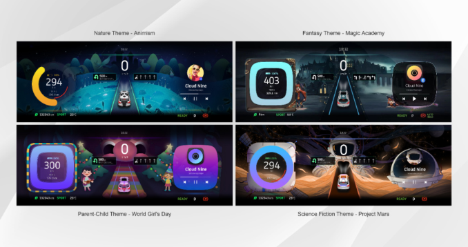
Some passenger cars on the market have the function of changing the per- sonalized interface of dashboard. For example, the Mercedes-Benz C-Class 2019 sedan allows users to select themes for Super Sport, Sport and Classic modes. The BMW 3 Series 2020 sedan’s dashboard can change the theme depending on the driving mode. Most brands on the market, like the for- mer, offer only a few pre-set HMI themes. WM Motor Technology Co., Ltd. launched the “WeShow Dashboard Theme Store” program (Figure 1) and cooperated with Shanghai Jiao Tong University School of Design and other universities to design and develop a large number of personalized themes in various styles, which are continuously updated and sold, forming a new business model.
However, there is a lack of standardized design methods of personalized interface for dashboard in the collaboration between enterprise developers and designers. This paper will propose design guidelines for dashboard user interface with aesthetics, usability and good experience, based on emotional design theory. It will guide designers what to do and what to avoid from the perspective of user experience, and propose some new ideas for the deve- lopment of personalized theme design for dashboards. The design guidelines proposed in this paper aim to let creators understand the design methods and design thinking of automotive dashboard themes, and provide reference for the design of user interface themes for other products.
RELATED WORK
Design principles for automotive user interfaces. According to the definition of ISO 9241 (2018), the usability of an HMI system can be evaluated in terms of effectiveness, efficiency and satisfaction.
106 Chen and Liu
Automotive HMI first needs to enable driving information display and human-machine interaction in order to be effective. The overall organiza- tion of information in an automotive user interface should present a narrow and deep structure. Common icons should be used to avoid ambiguity in understanding (Tan, et al., 2012). The interface should make immedi- ate and reasonable response according to the current driving status (Li, 2018). Efficiency means improving the efficiency of driver-interface interaction to achieve the interaction goal. In the interface layout, information closely related to driving should be placed in the main display area such as the dash- board, while information of secondary importance and not related to driving should be displayed in the center control panel and other locations. The inter- face layout should also be clear, with key information at the first level and auxiliary information at the second and third levels or in the sub-interface (Xi, et al., 2016). The display of high priority information should be emphasized and low priority information should be weakened (Li, 2018). Appropri- ate use of color proves to improve the design of HMI (Deodhar, et al., 2014). Users of different regions, ages, classes and genders have different require- ments for the HMI. In order to satisfy more users, the interface design should consider the habits and aesthetic concepts of different users (Zhang, et al., 2017). User preferences for HMI are also influenced by culture. Generic cultural models can make a measurable contribution to understand regional users’ values when selecting automotive HMI design features (Khan, et al., 2016). Future driving and traveling should create pleasant experiences by means of entertainment or efficient use of travel time (Detjen, et al., 2021).
In the field of UX design, Donald Arthur Norman (2005) proposed the well-known three-level theory that design needs to be perceived at three levels: instinctive, behavioral and reflective level. The design guidelines pro- posed in this paper focus more on the emotional effect of the HMI design on the user. Therefore, this paper corresponds the three levels to the three requi- rements of aesthetic, usability and experience, and describes them in detail respectively.
DESIGN METHODS Aesthetic
First, the design of interactive user interface should be aesthetically pleasing to appeal to users and induce them to use personalized themes instead of the default one. A beautiful interface can make people instinctively pleasant. Referring to the components of visual communication design proposed by Info Graphic design team (2019), this paper argues that the user interface design of automotive dashboard should meet the requirements of harmonious picture, beautiful composition and accurate color.
Interfaces consist of various shapes and textures, which contain different types of feelings or emotions. Designers should reasonably use visual ele- ments for combination and layout, so that the meaning conveyed by the user interface is accurate and unified, which users can intuitively perceive it.
Design Method of Personalized HMI for Automotive Dashboard 107
In most cases, the automotive dashboard has a bilaterally symmetrical fea- ture. The personalized theme should be designed based on the composition of the original interface, keeping a balance between the visual perception of the left side and the right side of the screen.
Color is an important component of an interface that conveys the perso- nality of the interface and evokes people’s associations of color. Each of the three dimensions of color - hue, saturation, and brightness - plays a role. For example, orange makes people feel warmer than blue, highly saturated colors make people excited, and dark colors make people feel blue. Designers should use color to accurately convey the style and atmosphere they want to express, while avoiding unpleasant color combinations. The use of color needs to be strictly controlled in the design of automotive user interfaces, as explained below.
Aesthetic differences exist due to the influence of various factors such as class, era, ethnicity and personal cultivation. The existence of aesthetic dif- ferences leads people to have different aesthetic standards and preferences. Users of the same car model also have aesthetic differences, and are bound to show different levels of preference for the same personalized theme, so the number and variety of themes should be increased to cover the needs of dif- ferent users as much as possible. For example, provide masculine, feminine and unisex user interfaces to meet the preferences of different gender users. The classification criteria of themes are not uniform, but can be classified by mood, content, tone, etc. Under the premise of diversified styles, designers can refer to current popular design styles, and doing so can appeal to a wider range of consumers.
Usability The most important thing for automotive dashboard is to achieve the function of information display and interaction, as it concerns driving safety. Since the personalized interface is designed after the original interface, care had to be taken not to interfere with the original user interface as much as possible during the design process.
Generally, graphics need to be kept as simple as possible to increase the recognizability. Overly fancy graphics or overly rich colors can make infor- mation difficult to read and increase the risk of driving. The information on the dashboard reflects the operating status of the vehicle’s systems and must be placed at the top of the interface without being obscured. Furthermore, this information should be displayed with emphasis and in high contrast to the background. It is important to note that some information (such as indicators and warning pop-ups) will only appeal in certain situations. So space should be reserved for them and avoid complex design in these areas. In order to make drivers concentrated on driving information, it is advisable to use soft colors in the background to reduce the level of arousal. When drivers are dri- ving in the dark or in tunnels, excessively bright screens can cause dazzle and make it difficult for the eyes to adjust to the light and discern the informa- tion on the screen, so low brightness colors should be used for the interface background.
108 Chen and Liu
The design of the personalized theme allows some of the icons to be modi- fied, but the design of the icons should ensure comprehensibility and clearly indicate the meaning of the function to avoid user confusion.
When designing a new personalized interface, do not change the layout of the interface. It takes time for users to get used to the location of different information, and changing to a new layout can be difficult and overwhel- ming. This can also lead to a loss of efficiency in reading information and pose a security risk.
Different colors have their specific symbolic meanings. Red indicates pro- hibition and danger, yellow indicates warning, and green indicates safety. The use of colors needs to be limited to avoid ambiguity. For warning lights and alert pop-ups, different colors indicate different alert levels and these colors are forbidden to be changed. For elements such as electric power and lane lines, color symbols should be used appropriately when different states are to be indicated by different colors. For example, blue or green can be used to symbolize safety in case of high power, and orange or red can be used to warn in case of low power.
Experience The great personalized user interface of automotive dashboard can evoke users’ pleasure, not only from the instinctive response brought by aesthetics, but also from the good experience of using the dashboard.
One of the biggest features of the dashboard personalization theme is its personalized design, which is the connotation and extension of emotional design. When the design matches their personality, users feel that the product understands them and that it reflects their taste and identity. The advantage of personalized themes is that it conveys diversified personalities, and the user only has to pick the design that best fits him or her. Therefore, it is necessary to increase the number and type of themes.
For some users, the existing personalized themes may not fully satisfy their needs because they want to be unique. For this reason, customized design services can be introduced, so that each user can have their own personalized interface. It can be realized in the following ways: (1) Provide existing visual elements, allowing users to combine and change colors by themselves to rea- lize participatory design. For example, the color colorizer updated by Tesla in 2022.4.5 system version allows users to choose any color and material they like to change the appearance of the car model in the HMI. However, it should be noted that users can only customize the interface to a limited extent, and the usability of the interface should not be compromised as a result. (2) Use of computer-aided design, with computer-generated interface graph- ics. There are many algorithm-based image generators that allow users to convert images in albums into a variety of styles to fit for the interface and use them as background images, or allow AI to randomly generate abstract pat- terns. Enterprises can convert the exclusive themes into non-fungible tokens (NFTs) to create an irreplaceable link between the generated interface and the owner, making the personalized theme an irreproducible digital artwork as well.
Design Method of Personalized HMI for Automotive Dashboard 109
The situational design of the automotive dashboard is also a reflection of personalization, which can adjust the interface according to the percei- ved user characteristics and environment (Zheng, Wu, 2018). The design for different contexts gives the user an immersive experience and creates an atmo- sphere that unifies the system and the environment. (1) Design personalized themes for specific occasions. Seasonal and holiday themes can be introduced. For example, during Christmas, users will be happy to add Christmas deco- rations to the automotive HMI to bring in the festive atmosphere, and this will also share the joy with other passengers in the car. (2) In addition to the visual design of the dashboard, also add auditory, tactile and olfactory expe- rience to the HMI. For example, when the user applies the forest theme, along with the changes of dashboard interface, there are also ambient lights, button sounds and car fragrance, all of which make users feel as if they are driving in a real forest, enjoying the comfort and relaxation brought by nature. (3) The system monitors and collects information about the environment and the veh- icle, which can be translated into visual elements to give real-time feedback to the user intuitively. For example, the weather mobile application simulates the current weather conditions on the screen, which can also be applied to the dashboard to remind the driver to prepare for the weather. When the car speed is collected, the interface can also translate the sense of speed into dyna- mic graphics or color. (4) On the basis of personal identification, combined with physiological and psychological perception technology, intelligent cars can realize real-time monitoring of human physiological and psychological states, so that the real-time personalization of the automotive user interface can be achieved (Baidu, 2018). For example, monitoring the user’s mood to change the tone of the theme, or enhancing the contrast of the screen when the user feels drowsy.
The user’s driving process is mainly divided into several scenarios such as unlocking - starting - driving - parking - locking - charging and several other scenes. Only by connecting all the driving scenes together can closed- loop experience be completed. So, the personalized theme for the automotive dashboard should not only present the user interface in driving scenario, but also the interface under other different scenarios. Suppose the current theme is “Space Odyssey”, then the driver can become an astronaut in the imagina- tion, and a driving journey becomes an interstellar adventure in outer space. Digital image achieves the interpretation of the plot through scene design (Shen, 2016). The personalized dashboard theme can become the carrier of the narrative, so that each trip becomes a story with the beginning, deve- lopment, climax and the end, so that users become the protagonist of the story.
CONCLUSION
This paper provides a design method for personalized user interfaces for automotive dashboards. Compared with the HMI design principles pro- posed by other scholars, personalized interfaces should emphasize users’ emotional experience. When autonomous driving becomes the future dire- ction of automobile industry, the emotional design of user interface for
110 Chen and Liu
automotive dashboards becomes more important when users are freed from the monotonous driving behavior and have more diverse interactions with the automotive HMI. In addition, the innovative ideas presented in the method require the joint efforts of designers and engineers to put into practice.
REFERENCES
Baidu AI interaction design institute, (2018) White Paper on Trends in Human- Machine Interaction Design for Smart Vehicles, https://mp.weixin.qq.com/s/tnm TqayEVHlZwoWmZuAbsw, March 9, 2022 CHINA. NATIONAL DEVELOPMENT AND REFORM COMMISSION. (2020). Smart Car Innovation Development Strategy, [online] Available from: https://www.ndrc.gov.cn/xxgk/zcfb/tz/202002/t20200224_1221077.html?code= &state=123 [Accessed: March 9, 2022] Deodhar, S., Agrawal, P. and Helekar, A., (2014) Effective Use of Colors in HMI
Design. International Journal of Engineering Research and Applications. 4(2). 384–387 Detjen, H., Faltaous, S., Pfleging, B., Geisler, S. and Schneegass, S., (2021) How to Increase Automated Vehicles’ Acceptance through In-Vehicle Interaction Design: A Review. International Journal of Human–Computer Interaction. 37(4). 308–330 Info Graphic Design Team, (2019) 7 Paramount Components of Visual Commu-
nication, https://www.infographicdesignteam.com/blog/components-of-visual-co mmunication/, March 9, 2022 ISO, (2018) ISO 9241-11:2018 Ergonomics of human-system interaction — Part 11: Usability: Definitions and concepts, https://www.iso.org/obp/ui/#iso:std:iso:9241: -11:ed-2:v1:en, March 9, 2022 Khan, T., Pitts, M. and Williams, M.A., (2016) Cross-Cultural Differences in Auto-
motive HMI Design: A Comparative Study Between UK and Indian Users’ Design Preferences. Journal of Usability Studies. 11(2). 45–65 Li, W.J., (2018) Research on Interaction Design of Automobile Digital Dashboard.
Design. 31(11). 138–140 Liu, H.X., (2012) A Brief Discussion on the Difference of Aesthetics. Art Science and Technology. 24(6). 11 Norman, D.A., (2004) Emotional Design: Why We Love (or Hate) Everyday Things.
New York: Basic Books Shen, G.D., (2016) Digital Image Narrative Design Pattern. Packaging Engineering.
37(4). 41–45 Tan, H., Zhang, W.Q., Zhao, J.H. and Wang, W., (2012) Automobile User Interface Visual Information Display Design Research. Art & Design. 37(9). 106–108 Tang, Y.Y., (2014) Research on the Evolution of Instrument Panel under the
Background of New Energy Resource. Art and Design. 12(11). 96–98 Xi, J., Lu, Z.P., Li, R. and Sha, C.F., (2016) Interface Design of Automobile Instrument Panel Based on Digital Background. Packaging Engineering. 37(18). 102–108 Zheng, B.W., Wu, Y.S., (2018) Research on the Development Direction of HMI
Interactive Interface in New Energy Vehicle Era. Design. 31(5). 13–15
LISTED IN THE AHFE DIGITAL BOOKSTORE CATALOGUE
Explore the complete digital volume
Affective and Pleasurable Design
Read this individual research paper free through the original publisher, or explore the full digital proceedings book.
ISBN 978-1-958651-17-9
Explore this ISBN in the AHFE Bookstore ↗Listed in the July 2026 bookstore catalogue; search by ISBN to confirm current availability · Digital book purchase optional