Cristina caramelo gomes (2023). Colour? What Colour? A difficult understanding between urban environment' professionals and users. In: Human Systems Engineering and Design (IHSED 2023): Future Trends and Applications. AHFE Open Access, vol. 112, pp. 178–186. https://doi.org/10.54941/ahfe1004128
CITAD Research Centre for Territory, Architecture and Design, Lusíada University of Lisbon, Portugal; CIAUD, Research Centre for Architecture, Urbanism and Design, Lisbon School of Architecture, Universidade de Lisboa, Portugal ↗
The built environment witnessed in the last years significant challenges and changes. From the growing of population inhabiting urban areas, natural disasters, and a pandemic context, built environment disclosers its impact in human experience. Based on the concepts of human centred design and social and cultural sustainability, urban solutions have been developing to improve and qualify user experience. The layout of public and private spaces has been challenged in its formal configuration, dimensions, and equipment, by means of research, available data, and the success of some practices. This movement has been beneficial to city centres, but it is expanding to dwelling peripheries, boosting multifunctionalities and solutions oriented to human requirements and expectancies answering to a need well recognised and experienced during the pandemic context.Despite the changes and the good examples, colour as a vital parameter of visual communication, is still neglected and applied as a simple aesthetic component. Repeatedly, the chromatic palettes are based on (inter)national fashion trends, disregarding the geography, climate, and culture of the place. Colour focus and/or blur our attention, while emphasising and/or disguising an element in its context, organising the space, aiding in orientation while communicating messages and symbols that illustrate the identity of the place and the community. Colour has the ability of challenge the perception of the volumes - despite their nature and scale – and spaces regarding their formal shape, proportions, visual weight, and texture. Furthermore, colour as an element of urban environment, expresses the hierarchy of the elements and their order in the environmental composition with respect to function, structure, etc. Furthermore, colour defines how individuals visually experience the environ, and as a medium it gives significance, emotional attitude, and functional information, emerging as a crucial attribute in human perception of the built environment.Numerous reasons can justify the repeated negligence in the use of colour in urban environ: the fear of using colour, unawareness, (or lack of skills) about how to use it, the copy of international and/or awarded models, and the use of finishing materials and colour tendencies, among others. However, this is a common reality for designers and architects, which sets the hypothesis of these professionals are unaware of the roles performed by colour and its impact in human daily living, while experiencing environments, products, and communication systems.The aim of this research paper is to raise the discussion regarding the way colour is neglected in the design of urban space although its importance to define the user experience. From the discussion we expect to have a better understanding of the problem and propose some guidelines to minimise it. To achieve the expected results, this piece of research will be supported by literature review related with the identified keywords and the analysis of some case studies in the Portuguese context. Literature review aims to explore the concepts and justify its importance not only for this study but in the urban planning, and the case studies to illustrate the (un)aware use of colour and its impact in place and community identity.
This is a position and exploratory validation paper about the experience of built environment through its colour. Grounded on established and com- monly accepted and literature review learned assumptions, some empirical examples from Portugal will be provided. It is expected that those examples will match the assumptions, thus confirming previous research.
Built environment can be characterized by the physical structures cre- ated and/or modified by human being that provide to individuals, and to
the communities, spaces to live, work and entertaining. Built environment is composed by material as immaterial once it assembles physical struc- tures as cultural meanings granting the identity of the place. From urban areas dedicated to public and green spaces, to neighbourhoods and buildings, regardless the geographic location and the functional purpose, built environ- ment aims to satisfy human requirements, and promote the quality of life. These ones are related with physiological, safety, belongingness, esteem, and self-actualisation in response of Maslow pyramid of human needs. (Grant, O’Connor & Studholme, 2019) (Baches, 2016).
If built environment is a physical and social structure to satisfy human needs, it is rational to admit and understand its impact in human lives as well as its construction is influenced by the way people live, work and interacts. This two-way relationship justifies the importance of the concept Human centred design and validates the premise that the built environ- ment influences human behaviour. However, physical environment does not decide human behaviour; human behaviour is also influenced by the social circumstances in which the action or the experience takes place, as well as by the individual feelings, intentions, attitudes, and expectations. Therefore, the individual experience emerges as an important aspect once it contributes significantly for our understanding about this two-way rela- tionship. Built environment aims to support human activities which implies the comprehension of the activities and functions performed by the users. Time is also an important aspect to consider in users-built environment rela- tion. Over time, user’s requirements and expectations change as well as the way activities are performed, defining this relationship as a dynamic and interactive one. Thus, it is unthinkable to have a built environment con- ceived and built for other than support human activities and for an intent not appropriate to human use. Still, reality can offer environments which are not supported by a user centred approach, disqualifying the individual experience.
BUILT ENVIRONMENT, COLOUR AND USER EXPERIENCE RELATIONSHIP The importance of colour as a research topic enhances a pole of questions that point out different perspectives due to their logical sequence, comple- mentarity, and interactions. Colour is an attribute of the natural and built environment, but it is the individual who gives it different meanings and associations with cultural and social (among others) aspects of everyday life. The diversity of meanings associated to colour is cause and consequence of the context of its existence. Geographical, cultural, social, and personal experiences contribute to different meanings of the colour or colours under analysis.
Colour emerges in natural environment, in painting and in different areas of design as a defining element of character, function, symbolism and aesthet- ics. Nevertheless, it is not easy for us to assume the same principles in the built environment, and yet, in the built environment, colour does not defeature its concept or lose its essence.
180 Gomes
Colour is indivisible from built environment: from the geographic location and orientation, the building façades and features, the urban furniture and equipment, the signage and even the dynamic life patterns of the place all contribute for the built environment polychrome. From construction materi- als appearance as the finishes with paint, tiles, stones, all create a language that renders the economic, social, and cultural context of the place and the building. The atmospheres formed by the assemblage of colours and tints con- tributes to the scenarios physical and psychologically (un)comfortable and (un)agreeable, throughout the chromatic visual comfort. Colour in urban environment conveys information about surfaces, volumes, details, functions that (un)attracts our attention, influencing our interpretation, and encour- aging a behavioural response regardless its appliance scale, that is, the city, the neighbourhood, the street, the building, and details. Colour, in urban environment, performs distinct purposes: enhance the identity of the place, (un)attract our attention by the harmony or contrast of hues and shades, revealing volumes, spaces and directions despite their materialisation in pub- lic areas, buildings, structures, urban equipment and furniture, etc…, that supports human inclusion and (un)grants comfortable, warm, and pleasing surroundings impacting significantly in the quality of the human experience. Regardless of the importance of the colour subject in built environment, expe- rienced reality reveals the misunderstanding of its appliance, not only in the urban environment aesthetics but in all the scales that colour can contribute with its influence and purposes.
Repeatedly, literature associates this phenomenon with the modernist movement which declines the ornaments and the coloured decoration, emphasising the purity of the form that reveals itself under the light, and the white colour is the one that responds to the purists and rationalists’ prin- ciples, colouring most of the public (and private) buildings. White emerges as a symbol of modernity and spirituality choice of the modern epoque (Noury, 2020). For decades, generations of architects defended that the modern archi- tecture chooses the white and the grey of natural materials to underline the purity of the form neglecting all the other colours. Juan Serra Lluch (2019, pg. 102) points out, “although the myth of the colour white in modernity has been debunked, a somewhat discontinuous chromatic tradition remains to be reread; it bears remembering that there was not a single building by Cor- busier in only white.” The postmodernist movement approached colour in a search for more humanised ambiences for cities and their suburban dwelling environs. Maybe this is the first (conscious) attempt to associate colour with the humanisation of the place to improve the user experience, to which the development of psychology studies influenced significantly.
Colour influences human perception of the dynamic of the place, facili- tates its reading and the sighting of its rhythm and perspectives. The presence of colour in built environment should be a way to offer visual comfort and pleasure which requires the study of related methods and tools to a shared culture of built environment polychrome (Noury, 2008). Albeit an increase in the presence of colour in built environment, the achromatic scale prevails along with questionable chromatic palettes, result of the subject misconcep- tion and/or as a response to fashion and trends. Repeatedly, built environment
Colour? What Colour? A Difficult Understanding 181
neglects the relevance of colour in the construction of place’s identity, as a response to geographic and climate aspects, in the reading of the built environment to attract our attention to forms, shapes, directions, and the symbolism of a (multi)cultural community, which affects the desired inter- action amid users and between them and the surroundings. What reasons support this achromatic rationale? The academic training of architects and designers? Do the academic curricula address colour? And if so, on what terms? And what is the responsibility of municipal entities in charge of the built environment planning and management?
As Ingrid Ivanovic (2022) points out, colour is undervalued in university architecture and design curricula. From its inexistence to elective disciplines or even mandatory but with reduced training hours and credits, there is no other opportunity for the future architects and designers to acquire and improve their knowledge about colour. Some authors defend that this real- ity is a result of: “the contemporary bias against colour (Willard, 1998); “the lack of concern with colour at an education level may be justified by the influence of Modern movement and its believe that colour distorts form and therefore reduces the objectivity in the act of seeing” (Durão, 2002); “the marginalization or exclusion of colour from higher education” (O’Connor, 2010); “a programmed ignorance of colour” (Anna Marotta in Calvo Ivanovic, 2022), and reality illustrates each one of these arguments.
PORTUGUESE CONTEXT As stated by Calvo Ivanovic (2022), the presence of colour in academic cur- ricula is inexistent or introduced in elective classes or in a mandatory but with a narrowed number of training hours and credits.
In the Portuguese academic context, a quick search on the websites of the different public institutions that deliver Architecture and Design degrees, regardless of the training field of specialization in these scientific areas, shows that the Architecture Faculty of Lisbon University (Faculdade de Arquitec- tura – Universidade de Lisboa, 2018) offers an elective discipline in the 2nd and 3rd cycles - Light and Colour, that takes place over a semester with 3h a week; the University of Minho in the course of Fashion Design and Market- ing (Universidade do Minho, 2023) has a discipline in the 1st cycle - Principles of Aesthetics and Colour - which takes place over a semester with 4hours a week. All the other public institutions, from North to the South, despite the scientific area of Architecture or Design does not offer any discipline dedi- cated to colour. It is expected that the subject of colour be tackled in other areas of knowledge, however, there is no information available to corrobo- rate it, and moreover are not disciplines dedicated to the subject of colour. Perchance, this situation is the reason why there is no offer of postgraduate or extra-curricular training or interest in this topic from the AEC professionals.
In the Portuguese context, any intervention in the built environment tissue, from the conception to the rehabilitation of a building or an urban public space, the approval from municipal authorities is required. This approval depends on a bureaucratic process that includes the delivery of all the ele- ments that contribute to the work to be carried out (AEC expertise area)
182 Gomes
expressed in technical drawings, and the theoretical support that justifies all the options taken and their compliance with the General Regulation of Urban Environments, the Master Plan and Detailed Plans (if any) of the munic- ipality, and other documents that may depend on the nature of the work or its location. The General Regulation of Urban Environments, that regu- lates the urban morphology, dictates the principles of habitability and safety of built environment, as well as their integration and contribution to the identity of the place, which implies the need to deliver on the bureaucratic process, the mention of the finishing materials and their appearance. For that an elevation with the representation of the finished material and its appear- ance, namely its colour, is required. If subsequently there will be the need to change the image of the building or just the finishing material even without the change of its image, a new documentation must be delivered to a new approval (to this issue). Quoting the document of the Portuguese General Regulation of Urban Environments (Leis, decretos, 1951), in a free transla- tion of the original text, “All buildings, despite their nature, must be built with perfect observance of the best standards of the art of building and with all the necessary requirements to ensure, in a lasting way, the most appropri- ate safety, health and aesthetic conditions...” Plus, “Constructions in urban or rural areas, whatever their nature and purpose, must be designed, exe- cuted, and maintained in such a way as to contribute to the dignification and aesthetic enhancement of the complex in which they will form part. No constructions may be erected that could compromise, due to their location, appearance or proportions, the appearance of towns or architectural com- plexes, buildings, and places of recognized historical or artistic interest or to damage the beauty of the landscape.” The document of Lisbon’s Municipal Master Plan says that “The works of construction, expansion and alteration must fit the dominant morphological and typological characteristics of the street where the building is located and contribute for the respective archi- tectural and urban enhancement” (Lisboa. Câmara Municipal, 2012). The information offered by these documents is mute about colour, or we can infer that colour is included in the aesthetics considerations, which implies the attribution of just one dimension to it and the neglection of all the oth- ers possessed by colour. Municipal professionals (civil servants with different areas of specialisation) are the ones in charge for the process evaluation. In the AEC cluster, architects emerge as decision makers for the morphology of the built environment, deciding the city’s colour. This way of defining the colour has positive and negative results: the positive ones can be achieved by the different approaches to colour, as the appearance of the built environment can bring more diversity by the emergence of new materials and chromatic palettes as a response to the context, despite its technical, cultural and social nature, materializing the position of Pastoureau (2001, pg. 7) “colour is first and foremost a social phenomenon”once is society that gives it meaning. The negative ones can be achieved by the construction of a new identity through the adoption of inadequate trends or by the protection of the place’s identity, insisting on the perpetuation of a chromatic palette, which in a specific con- text is justified, but its gratuitous persistence just manage the sequel of boring environments.
Colour? What Colour? A Difficult Understanding 183
The grey environments’ trend stresses the importance and the presence of the achromatic palette, changing the image of the context as well as its identity, rivalling with respectable as well as questionable chromatic choices as a product of their construction’s temporal social and cultural trends. As an exception of the achromatic palettes, the social housing neighbourhoods, display colourful environments in the name of the identity of the place or the relationship between the identity of the place and the identity of their inhabitants.
Built environment proves that the contextual use of the colour is repeatedly an answer to the aesthetic movements (of the social and cultural context or the social and cultural features of the professionals related with its choice and validation) forgetting all the other dimensions of colour and questioning the result of the built solution. If the selection of colour is decided in the name of aesthetic and the quality of the settlement, as these concepts are so likely to have different understandings, the result is that for the same proposal there may be different evaluations, depending on the definition and understanding of who evaluates.
COLOURED BUILT ENVIRONMENT – MEANINGFUL EXAMPLES The selected examples aim to exemplify the use of colour in the built environ- ment and how the potentialities offered by colour are neglected in a repetitive way. The city is a living organism, changing in response to technological, eco- nomic, social, and cultural context. Although the importance of the place’s identity continuous construction the free rupture to follow trends or to intro- duce models from other geographic regions and cultures, promotes the use and abuse of patterns that contribute to a new identity, but neglects the cul- tural heritage of the area promoting a homogeneous image decreasing the features that distinguish it from the others.
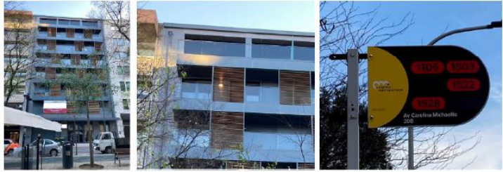
The first example shows a building in a consolidated and privileged area of Lisbon’s city, with a strong presence of the tertiary sector. This area just suf- fered, some interventions on its public space to improve the user experience, and the construction of a housing building boosts the functional diversity despite targeting the upper-class population. The building is oriented North /South, and this black façade is facing the North direction. The black colour of the building creates a disruption in the continuous white façades offered by the street profile which can be interesting for the experience of the street, but it is not the best solution towards the quantity and quality of natural light in the balconies and immediate interior spaces. Also, this colour does not respect the identity of the place, Lisbon image was always coloured by coloured tiles and painted walls. In view of the argument of the municipal authority to the impact of new constructions, and the need to contribute to qualify the place where they are inserted, what were the arguments to validate this chromatic option? An example of architecture’s contemporary trends? The symbolic association with the elegance and luxury concepts?
The example of the bus stop in Lisbon demonstrates that an inadequate chromatic choice compromises the communication process and at the limit, segregates the human being, because of his or her ability to perceive colour.
184 Gomes
Figure 1: The black building in the white street. The bus stop in red and black (Author, 2023).
As a bus stop, the selected example offers a signage that displays the num- ber of the buses that stops there to pick up or drop off people. This signage is a brand new one and intends to represent the recent fusion of different transport companies. The dimension of each text character is not the best suited to be read and understood at a certain distance, and the chromatic contrast compromises the reading plus it cannot be perceived by a colour blind and an amblyope person. The update of the company’s signage refuses all the knowledge available about colour, particularly on human colour per- ception, revealing the lack of awareness or negligence of the professional(s) who designed it, as well as those who validated and approved it.
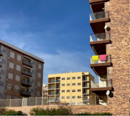
Figure 2: Armação de Pêra, new constructions and new colour language (Author, 2023).
The next example demonstrates the impact of a chromatic palette choice and its relationship with the chromatic context in which the colour is inserted. The example refers to the village of Armação de Pêra, a seaside area in the south of Portugal. Since the fifties this village is oriented to tourism, mostly in summertime due to the weather conditions and the quality of the beaches nearby. The area experienced an urban expansion in the turn of this mil- lennium with the occupation of areas further away from downtown and waterfront. This was not the first expansion moment but this one has been driven by a larger built area featured by lower buildings and less occupa- tional density. The new construction earned new volumetric shapes as well as finishing materials and colours. The new image questions the identity of
Colour? What Colour? A Difficult Understanding 185
the place besides it is not the best one to respond to the geographic features of the region. The dark colours offered by façades that face the south and west directions and particularly by the windows’ blinds do not contribute to the desired feeling of freshness when the temperature easily exceeds the 35
. The earliest buildings notwithstanding the construction moment and the social status associated, prevailed the white and sand colours in response to tra- ditional constructions and the proximity of the sea. The new constructions introduce a new colour language which is often followed by heedless profes- sionals and/or owners changing the traditional buildings chromatic palette which stresses its misfit in relation to the street profile. Other recent examples in which prevail a light chromatic choice, demonstrate the lack of harmony in the contrasts, offering unpleasant perspectives, as each colour demands for attention, and in some cases competes with the use of white, grey and black.
How and why is this repetitive negligence of colour concepts in built envi- ronment design? More than the lack of knowledge, it is the insistent and limited connection of colour to the aesthetic plan, it is the unwillingness to learn from the available literature and the best and worst solutions applied and available to be studied.
ISSUES TO DISCUSS Several examples, despite its nature and function, might be presented to illus- trate the negligence of colour in built environment and its consequence on the user experience. Literature review evidences the importance of the topic and reveals its multi/inter disciplinarity. Yet, the built environment exposes the lack of awareness of the AEC cluster. Reasons can be founded in the academic curricula of architects and designers, as well as the government and munic- ipal regulations. As result, colour is approached as an aesthetical parameter associated to the personal taste and individual expression of those who decide it and those who validate the decision. The unawareness about the purposes of colour in the built environment results in a distorted and fragmented view of the phenomenon of colour that impacts the concepts of environmental, social, and cultural sustainability. A better interaction between academia and industry is needed to enhance the use and experience of colour in the built environment. A new paradigm shift is needed.
ACKNOWLEDGMENTS
This work is financed by national funds through FCT - Fundação para a Ciência e a Tecnologia, I.P., under the Strategic Project with the ref- erence UIDB/04026/2020 and the Strategic Project with the references UIDB704008/2020 and UIDP/04008/2020.
REFERENCES
Baches, M. B. E. (2016) Hierarchy of Needs: Application in Urban Design and Community-Building. Website: http://mallorybaches.com/discuss/2016/1/26/hier archy-of-needs.
186 Gomes
Calvo Ivanovic, I. (2022) Colour Design Training Itinerary, A framework for the teaching and learning of colour in the design discipline. Doctoral Dissertation. Website: https://www.researchgate.net/publication/364996152_Colour_design_ training_itinerary_A_framework_for_the_teaching_and_learning_of_colour_in_ the_design_discipline_Doctoral_Dissertation. Durão, M. J. (2002). Colour in the Built Environment. Fabrikart: Arte, Tecnología,
Industria, Sociedad, (2), 162–169. Faculdade de Arquitectura- Universidade de Lisboa (2018) Optativas 2022/23 · 2.
ciclo. Website: https://www.fa.ulisboa.pt/index.php/pt/component/sppagebuilder /page/146-2022-23. Grant, A. M., O’Connor, S. A. & Studholme, I. (2019) Towards a Positive Psy-
chology of Buildings and Workplace Community: The Positive Built Workplace Environment. Int J Appl Posit Psychol 4, 67–89. Lisboa. Câmara Municipal (2012). PDM: Regulamento do Plano Diretor Municipal de Lisboa. Website: https://informacoeseservicos.lisboa.pt/fileadmin/downloa d_center/normativas/regulamentos/urbanismo/Regulamento_PDM.pdf. Lluch, J. S. (2019). Color for Architects. Princeton Architectural Press. Noury, L. (2008). La couleur dans la ville. Editions du Moniteur. Noury, L. (2020). Symbolique des couleurs – Art, design and architecture. Les
Editions du Palais. O’Connor, Z. (2010). Black-listed: Why colour theory has a bad name in 21st century design education. Connected 2010 -2nd Conference on Design Education, 1–4. Pastoureau, M. (2001). Blue: The History of a Color, Princeton University Press. Portugal. Leis, decretos, etc (ago. 7, 1951). Regulamento Geral das Edificações
Urbanas – RGEU: Decreto-Lei n.
38382. Diário do Governo, n.
166/1951, 1
Suplemento, Série I, versão de 8-maio-2023. Website: https://dre.pt/dre/legisla cao-consolidada/decreto-lei/1951-120610500. Universidade do Minho (2023) Design e Marketing de Moda (Licenciatura).
Website: https://www.uminho.pt/PT/ensino/oferta-educativa/Cursos-Conferente s-a-Grau/Paginas/Licenciaturas-e-Mestrados-Integrados.aspx. Willard, C. (1998). A dystopia of colour education in a utopia of colour experience.
Human Systems Engineering and Design (IHSED 2023): Future Trends and Applications
Read this individual research paper free through the original publisher, or explore the full digital proceedings book.
ISBN 978-1-958651-88-9
Explore this ISBN in the AHFE Bookstore ↗Listed in the July 2026 bookstore catalogue; search by ISBN to confirm current availability · Digital book purchase optional