Shuang Xia, Haiyan Wang, Shan Huang (2022). Evaluation of the Readability and Legibility of Fonts on the Cockpit Interface. In: Intelligent Human Systems Integration (IHSI 2022): Integrating People and Intelligent Systems. AHFE Open Access, vol. 22. https://doi.org/10.54941/ahfe1001046
The fonts on the aircraft interface play a vital role in the speed and accuracy of the pilot's decision-making process. In this paper, we create a new type-face to display textual information on the aircraft interfaces, then compare it with two fonts (Futura and Helvetica) widely used in aeronautical context. The font/background contrast threshold measurement and eye movement experiment for visual search of target characters are used to evaluate the readability and legibility of fonts. From this evaluation, we find that the leg-ibility and readability of Air are better than the other two fonts in the case of low contrast. The results produced by Helvetica and Futura are not much different but have advantages over Air in some characters. The experimental conclusions and data provide important scientific basis for the development and evaluation of cockpit fonts.
Intelligent Human Systems Integration (IHSI 2022): Integrating People and Intelligent Systems https://openaccess.cms-conferences.org/#/publications/book/978-1-7923-8988-7
INTRODUCTION
Cockpit screen is the interactive bridge between the flight crew and aircraft systems, and textual information is one of the key channels for the pilots to obtain detailed information about aircraft systems. Multiple factors such as the diversity of textual information, the physical characteristics of typeface, the complexity of flight missions, and the variability of external environments lead to the recognition performance of the font directly affecting the speed and accuracy of the pilot's judgment and decision-making, which are related to the aircraft safety. Therefore, the readability and legibility of fonts on the cockpit screen are particularly critical. Legibility, originating from the printing industry, refers to the degree of distinction between character shapes (Tinker, 1963), that is, whether readers can quickly identify letters and avoid confusion, including counter, strokes, thickness, etc. Readability refers to the degree to which texts can be easily and comfortably read and understood. It is determined by the typography of the font, mainly related to factors such as size, line spacing, and kerning. The above are internal factors, while external factors include font/background contrast, lighting, viewing distance, and screen field of view. In the ergonomic design of the civil cockpit, Federal Aviation Regulations (FAR) derived advisory circular provides guidance for font design (Jeffrey, 2012). Under all expected operating conditions, all alphanumeric information displayed on the interface should be easily identifiable, with sufficient size and visual contrast, so that the pilot can observe the information without excessively adjusting his posture while on the seat. The European Air Traffic Management (Stefana et al. 2000) points out that letters and numbers that can cause confusion should be easy to distinguish (such as, I /1, P/R, B/D/E, G/O/C, O/0, Z/2).
Common evaluations of text legibility and readability mainly include user questionnaires, expert interviews, performance evaluations, and physiological measurements. Eye movement and brain physiological measurement that can effectively complement the traditional subjective measurement to improve the reliability and validity of the evaluation process (Tijerina, 2009), have high evaluation value in interface text measurement, but there are few studies using them to evaluate legibility and readability. Various methods have been used to measure legibility and readability. Previous methods of measuring legibility included decreasing viewing time to establish threshold, increasing viewing distance to establish threshold, and reducing contrast to establish threshold (Luckiesh et al. 1939). Another study used the size threshold and reading speed to evaluate readability (Arditi, 2006).
FONT OPTIMIZATION SCHEME The fonts on the current cockpit interface have the following problems: First, the displayed text can be quickly recognized under normal flight conditions, but under adverse conditions such as external reflected light conditions, vibration conditions and turbulence conditions, the pilot's perception of fonts will be biased. Second, textual information (basically
Intelligent Human Systems Integration (IHSI 2022): Integrating People and Intelligent Systems https://openaccess.cms-conferences.org/#/publications/book/978-1-7923-8988-7 numerical, characters and short symbol words) on screens is complicated, and similar words or continuous texts can easily cause visual confusion. Third, the pilots need to carefully monitor, confirm, or quickly browse the changes in instrument values, and there are differences in reading perspective and viewing distance due to the location of the information interface layout, which makes it difficult to recognize and read non-optimal visual field information.
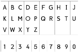
From the perspective of the existing problems of fonts and the influencing factors of readability and legibility, specific principles that guide font design were proposed to create a new aviation typeface. We had identified a set of recommendations for design, not strictly limited to, but including the followings. Typeface will strictly express basic stroke parts of letter anatomy to provide good character identification (Vinot et al. 2018). The angle and width of strokes will be adjusted appropriately to achieve visual compensation, ensuring that the fonts are visually rigorous and beautiful, so that the pilots feel comfortable and satisfied. According to design principles, a set of simplified characters was drawn on paper, then scanned and vectorized. Using these vector shapes, a new font (Figure 1) was then created with the outline font editor Glyphr Studio. The new font Air enlarges the characteristics of letters and improves the identification of characters.
Figure 1. Font Air (10 numbers and 26 capital letters)
EVALUATION PHASE Once this new font achieved, we developed a continuous experimentation to verify the graphic properties of Air and evaluate the legibility and readability of fonts in severely degraded cockpit environments. The font Air will be compared with Futura and Helvetica, which are widely used in aircraft screen, to evaluate fonts on the cockpit interface. We established a character/background contrast (the brightness of the foreground text divided by the brightness of the background) threshold through measuring to initially identify and quantify the relative legibility of the three fonts. Then, the eye movement experiment of the target character visual search was performed under low contrast conditions to evaluate the
Intelligent Human Systems Integration (IHSI 2022): Integrating People and Intelligent Systems https://openaccess.cms-conferences.org/#/publications/book/978-1-7923-8988-7 readability of the fonts, in which the response time and accuracy were important indicators.
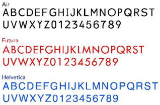
CONTRAST THRESHOLD MEASUREMENT EXPERIMENT For each font (Futura, Helvetica, and Air), thirty-six characters (26 letters: A to Z; 10 numbers: 0 to 9) were presented (Figure 2). Compared with the standards of the aviation management regulations of various countries, the character/background contrast ratio is at least 3:1. The other influencing factors of the three fonts were the same, that was, the height was 4.43 mm, and the character viewing angle was 17.4 arc minutes. The WCAG 2.0 contrast test program was used to calculate the contrast ratio (Cooper et al. 2016).
Fifteen subjects (aged 21 to 26) from Southeast University recognized characters (letters and numbers) which were briefly presented on a screen (14-inch HP monitor with a resolution of 1920*1080 pixels) set 30 inches away from the subject. A device bolted to the table maintained the subject/screen distance. A trial started with the display of a fixation pattern on the screen center during 500ms, followed by the display of the character at the same location (the target character was not recognizable at this time), during which time the subject slowly dragged the slider on the screen to increase the contrast until it stopped when the character could be recognized. Three fonts each provided 36 characters, which were pseudo- randomly presented.
Figure 2. 36 characters of three tested fonts (Air, Futura, and Helvetica) EYE MOVEMENT EXPERIMENT OF VISUAL SEARCH TARGET CHARACTER
Before the experiment, characters that were prone to confusion among the 36 characters need to be classified. A test sample was designed as a set of characters composed of target characters and distractor characters, and the subject needed to count the number of target characters from the set of characters. To eliminate the influence of the time difference caused by the eye saccade movement, a group of search characters were presented in the form of 20 characters equidistant horizontally. Thus, any given sample was made of 1, 2, 3, 4 or 5 occurrences of a given target character and the completing number of distractor characters (19 to 15). Each target character and distractor character could pseudo-randomly appear in
Intelligent Human Systems Integration (IHSI 2022): Integrating People and Intelligent Systems https://openaccess.cms-conferences.org/#/publications/book/978-1-7923-8988-7 any given set of characters, and the position of 20 characters was also pseudo-random.
Twenty subjects (aged 21 to 26) searched characters which were briefly presented on a screen (17-inch display with a resolution of 1280*1024 pixels) set 30 inches away from the subject. There was no limit to the search time, even though the instructions emphasized speed and accuracy. A trial started with the display of a fixation pattern on the screen center during 500ms, followed by the display of the character at the same location during 400ms, and then the given set of characters (Figure 3) was presented centered on the screen. Once the search was completed, the subject depressed the corresponding number key he thought was correct, which caused the characters to disappear from the screen and switching to the next trial. Each subject needed to complete 108 search tasks and could rest at the end of any trial.
Figure 3. A test sample with target character "K"
Figure available in the original PDF paper.
RESULTS
Experiment 1. For each type, a one-way analysis of variance (F represented the level of significant difference and P represented the test level) of the relevant sample was performed. The ANOVA showed significant effects: the font type had no significant impact on the character/background contrast threshold (F=0.031, P=0.969>0.05). The average contrast thresholds of 3 fonts were specifically analyzed, showing that the lower the contrast threshold, the better the font legibility. The low contrast thresholds of 3 fonts had relatively small differences, but the lowest contrast threshold of Air was 1.278. The contrast thresholds of the character "1", "6", "7", "I", "L", "F", "J" and "Q" were significantly higher than other characters, so these characters had weaker legibility.
Experiment 2. When searching for target characters with a contrast ratio of 3:1, Air was searched for a shorter time than Futura and Helvetica and had the highest accuracy rate (Table 1). The one-way ANOVA on the response time and rate of accuracy showed that the 3 fonts had a significant impact on the response time (F=4.471, P=0.016, P<0.05), and had a significant impact on the correct rate (F=5.435, P=0.007, P<0.05). Sustained by the Least Significant Difference test, the Post-test multiple comparisons showed an effect of the font: the Air produced a shorter reaction time and more correct response than Futura and Helvetica, and there was no significant difference between Futura and Helvetica in accuracy and response time.
Table 1: Response time and Rate of accuracy of three fonts Font type Response time/s Rate of accuracy/%
Table available in the original PDF paper.
Futura 4.81872 92.08 Air 5.46064 96.81
Intelligent Human Systems Integration (IHSI 2022): Integrating People and Intelligent Systems https://openaccess.cms-conferences.org/#/publications/book/978-1-7923-8988-7
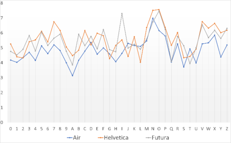
Helvetica 5.57389 92.22 Among the 36 characters, the response time and accuracy rate of the subjects to the "5", "7", "C", "D", "I", "N", "R", "V" and "W" was longer than that of other characters, thus these characters had weaker readability and legibility (Figure 4). Except for the "T" and "W", the accuracy of the remaining characters in Air was above 90%, so the overall character readability and legibility were better than the other two fonts.
Figure 4. Response time of 36 characters
Eye movement data that counted by TobiiStudio, can provide valuable information about the search path, the number of gaze points, and the distribution of gaze points, indicating the degree of attention of the subject to the confused characters (Beymer et al. 2008). With the increase of similarity ratio of the target character and distractor characters, the number of fixation points also increase, so the readability and legibility will decrease. This is due to the small spacing in a set of characters and the repeated or similar strokes of adjacent characters, causing visual confusion, such as the strokes of W/V/X/Y with similar oblique diagonal lines (Figure 5).
Intelligent Human Systems Integration (IHSI 2022): Integrating People and Intelligent Systems https://openaccess.cms-conferences.org/#/publications/book/978-1-7923-8988-7
Figure 5. Gaze point distribution and search paths for the character "X" of Futura, Air and Helvetica Discussion. Through contrast threshold measurement and target character visual search experiments, this study compares the new font Air with Futura and Helvetica, which are widely used in aircraft screen, to evaluate the readability and legibility of the font. Although Futura and Helvetica had shorter response time for the "J", "L" and "T" than Air, the correctness of Air was higher. This may be the number of target character "J" of Futura and Helvetica less than that of Air, resulting in a shorter search time. The font specifications do not provide standards for the above-mentioned characters with weaker readability and legibility, thus results from experiments geared towards design validation helps refine character shape in the standard.
Figure available in the original PDF paper.
CONCLUSIONS
In this study, a comparison of three fonts has shown that the new font Air does well with respect to the tested requirements of legibility (character recognition and discrimination) and readability (text reading and comprehension) better results than in-use Futura and Helvetica font. In the case of low contrast, the accuracy of the character search of Air was significantly higher than that of Futura and Helvetica, and the response time was the shortest. More than half of Air’s 36 characters were more readable and legible than the other two fonts, but Futura and Helvetica had advantages over Air in some characters such as "J" and "N". Characters such as the "5", "7", "C", “J”, "L", and "W" need special attention when selecting and evaluating cockpit fonts, because their readability and legibility are weaker than other characters. The experimental conclusions and data provide important scientific basis for the development and evaluation of cockpit fonts.
ACKNOWLEDGMENTS
The author wishes to thank all the volunteers who participated whole heartedly and spent their valuable time in the study. This work was supported by the National Natural Science Foundation of China (No. 71871056) and Aerospace Science Foundation of China (No. 20185569008).
REFERENCES
Arditi, A. (2006). Lapses in the verbal reporting task. Vision Research. 46, 1327-1330.
Intelligent Human Systems Integration (IHSI 2022): Integrating People and Intelligent Systems https://openaccess.cms-conferences.org/#/publications/book/978-1-7923-8988-7
Beymer, D., Russell, D.M., Orton, P.Z. (2008). An Eye Tracking Study of How Font Size and Type Influence Online Reading. Proceedings of the 22nd British HCI Group Annual Conference on People and Computers, 15-18. Cooper, M., Kirkpatrick, M., Connor, J.O. (2016). Techniques and Failures for Web Content
Accessibility Guidelines 2.0. W3C Working Group. Jeffrey E.D. (2012). Airworthiness standards: transport category airplanes. U.S. Department of Transportation Federal Aviation Administration, FAR-25. Luckiesh, M., Moss, F.K. (1939). The visibility and readability of printed matter. Applied
Psychology. 23, 645-659. Matsuura, Y., Terada, T., Aoki, T., Isoyama, N., Tsukamoto, M. (2019). Readability and legibility of fonts considering shakiness of head mounted displays. Wearable Computers, 150-159. Stefana, B., Jegher, B. (2000). Font Requirements for Next Generation Air Traffic
Management Systems. European Organization for the Safety of Air Navigation, HRS/HSP-006-REP-01. Tijerina, R. (2009). Eye movements and attention in reading, scene perception, and visual search. The Quarterly Journal of Experimental Psychology. Tinker, M.A. (1963). Legibility of print. American Journal of Optometry and Archives of
American Academy of Optometry. 40, 614-21. Vinot, J.L., Athenes, S. (2018). Legible, are you sure? An experimentation-based typographical design in safety-critical context. ACM conference on Human Factors in Computing Systems, 2287-2296.
Intelligent Human Systems Integration (IHSI 2022): Integrating People and Intelligent Systems https://openaccess.cms-conferences.org/#/publications/book/978-1-7923-8988-7
LISTED IN THE AHFE DIGITAL BOOKSTORE CATALOGUE
Explore the complete digital volume
Intelligent Human Systems Integration (IHSI 2022): Integrating People and Intelligent Systems
Read this individual research paper free through the original publisher, or explore the full digital proceedings book.
ISBN 978-1-7923-8988-7
Explore this ISBN in the AHFE Bookstore ↗Listed in the July 2026 bookstore catalogue; search by ISBN to confirm current availability · Digital book purchase optional