Jing Yang, Ziyi Wang (2022). Interface Design Evaluation of Educational APP for Preschool Children Based on Analytic Hierarchy Process. In: Usability and User Experience. AHFE Open Access, vol. 39, pp. 323–328. https://doi.org/10.54941/ahfe1001724
To determine the optimal visual design mode for preschool children through the analytic hierarchy process and to establish a visual design method for early education apps. Methods: Using the English early education app as an example, the visual design elements were extracted using the focus group method, and their shapes were compared to those of existing similar apps on the market. Analytic hierarchy process was used to determine the weights of the two, and a design form suitable for early education applications was obtained. Conclusion: Analyzing the app interface design for preschool children using the analytic hierarchy process can in-crease learning efficiency and effectiveness, align the design with children’s habits, and improve the design’s usability.
According to a UNICEF report, 1/3 of global Internet users are children, and the use of the Internet is gradually spreading to younger age groups. (UNITED Nations, 2018) Preschool children are one of the most avid users of educational apps, with approximately 80% of parents downloading spe- cialized educational software for their children. (Behnamnia et al. 2020) Preschool children are still in an early stage of physical development, and their learning activities are primarily influenced by their physiological deve- lopment. They possess a unique ability to discriminate between shapes, lines, and colors. As a result, the visual design method used in educational apps has a significant impact on children’s learning. Using the English early edu- cation app as an example, this paper analyzes the visual design elements of the app using the analytic hierarchy process (AHP). It establishes a method for designing objectively for preschool children’s educational apps, increases children’s learning efficiency and use effect, aligns the design with children’s habits, and improves design usability.
RESEARCH BACKGROUND Educational app for Preschool Children
children. Three conditions must be met in order for toddler apps to be meaningful: (1) the app’s design must be appropriate for young children’s developmental stage and needs; (2) the content must promote young chil- dren’s cognitive, academic, social, and physical development; and (3) the process of digital interaction should promote young children’s behavior and activities. (Liao and Li, 2019).
Analytic Hierarchy Process AHP is a method for analyzing multi-objective decision-making situations. It is a quantitative calculation method that analyzes both qualitative and quan- titative data concurrently to arrive at a conclusion. This method is primarily used to decompose complex multi-level and multi-faceted problems into their constituent levels and elements. It pairs each level and factor and establishes a judgment matrix to use mathematical and chemical methods to calculate the matrix’s largest eigenvalue and eigenvector, obtain the corresponding sch- eme’s weight value, and compare the weight value to provide a data reference for selecting the best scheme. (Li and Zhu, 2012).
RESEARCH METHOD The authors propose an AHP-based design method for an early education app. To begin, the focus group method clarifies the visual design elements of a preschool children’s app, and the element form that is appropriate for an early education app is analyzed in relation to the design elements. Second, using the AHP, determine and verify the consistency of the weights of design elements and element shapes, and then obtain the two weights. Thirdly, the scheme is conceptualized around the element shape’s weight value, and it is divided into three distinct weight value schemes: the maximum weight value scheme, the middle weight value scheme, and the minimum weight value scheme. Finally, the schemes are weighted and preference evaluated, and the final results are validated.
Elements of Visual Design of apps for Preschool Children Preschool children’s physical and visual abilities are still developing. Thus, when designing an app for preschool children, it should be visually distinct from adult app design in order to create a visual design form that is appro- priate for children’s characteristics. In terms of color, in a study of children’s color perception, it was discovered that the order of preference for 12 colors was red, pink, orange, light green, yellow, purple, blue, sky blue, white, black, dark green, and brown for children aged 3-6. Throughout this time period, gender-based color preferences gradually emerged. Yellow and blue were the most sensitive colors for boys, followed by red and green; red and yellow were the most sensitive colors for girls, followed by orange and blue.
In terms of shape, children frequently classify shapes according to their cognitive difficulty, as follows: circle, square, triangle, rectangle, semicircle, trapezoid, rhombus, and parallelogram. Because thinking development is still immature, children have difficulty comprehending three-dimensional graph- ics, and are more interested in simple, honest, and rounded shapes. According
Interface Design Evaluation of Educational APP 325
Table 1. Element form analysis of English education apps for preschool children.
Table available in the original PDF paper.
Design Elements Type 1 Type 2 Type 3 Less than3% 3%-5% More than 3% Word Size (Percentage of Page)
Visual Style Stereoscopic Semi-stereoscopic Graffiti Interface Color Warm color Intermediate color Cool color Color Complexity Less than four colors
Four to six colors More than six colors Layout Form T-shaped layout Centered layout Left and right layout
to psychologist Toshitaka Tanaka’s early childhood experiments, children aged 3-4 can visually compare the sizes of two objects. For children aged 5-6, more subtle comparisons can be made, or tools can be used to complete comparisons. (Ma, 2014) In terms of design style, the currently available early education apps are complicated. Chang Y discovered that when chil- dren aged 5-6 are learning English words, images with dynamic effects and a high level of picture complexity can elicit and sustain children’s enthusiasm and interest in learning. (CHANG et al. 2005) Focus group experiments were conducted based on the visual development characteristics of the said preschool children, and four designers with experi- ence in early education app design, two preschool guardians, two preschool teachers, and one host were invited. Finally, the following visual design ele- ments are determined for the preschool children’s educational app: visual style, interface color, color complexity, word size, and layout form.
Element form Analysis The existing early education apps on the market can be classified into five categories based on their content: cognition, life knowledge, children’s ani- mation music, story reading, and games. (Liao and Li, 2019) The purpose of this paper is to examine an English early education app in the cognitive category. Twenty English learning apps for children ages 0-6 were selected from the App Store. To compare, the word learning interface was chosen as the core interface. An element form analysis of English education apps for preschool children was obtained as shown in Table 1.
Weight Analysis of Design Elements and Element Form The AHP was used to determine the weights of design elements and element forms. To begin, 15 designers with experience developing educational apps for preschool children, ten preschool teachers, and ten preschool children’s guardians were recruited. The average age of the participants was 36.2 years, and all have had prior experience with early education apps. The subjects were asked to compare and score the visual design elements and element types of an English education app for preschool children. The scoring scale ranged from 1 to 9; the reciprocal of the value indicated that the latter item was more significant than the former (Shi and Li, 2017).
326 Yang and Wang
Table 2. The weights of the design elements.
Table available in the original PDF paper.
Design Elements Weight Word Size (Percentage of Page) 0.134 Visual Style 0.464 Interface Color 0.048 Color Complexity 0.085 Layout Form 0.267
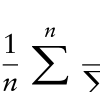
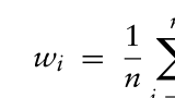
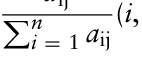
First, create a judgment matrix A=[aij] n·n. n is the number of feature shapes. The main diagonal is the comparison of the feature shapes themselves; hence, it is equal to 1, aij= 1 aij ,aij > 0. The eigenvector corresponding to the largest eigenroot λmax of the jud- gment matrix is denoted as W after normalization. The element of W is the ranking weight of the relative importance of a factor at the same level as that at the previous level.
Equation reproduced from the original PDF.Equation reproduced from the original PDF.
aij Pn
n
Equation reproduced from the original PDF.
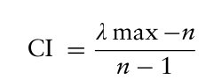
To ensure that the evaluator’s thinking is consistent throughout the pro- cess and that the judgment matrix is compatible, it is necessary to conduct a consistency check on the evaluation results and to use CI to represent the judgment matrix’s consistency index:
Equation reproduced from the original PDF.
n −1 (2) λmax is the maximum eigenvalue, n is the order, and CR is the consistency ratio. The value of CR judges the consistency test:
CR = RI
CI (3) RI stands for the Average Random Consistency Index, which specifies the value of each order. When CR ≤0.1, the consistency is passed; otherwise, it is not passed and must be recalculated. (Shi and Li, 2017)
The subjects compared the importance of the design elements and element forms in the early education app and averaged all weights that passed the consistency test. Table 2 lists the weights of the design elements. Table 3 lists the weights of the element forms.
Design of Word Interface for English Early Education apps Based on Weight Analysis According to the weight analysis above, the scheme design is classified into three categories: “maximum weight combination,” “intermediate weight
Interface Design Evaluation of Educational APP 327
Table 3. The weights of the element forms.
Table available in the original PDF paper.
Design Elements Type 1 Type2 Type3 Word Size (percentage of Page) 0.501 0.232 0.265 Visual Style 0.434 0.239 0.324 Interface Color 0.462 0.294 0.236 Color Complexity 0.311 0.503 0.181 Layout Form 0.237 0.359 0.396
Table 4. The combination scheme of element forms.
Table available in the original PDF paper.
Figure 1: A demonstration of the three schemes.
combination,” and “minimum weight combination,” as shown in Table 4. As illustrated in Fig. 1, three English early education app word interface design solutions are obtained. The first scheme is a maximum-weight com- bination, the second is a middle-weight combination, and the third is a minimum-weight combination.
328 Yang and Wang
Test Result Twenty-four preschool children were invited (12 males and 12 females, mean age 4.8 years). After consulting with their parents and teachers, five words were evaluated for which no one tested had any prior knowledge (the diffi- culty of the words was in line with the learning level of pre-school children). Three groups of subjects were divided, and three schemes were used to assist the subjects in memorizing five words. Apart from the interface design sch- eme, there were no other variables in the test. The measured word memory was assigned a point value between 1 and 5 (the Chinese translation of the tested word was assigned a point value of 1). Eventually, the following test results are obtained:
First scheme: 2.75, Second scheme: 2.5, Third scheme: 2.16.
EPILOGUE With the Internet’s penetration into younger age groups, the design require- ments for educational apps for pre-school children are increasing. However, because preschool children’s visual and comprehension abilities are still deve- loping, the app design for them must be distinct from the requirements for adults to use the app. AHP is capable of objectively analyzing the design elements and associated forms of educational apps aimed at preschool chil- dren and recommending an appropriate design method. This study uses an English early education app as a case study to demonstrate how a compreh- ensive design approach can be used to increase children’s learning efficiency and app usage effect. Along with the explicit test method discussed in this study, the design form for preschool children can also be combined with the implicit test method, which will be studied further.
REFERENCES
Behnamnia N, Kamsin A, Ismail M A B, et al. (2020) The Effective Components of Creativity in Digital Game-Based Learning among Young children: A Case study. Children and Youth Services Review. CHANG Y, Lin C, Lee Y. (2005) The preferences of young children for images used
in dynamic graphical interfaces in computer-assisted English vocabulary learning. Displays, pp. 147–152. Liao P, Li L. (2019) Analysis and research on the status quo of the use of preschool education APPs. Education Modernization, pp. 125–126. Li Y, Zhu L. (2012) Product Availability Evaluation Method Based on Fuzzy AHP.
Journal of Mechanical Engineering, pp. 183–191. Ma X. (2014) Design pre-school children educational software interface based on the iPad Shi W, Li Y. (2017) APP Design for the Elder Based on AHP. Packaging Engineering,
pp. 126–131. UNITED Nations Children’s Fund. (2017) The State of The World’s Children 2017: Children in a Digital World. Available at: https://www.unicef.cn/
LISTED IN THE AHFE DIGITAL BOOKSTORE CATALOGUE
Explore the complete digital volume
Usability and User Experience
Read this individual research paper free through the original publisher, or explore the full digital proceedings book.
ISBN 978-1-958651-15-5
Explore this ISBN in the AHFE Bookstore ↗Listed in the July 2026 bookstore catalogue; search by ISBN to confirm current availability · Digital book purchase optional