Changxue Pan, Jinjin Wang (2023). Color Preference of Large Cruise Catering Space Based on Eye Tracking Technology. In: Affective and Pleasurable Design. AHFE Open Access, vol. 71, pp. 188–195. https://doi.org/10.54941/ahfe1003258
The color of large cruise catering space, an indispensable part of the design, is of great significance to improve the dining experience of visitors and ensuring the comfort of the space. In this study, the eye tracking technology is used for the color needs of visitors in cruise catering space. From the perspective of visitors’ color preference, the study discusses design methods of color coordination for cruise catering space in detail, and design rules and inspirations of color matching in cruise catering space, on a basis of effective data of eye tracking experiments. And from the perspective of visual psychology and combination of colors, the study analyses color elements of cruise catering space. Subjects were invited to conduct simulation test, in which the eye tracker was used to record the data of eye movement when the subjects looked at cruise catering space, including heat map, AOI and saccades, etc. At the end of each task, each subject was asked to give the color preference in the process, so as to analyze the correlation between objective research data and subjective preference. According to the heat map, it is found that the subjects mainly focus on the catering space featuring “analogous colors harmony” and “triad complementary colors harmony”. And according to the AOI bar chart, it can be concluded that the subjects show an average fixation level in the area of “red and orange” significantly higher than that in other areas. Therefore, the results suggest that visitors are more interested in the color coordination and design of cruise catering space, when it features colors similar with red and orange. And the color preference of visitors is of great significance to improve the color quality of cruise catering space, which can stimulate people’s appetite, thereby creating a pleasant and comfortable dining environment.
The color preference of tourists is an important factor that influences their satisfaction with the cruise experience, because colors have an intensive psychological and physiological effect on people ( ´Curˆci´c, 2019. Gokcakan, 2016). Reasonable color design of large cruise catering space can meet the functional needs of catering space and promote the consumption appetites of visitors in a more effective way, increasing the added value of cruise ships, and establishing a good image and improving the competitiveness of cruise
Color Preference of Large Cruise Catering Space Based on Eye Tracking Technology 189
enterprises. Everyone has their own favorite colors to reflect their persona- lity (Krsti´c and Radelovi´c, 2013). Personal characteristics such as gender, age and education have a significant impact on color preferences in different ways (Bakker, 2015).
In this study, the whole process of tourists’ eye movements during the visual search task was recorded by eye-tracking technology, which is typi- cally used to capture human visual attention characteristics (Guo, 2022). it provides researchers with objective data on the viewer’s subjective emotions and cognitive processes occurring in the brain (Cho, 2020). A longer fixation in a particular area of interest (AOI) is typically considered indicative of gre- ater interest and engagement (Just, 1976. Poole, 2005). The study take use of the unique superiority of eye tracking technology in psychological researches to establish the correlation among colors of large cruise catering space, visi- tors’ cognitive psychology and characteristics of eye movement, and obtain effective real-time experimental data, thus revealing the color preference of visitors.
DESIGN OF EYE TRACKING EXPERIMENT Selection of Experimental Samples
Although many studies have been conducted on the effects of color on emotions and behavior, most of them have involved single colors and few researchers have noticed the effects of several color combinations (Deng, 2010). But monochromatic color is usually not used in large cruise cate- ring space, so it is necessary to pay more attention to make clear the impact of color combination on visitors’ emotions. When examining the usage of colors in visuals, it can be said that the primary colors combi- nation of pastel tones is preferred rather than the use of primary colors alone only (Uluçay, 2019). Pile mentions different methods of selecting color combinations: Monochromatic colors harmony, Analogous colors harmony, Complementary colors harmony and Triad complementary colors harmony (Pile, 1997).
Based on the color harmony of large cruise catering space, the samples are selected, that is, the real pictures of catering space of Viking Sea, Costa Serena, Queen Mary 2, and Oasis of the Seas are identified as experimental samples. These four catering spaces take different ways of color harmony to coordinate colors, namely, monochromatic colors harmony, analogous colors harmony, complementary colors harmony and triad complementary colors harmony. (see Table 1).
Experimental Purpose In this experiment, the eye tracking technology is used to measure eye move- ments such as fixation (stop) and saccade (jump or move) to obtain data including heat map, AOI map and saccades, etc. At the end of each task, each subject was asked to give their color preference in the process, so as to analyze the correlation between objective research data and subjective prefe- rence, providing the large cruise catering space with a basis and reference for the design of color coordination.
190 Pan and Wang
Table 1. Experimental samples of large cruise ship catering space.
Table available in the original PDF paper.
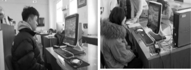
Figure 1: Partial subject test scenarios.
Experimental Procedure (1) Instrument: Tobii T60 desktop eye-tracking device (2) Subjects: as this experiment mainly analyzes the color preference of visi- tors, it demands the subjects with a certain understanding of the color characteristics of large cruise catering space, in order to avoid the data error caused by the blindness that those with color vision deficiency or insensitive color perception might show to test items. Finally, 16 women and 14 men, aged between 20 and 40, were selected to participate in the experiment (see Figure 1). (3) Steps: Check the experimental environment, debug the equipment, briefly explain to the subjects and conduct the preliminary experiment.
Comprehensive group: the subjects watch the comprehensive scene of large cruise catering space for 10s.
Out-of-order single: after a short break, the subjects watch 4 scene segments in random order for 8s each.
Fill in the online subjective favorite table and check the quality of previous experimental data.
EXPERIMENTAL RESULTS AND ANALYSIS Eye Tracking Technology for Physiological Signal Acquisition
(1) Comprehensive Group In the analysis of the comprehensive scene of large cruise catering space, heat maps and tracks are analyzed and compared. Among them, the heat map
Color Preference of Large Cruise Catering Space Based on Eye Tracking Technology 191
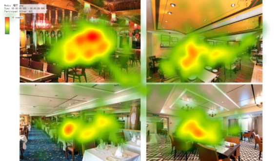
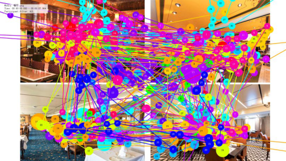
Figure 2: Heat map in comprehensive scene of large cruise catering space.Figure 3: Eye tracks in comprehensive scene of large cruise catering space.
can directly reflect positions drawing greater attention or being ignored. Red represents a long fixation, while green represents short (see Figure 2). And the tracks can show the order in which fixation points are formed (see Figure 3).
With the comprehensive scene picture of large cruise catering space, the distribution of heat maps and the concentrated range of fixations in tracks can be analyzed. And it is found that the subjects mainly focus on the cate- ring space of Costa Serena, followed by that of Oasis of the Seas and Viking Sea. Thus, the catering space with analogous colors harmony is preferred by visitors.
(2) Out-of-Order single Based on the results of heat maps and AOI data (see Table 2), it can be found that in the large cruise catering space with monochromatic colors har- mony, the subjects pay more attention to the dining area and the entrance and exit. And the selected AOI_1 area draws more attention from the subjects. It can be seen in the bar chart that the average attention to the AOI_1 area
192 Pan and Wang
Table 2. Experimental data from scene segments of large cruise catering space.
Table available in the original PDF paper.
large cruise ship Heat map AOI map AOI data
Viking Sea
Costa Serena
Queen Mary 2
Oasis of the Seas
is significantly more than that to other areas. Therefore, it can be concluded that the subjects focus more on the target area and may have greater interest and satisfaction.
In the large cruise ship catering space scene with analogous colors har- mony predominantly, the subjects’ attention areas were relatively scattered, but relatively concentrated in some dining areas and window parts. Obse- rving the AOI bar chart, it can be concluded that the average gaze level of the subjects in the AOI_1 area was extremely high, significantly higher than the other areas, and it can be tentatively concluded that the subjects were more interested in the color scheme and scene design of the upper part of the restaurant space in this scene.
In the scene of large cruise restaurant space with complementary colors harmony, the subjects focused more on part of the dining area and entrances, and the subjects’ attention level was extremely high in the entrance part of the selected AOI_2 area, so it can be concluded that the visual design of entrances and exits should be paid attention to in the design of the large cruise catering space. The bar chart shows that the average attention of the subjects in the AOI_1 area is significantly higher than that in the AOI_2 area, but slightly lower than that in the other areas, which shows that the subjects’ attention to the corridor part is not as high as envisaged.
In the large cruise dining space scene with a triad complementary colors harmony, the subjects’ attention areas were relatively scattered, but relatively concentrated in some dining areas and entrance/exit parts. Observing the AOI bar chart, it can be concluded that the subjects’ annotated data of each box- selected area are partially lost, among which two areas, AOI_1 and AOI_2,
Color Preference of Large Cruise Catering Space Based on Eye Tracking Technology 193
Table 3. Questionnaire survey data based on single scene of large cruise catering space.
have higher attention level, but the attention level of AOI_1 is more scattered, which can be tentatively concluded that the color is more evenly guided to the subjects in this scene.
Subjective Questionnaire Survey of Visitors’ Color Preference The subjective questionnaire obtained the following scale (out of 5) by asking the subjects to rate the colorfulness, hierarchy and attractiveness of a single realistic picture of a large cruise ship dining space, and the average score of each picture was obtained as the final score of this picture (see Table 3).
In summary, the comparison of eye tracking data (heat map, eye tracks and AOI map) and subjective questionnaire data makes it clear that the trends of data are basically consistent. So there is a certain positive correlation between the results of eye tracking experimental data and those of subjective evalua- tion data, that is, ideal data characteristics are shown in the fixation level of target interest areas corresponding to the pictures with high subjective liking score.
CONCLUSION
Design Features of Color Coordination in Large Cruise Catering Space According to the results of comprehensive group, it can be found that in the color environment of large cruise catering space, visitors prefer warm colors with medium or high brightness, such as orange, yellow and red. Warm yel- low, as the most frequently used color in restaurant colors, can very strongly stimulate the appetite (Huang, 2022), creating a pleasant and comfortable dining environment.
In addition, the combination featuring analogous colors harmony is more popular among visitors, as there is a sense of order among these colors, which can establish connections between different design elements in catering space. Compared with monochromatic colors, they are not too monotonous and boring. And compared with complementary colors, they can reduce visual burden of visitors caused by tedious color combinations.
The results of out-of-order single show that visitors pay more attention to the large cruise catering space with balanced color distribution. The main color, background color and decorative color of large cruise catering space should be interconnected, and the repetition or echo of colors should be used to perfect the relationship between the part and the whole.
194 Pan and Wang
Limitations and Prospects Many achievements are made in this study on the color preference of large cruise catering space based on eye tracking technology, but there are also some limitations in it. Therefore, the future studies can make up for the shor- tcomings from the following aspects. Firstly, the experiment only gets a small number of subjects, but it should have considered the impact of factors such as different age groups, economic income, cultural background and region. Secondly, this study only tests the color preference of the catering space in four representative international large cruise ships, so more samples can be selected for experiments in the future researches. A larger sample size can verify and improve the accuracy of the algorithm, making the whole study more scientific. Thirdly, this study tests the visitors’ color preference based on different ways of color harmony, but the test standard is too simple, so it is necessary to establish the test system from the aspects of lightness, purity, hue and color temperature, so as to obtain more comprehensive and exact color preference data.
ACKNOWLEDGMENT
This article was produced with the support of Wuhan University of Technology Sanya Science and Education Innovation Park Open Fund (2021KF0033), Science and Technology special fund of Hainan Province (No. ZDYF2021GXJS214), Sanya Yazhou Bay Science and Technology City Hainan Special PhD Research Fund Project (HSPHDSRF-2022-03-022).
REFERENCES
Bakker, I., van der Voordt, T., Vink, P., de Boon, J. and Bazley, C. (2015), Color preferences for different topics in connection to personal characteristics. Color Res. Appl., 40: 62–71. ´Curˆci´c, A., Kekovic, A., Randelovi´c, D., & Momcilovic-Petronijevic, A. (2019).
Effects of color in interior design. Zbornik radova Gradevinskog fakulteta, 35, 867–877. Cho, J. Y., & Suh, J. (2020). Spatial color efficacy in perceived luxury and preference to stay: an eye-tracking study of retail interior environment. Frontiers in psychology, 11, 296. Deng, X., Hui, S. K., and Hutchinson, J. W. (2010). Consumer preferences for color
combinations: An empirical analysis of similarity-based color relationships. J. of Consumer Psychology 20, 476–484. Gökçakan Çiçek, N., & Gökçakan, K. (2016). Characteristics of colours, interior design and their psychological and physiological effects. Turkish Online Journal of Educational Technology, 2016 (November Special Issue, 425–430. Guo, S., Shi, Y., Xiao, P., Fu, Y., Lin, J., Zeng, W., & Lee, T. Y. (2022). Creative
and Progressive Interior Color Design with Eye-tracked User Preference. ACM Transactions on Computer-Human Interaction. HUANG, Y., & LIN, X. (2022). Study on the Relationship Between Tableware Color and Consumers’ Appetite. Psychology, 12(5), 289–293. Just, M. A., & Carpenter, P. A. (1976). Eye fixations and cognitive processes. Cogni-
tive psychology, 8(4), 441–480.
Color Preference of Large Cruise Catering Space Based on Eye Tracking Technology 195
Krsti´c, H., & Radelovi´c, D. (2013). Color as a powerful tool in interior design.
In Proceedings Third international science conference Balkan color, 568–575. Poole, A., Ball, L. J., & Phillips, P. (2005). In search of salience: Aresponse-time and eye-movement analysis of bookmark recognition. In People and computers XVIII—Design for life. Springer, London, 363-378. Pile, J. F. (1997). Color in interior design (pp. 1068–1079). New York, NY: McGraw-
Hill, 77–86. Uluçay, N. Ö. (2019). An interior design exhibition: An assessment of color scheme preferences and the emotional states of students. Color Research & Applica- tion, 44(1), 132–138.
LISTED IN THE AHFE DIGITAL BOOKSTORE CATALOGUE
Explore the complete digital volume
Affective and Pleasurable Design
Read this individual research paper free through the original publisher, or explore the full digital proceedings book.
ISBN 978-1-958651-47-6
Explore this ISBN in the AHFE Bookstore ↗Listed in the July 2026 bookstore catalogue; search by ISBN to confirm current availability · Digital book purchase optional