Giuseppe Di Bucchianico, Stefania Camplone, Raffaella Massacesi, Rossana Gaddi (2023). POT Design: Participatory design workshops for guidance on university choice in design. In: Design for Inclusion. AHFE Open Access, vol. 75, pp. 254–260. https://doi.org/10.54941/ahfe1003942
The issue of participation is at the basis of the design approaches of design for inclusion. In particular, active and conscious involvement must be the starting point of any action that intends to look at inclusion. This is all the more true when addressing young students who are about to make their university choice: nothing more useful than leading them to directly experience a simulation, albeit simplified, of what could be assimilated to the possible training experience that awaits them.This contribution describes two design experiences conducted by a heterogeneous group of young designers in the context of an ideas competition, developed starting from a study orientation initiative promoted by the Italian Ministry of University, which was repeated for two successive academic years and on two different themes, albeit refer-ring to central areas of industrial design: product design and communication design. The goal was to develop artifacts that had their greatest value in the ability to enhance problematic environmental contexts, human diversity, and some issues and effects related to the post pandemic period.
To choose the most suitable university path, high school students start a refle- ction based on the experiences they gain through school activities, through the gradual discovery of their own inclinations and passions, with dialogue within the family and comparison with the social, economic and territorial context of reference. This phase of “listening” to multiple information affe- cts students’ personal choices and their ability to project themselves into the future by concretely visualizing a profession, and it is built with non- unique methods and timing. The orientation path then enters a “research” phase, where the diploma student activates himself to deepen the intuitions and impressions collected, to verify possible training paths and enter into the merits of professional choices. If part of this process is carried out autono- mously by the student, there are a series of activities organized by training institutions that the student can choose to attend. As for autonomous resea- rch, a fundamental role is played by online resources of training institutions:
POT Design. Participatory Design Workshops for Guidance 255
websites can allow in-depth analysis of individual training paths, access meth- ods, objectives and employment opportunities, and social tools connected to them have the role of informing more immediately, essentially characterizing themselves as points of first access for further in-depth analysis that refers to the contents of official online pages.
Orientation paths prepared by training institutions include presentations and introductory lessons, individual orientation interviews. These are activi- ties that take place primarily in person, in school or university classrooms. Following pandemic events, online methods have also been implemented, such as webinars, live social media events open to public questions, synch- ronous and asynchronous online lessons, and video presentations. In the context of orientation activities, universities constantly seek to identify more effective, more inclusive and immersive, less fragmented methods. Actions are introduced to help the approach path of individual students.
Looking at the topic from the point of view of the design discipline, one wonders how to design solutions that are accessible and responsive to the needs and aspirations of all individuals, enhancing their specificities and differences, minimizing elements of frustration, considering students in the orientation phase not as end users, but actively involving them in a design process through participatory and co-creative practices that characterize the designer profession and that are particularly difficult to explain without direct experimentation.
DESIGN PROJECT AS A PARTICIPATORY AND INCLUSIVE TOOL Design for inclusion is a design approach aimed at creating accessible envi- ronments, products and services taking into account the different abilities, needs and preferences of people. Design for inclusion refers to the design for human diversity, social inclusion and equality. This means that the project is not based on an abstract model of a standard user, but actively and consci- ously involves real people in the design process, enhancing their specificities and expectations. The theme of participation is at the basis of design appro- aches for inclusion. Active and conscious involvement, as well as the tool of direct experience through project practice, contribute to sharing objectives and methods. Participation makes it possible to collect useful information on users’ needs and aspirations, to stimulate creativity and innovation, and to promote the appropriation and sustainability of design solutions. Experie- ncing design activity helps to understand methods, dynamics and workflows that would otherwise be difficult to understand by reading only training pro- grams; it is the most immediate way to understand the project dimension of the designer’s activity.
Implementing participatory design workshops for university orientation is an experimental educational experience that involves high school students in a discovery path of design and its potential. Through a series of practical and interactive workshops, participants are guided to design and create prototy- pes of products or communication artifacts that respond to a design challenge related to a relevant social theme. The project aims to stimulate students’
curiosity and motivation towards design, to make them aware of the diffe- rent disciplines and professional opportunities in the sector, and to promote the development of transversal skills such as critical thinking, collaboration, communication and creativity. Through a series of practical activities, stu- dents can discover the different areas of design, its methods and fields of application. The project aims to stimulate students’ curiosity and motivation towards design, offering them a broader and more realistic view of possible professional and academic opportunities in this field. An example of expe- rimentation with an inclusive orientation laboratory took place through the two editions of the “POT Design” competition - Plans for Orientation and Tutoring.
THE POT DESIGN COMPETITIONS: I EDUCATE/I PRODUCE AND I CONTACT/I SHARE The National Design Competition “POT Design” was held in two different years. The first, in the Academic Year 2019-2020, on the theme “educate/pro- duce” aimed at product design; the second, in the year 2020-2021, focused on product design and communication design through the theme “I contact/I share”.
The competition announcements were funded by the Italian Ministry of University and Research for the Orientation and Tutoring of university stu- dents, with two priority objectives: on the one hand, to provide high school students with an alternative outgoing orientation channel based on learning through first-hand experience, on the other hand, to provide university stu- dents with opportunities to investigate their own skills and experiment with teamwork. In both editions, the two competitions allowed university stu- dents, final year high school students together with selected companies, to experience a laboratory activity aimed at design.
In the first edition, students were invited to design according to two “concrete actions” responding “to the urgent need for participation, sharing, and co-design of processes that can modify social, cultural and environ- mental behaviors”. The competition, in its first edition, involved all Italian universities with degree courses in Design, with the aim of supporting espe- cially young graduates in making an informed choice about their study path (Camplone, Di Bucchianico and Villani, 2021).
The second edition of the national Pot Design competition has encoura- ged participants to “propose one or more actions useful for imagining and communicating their vision of the post-pandemic future, based on the incipit I contact/I share through objects, words, sounds or images”.1 The competition involved all Italian universities with degree courses in Design and refers to the field of Plans for Orientation and Tutoring (POT) aimed at supporting the orientation path in design of graduates. The competi- tion is imposed as a training tool aimed at increasing participants’ awareness of their own skills and vocations. University students and students in the last two years of secondary school (or in the period between obtaining their
1Extract from the contest call
POT Design. Participatory Design Workshops for Guidance 257
diploma and enrollment) are invited to collaborate on the development of a creative project on the given theme. The ultimate goal of the competition is to help young high school senior experience first-hand the operational methods of design and train university students already enrolled in Design Courses as “tutors”. The two key actions that characterize the competition, I contact and I share, invite you to develop design projects aimed at promoting the well-being and resilience of people and communities in four different catego- ries: objects (product design), words (writing texts, slogans, essays), sounds (music and songs), images (photos, graphics, videos).
THE DESIGN PROJECT CONSTRUCTION The activities of the competition were initiated with a promotional event in schools. The initiative involved all Abruzzo secondary schools, for stu- dents in the 4th and 5th year, and second-year students of the Design degree course at the University G. d’Annunzio in Pescara to participate in “concrete” orientation activities (design, sharing, participation).
The aim was to facilitate the conscious choice of university studies for sch- ool students through design projects, intended as a “tool”capable of bringing out personal motivations and attitudes.
In particular, for the second edition of “POT Design”, five design teams have developed design projects related to communicative artifacts and have seen direct participation in design activities from the scientific high school and art high school in Pescara with a selection of students from the Design degree course.
This latter competition was divided into two phases: local and national. In the local phase, the judging committee, composed of professors in the Indu- strial Design disciplinary sector, nominated the winning group that would have participate in the national selection.
The national phase is still underway due to the pandemic emergency and will soon be concluded with the meeting of the national selection commission to nominate the winning groups.
To support the contest activities, the identification of some support figures was provided, such as student tutors and external tutors, selected through a call for applications.
LOCAL RESULT OF POT DESIGN I CONTACT/I SHARE The student teams participated in the “images” category. The proposals are characterized by the choice of an output and a media shared by all parti- cipants: communicating a reflection on the theme of I contact/I share by elaborating a sequence of images accompanied by keywords and brief capti- ons to be published via the Instagram social network. University tutors and school students have indeed decided by mutual agreement, during prelimi- nary plenary meetings, to standardize the final output while leaving full freedom to style, techniques and of course the message.
The design groups faced the phases of analysis, brainstorming, elaboration of the concept and elaboration of the final project working online, through
Microsoft Teams channels due to ongoing pandemic restrictions. The given theme and the operating condition have intertwined opening the different project phases to the design for inclusion participatory design themes.
University tutors had to immediately coordinate networking methods, allow access and knowledge of computer tools, and encourage participation by all group members. In the analysis and brainstorming phases, the decli- nation of the main themes has returned both the already acquired skills and the personal experiences and emotions of the participants who, due to the pandemic, experience first hand the lack or discovery of new ways of contact and sharing.
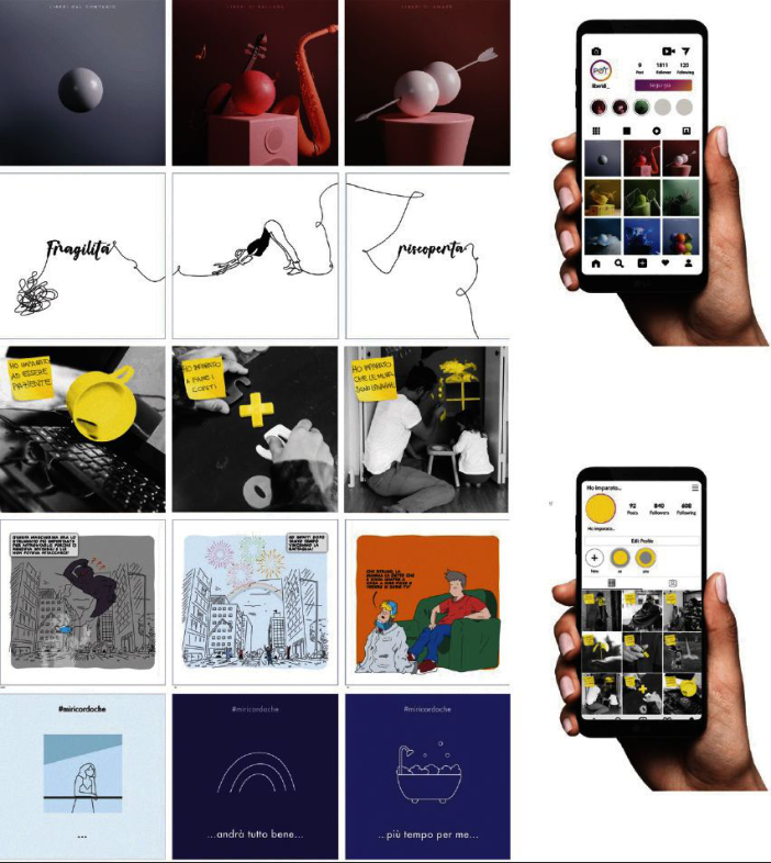
The title that each team gave to its project is a claim that communicates the sense of discovery and overcoming fears (Fig. 1).
Figure 1: From top to bottom, three images for each project: “Free to”, “The strength of fragility”, “My son’s distance learning is no longer scary”, “An evil monster”, “I remember that”. Media: digital image 800x800 px. On the right: feed Instagram mockup.
POT Design. Participatory Design Workshops for Guidance 259
Free to was created with the intention of expressing the actions and fee- lings that we will return to experiencing once the pandemic is over: free from fear, free to dance, travel, train, dream and invent. The nine images are desi- gned as individual posters that promote the “free to” claim and are intended for publication as an Instagram feed. They are made through the 3D modeling of simple shapes (the sphere that represents the individual person and a few elements of context), in the renderings are used materials with textures that respond to light in different ways and with a saturated but monochromatic color palette for each poster.
The strength of fragility is a sequence of images made for the Insta- gram feed, tells the evolution of the feeling of fragility, from inner chaos to awareness of the value of fragility itself. The sequence is graphically rea- lized through the sign left by a line that freely crosses nine vignettes without solution of continuity and draws words and images: the words are fragility, rediscovery, empathy, connection. The images are the visualization of simple actions, such as doing gymnastics, reading, hugging, playing an instrument, actions that have helped us understand our vulnerability and rediscover a lost sense of care, for ourselves and for others.
My son’s distance learning is no longer scary is an Instagram feed and is built through black and white photographic images within which the prota- gonist element of the narrative is underlined by the color yellow: “I learned to be patient” is the writing pinned on the photo of a computer keyboard on which a cup of coffee has been spilled. The project visually represents the effects of Distance Learning on students’ parents. It represents discomfort but also the desire to overcome it, the discovery of new attitudes and the strengthening of the bond with one’s children.”
An evil monster is a comic streep to read by scrolling through an Insta- gram slideshow. The vignette drawings, in outline and with essential colors to identify background and figure, represent a dad who tells his son about the pandemic period using the metaphor of the Covid monster and the Human- Superheroes who fought it. Dad’s story is different from Mom’s (a period of homemade pizzas and TV series, she said) and the little one can’t make sense of it. The vignettes represent the magical worlds and adventures that a child can imagine by listening to a story and at the same time the irony of the situation.
I remember that is a project composed of nine graphic illustrations intended for Instagram feed. Each image, characterized by a background in different shades of blue and by a linear graphic, is underlined by a hashtag and a payoff and is designed to be understood autonomously and at the same time be part of a narration. They are the loud thoughts of each of us in the atypical daily life of the emergency period. The goal of the images is to bring a message of hope on social media aimed at a future free from Coronavirus after more than a year of restrictions and social distancing.
CONCLUSION
The working groups have conducted a design experience of inclusion, consistent with the cultural, methodological and technical preparation of
university students in design and consistent with the needs of clarity and understanding of high school students regarding the first approach to meth- ods and tools of a design discipline such as that of design and themes of inclusion and accessibility of information. The competition is designed for a first approach to the methods and tools of a design discipline such as that of design and themes of inclusion and accessibility of information. The project outcomes involved the use of communication design tools such as images, text, color.
The teams developed content using different media and techniques such as 3D modeling, illustrations, comics, photomontages. The students have carried out an effective research on the topic of inclusive communication languages, verifying their choices with university tutors.
CREDITS This text is the result of a common discussion and elaboration work, but the writing of the various paragraphs can be attributed to: Giuseppe Di Bucchianico for the abstract and the Introduction; Raffaella Massacesi for the paragraphs “The POT Design competitions: I educate/I produce and I contact/I share” and “Local result of POT Design I contact/I share”; Ste- fania Camplone for the paragraphs “Design project as a participatory and inclusive tool” and “The design project construction”; Rossana Gaddi for the Conclusions.
REFERENCES
Camplone S., Di Bucchianico G., Villani E. A. (2021). Designing Designers Through Inclusion. A Design Experience of Career Choice Orientation. In: Advances in Industrial Design. Proceedings of the AHFE 2021 Virtual Conferences on Design for Inclusion, Affective and Pleasurable Design, Interdisciplinary Practice in Indu- strial Design, Kansei Engineering and Human Factors for Apparel and Textile Engineering, Sungsoo Shin C. et al. (eds.), Lecture Notes in Network and Systems Series, vol. 260. Cham: Springer, pp. 317–323. Camplone S., Di Bucchianico G. (2020). Ud’A at the POT Design Competition:
an eco-inclusive experience of “orientation” to the project. In: Abitare la terra, Supplement to n.53, year XIX, 2020. Roma: Gangemi editore, pp. 28–29.
LISTED IN THE AHFE DIGITAL BOOKSTORE CATALOGUE
Explore the complete digital volume
Design for Inclusion
Read this individual research paper free through the original publisher, or explore the full digital proceedings book.
ISBN 978-1-958651-51-3
Explore this ISBN in the AHFE Bookstore ↗Listed in the July 2026 bookstore catalogue; search by ISBN to confirm current availability · Digital book purchase optional