Raffaella Massacesi (2024). Visual design for diversity and inclusion in web design. In: Design for Inclusion. AHFE Open Access, vol. 128, pp. 161–170. https://doi.org/10.54941/ahfe1004801
Promoting diversity and inclusion in the realm of web design necessitates a paradigmatic shift in the creation and interpretation of digital spaces. This article explores the challenges inherent in integrating principles of diversity and inclusion into web design. Value and visual strategies oriented towards inclusion can transform digital spaces from mere information channels into collaborative environments that respect diversity and promote inclusion. This contribution aims to explore the theme of diversity and inclusion in web design, with a focus on university websites. The main goal is to understand the students' perspective and their perception of the issue, and to identify possible elements of innovation through visual design and User eXperience design.
Academic literature and research in the field of design are increasingly focus- ing on the themes of inclusion and respect for diversity, and on how the integration of these themes, both in the learning phases of design disciplines and in professional practice, can form a solid cultural foundation and lead to a radical change in the approach to projects, promote a more inclusive environment, and reflect the diversities of society.
The introduction of the concept of design thinking (Brown, 2009), a methodology that focuses on user needs and emphasizes their importance in the innovation process, lays the groundwork for understanding the crucial role of design in promoting inclusivity.
The methodological settings suggested by Norman (2013), although not specifically focused on equality and inclusion, further strengthen this perspec- tive and are essential to grasp the importance of usability and accessibility in design as essential components of inclusive design.
In a broader discussion on inclusive design, we can observe the evolution of its meaning, from barrier-free to Universal Design to Design for All, and through the observation of selected case studies, it is evident how inclusive design still represents a significant challenge that designers and the market cannot ignore (Coleman, Clarkson, Dong, Cassim, 2008).
From a multidisciplinary perspective, the work of Holmes (2018) explores how inclusion can be a driver of innovation in design, offering a
comprehensive view of the opportunities that can be created when design meets human diversity: the designer must be aware of their responsibility in implicitly determining, through their work, who can have access to a product or service.
In digital design, the theme of inclusion is often identified with that of accessibility. Studies related to web accessibility (WCAG) provide us with rules and tips that allow web designers to set up the design according to criteria that favor the optimization of the navigation experience for users with different needs, suggesting guidelines, promoting customization, or the multisensory approach. In constructing websites for public administration, a normative approach is generated with outcomes that contrast with the prin- ciples of user experience design. However, the communicative aspects of a digital service can be considered an integral part of the service project itself, and the contribution of the design discipline can be strategic to avoid an exclusively normative or fragmented approach (Sinni, 2022).
AIMS In the context of research and design experimentation for public administra- tion websites, a particularly relevant aspect is the role of university websites, which must meet the needs of different user communities. A university entity’s website is an official information tool and addresses users with diversified needs and goals. Professors, students, prospective students, families, and companies can interact and represent themselves as communities in the “dig- ital space”. Design has the role of defining new spaces and new ways of interacting, allowing people to relate to each other and with the services offered. Accessibility and the inclusion of diversities are design themes that lay the foundations of this new expanded space.
In continuity with ongoing research on the theme of digital spaces for com- munities of people (Massacesi, 2022), this article provides an overview of the analyses and design outcomes achieved by design students in their final thesis workshop during the development of the new website project for their own university department. It particularly highlights the results of theses that have based their design process on the adoption of a value strategy aimed at integrating an inclusive approach. Examining the students’ work not only brings up discussions on visual design strategies for the web but also initiates a debate on what students find useful for transforming the digital space of the department’s website from a mere informational channel into a collaborative environment that respects diversity and promotes inclusion.
The main objective of this contribution is to understand the students’ per- spective on perceived value aspects and investigate effective communication strategies. Digital design in the field of communication has the task of defin- ing new spaces and modes of interaction, allowing groups of users to relate to each other and with the services offered. Accessibility and inclusion are fundamental themes that shape this new virtual space. The accessibility of a site is not only a matter of customization and multisensory approach but also the implementation of value and visual strategies to provide virtual places of interaction through the web interface.
Visual Design for Diversity and Inclusion in Web Design 163
To achieve this goal, it is essential to identify the communities of people and the criteria for meeting and participation, disambiguate the information by providing learning paths, and plan the use and management of content based on accessibility. Communication design must seek and experiment with solutions that allow the representation of diversity in the shared digital space.
The research stems from a strategic project of the Department of Architecture-UdA in Pescara, which is currently in the phase of analysis and selection of the most suitable processes for the definition of project con- cepts in order to redefine the personality and reputation of the department’s value identity. During the period 2021–2023, students in the final commu- nication design laboratory were involved in the preliminary analysis phases through thesis work that develops the theme of the new identity and its com- munication through the web. The main purpose of this research phase is to understand the students’ viewpoint on perceived value aspects as users and investigate possible communication strategies.
Through an analysis of case studies and the presentation of selected design examples, this contribution aims to explore which tools and criteria can be effective for inclusive communication on the web.
METHODOLOGY
The methodology adopted in this study follows a process divided into three phases, in line with the design and development methods of the user experience design (Bottà, 2018; Cooper, 2004), as summarized below.
Understanding phase: during this phase, university websites from depart- ments similar to the one under redesign and investigation are analyzed, i.e. educational institutions in the fields of disciplines of design and architecture. A thorough investigation is conducted on layout choices and visual choices. This phase allowed for a deep understanding of the research context and the problems related to information architecture, communication design, visual design, interface and interaction design, identification of target user groups, and conditions of inclusivity and diversity, and an evaluation is carried out, according to UX design criteria, of the value strategies adopted in the design of the websites. Students, in this phase, as both designers and users, are able to experience their perspective as outsiders and insiders, with a high degree of immersion and identification. The data collected are used to represent the project research framework, understand its context and content, and organize the project concept.
Creation phase: In this phase, following the design thinking process, students approach the project concept starting from the identification and experimentation of innovative solutions, followed by the selection of a value strategy which then moved into a testing, experimentation, verification, and fine-tuning phase. They conduct research on both internal and external stake- holders, identify the UX strategy, define user personas, and construct use cases. They developed a “moodboard-style tile” to translate the chosen value strategy into visual and interactive elements. The main goal of each design is to identify a strategic element related to the actions, that can be performed
164 Massacesi
through the website pages, and decide how interfaces allow them to be executed.
Prototype-evolution phase: the websites are prototyped and analyzed through the peer review tool, with the collaboration of students from the lab- oratory divided into test groups. The design hypotheses are then verified and corrected based on feedback; each graduating student carries out the visual prototyping of the homepage, of the standard page, and of the strategic page of the website.
The three phases are carried out according to the typical iterative pro- cess of design thinking and therefore in a non-linear manner but constantly welcoming new definitions and experiments.
The projects focus on various aspects of design and online engagement in the university context. The themes range from the development of inclusive and accessible websites, the use of advanced technologies such as extended reality, to social and professional interaction through digital platforms.
Particularly significant were some theses that explored the web as an innovative sharing space for freshmen, students, graduates, faculty, and businesses. In this phase, themes related to design for social inclusion are deepened.
Regarding inclusive design, this contribution refers to the definition given by Susan Goltsman: “Inclusive design doesn’t mean you’re designing one thing for all people. You’re designing a diversity of ways to participate so that everyone has a sense of belonging” (Holmes, 2018).
The actions taken aim at including different physical abilities through web accessibility tools and identify strategies to avoid misalignment between the objectives of people navigating the site and the outcomes of the experience by eliminating gaps and frustrations. The department’s website is considered, by students involved in the research project, as a tool that helps them better understand, navigate, prioritize information, rely on the experience of older students, identify key steps, share project information, and brainstorm, as well as understand how to present themselves in the world of work. The design actions translate into visual elements that facilitate the understanding of various activities and different paths, considering the diverse experiences of users. An overview of the main design strategies is presented in the following results.
RESULTS
The basic design elements for inclusion that can be derived from the first phase of analysis and exploratory design can be grouped and described according to the main aspects of visual design.
Layout The types of layout examined are closely related to the choice of value strategy. These two aspects cannot be separated since the briefing required students to base their work on the UX strategy and the differentiating value proposition, to be experimented with through the website and reflected in various pages through the structure of information architecture and con- gruent visual design choices. In this sense, the structure of websites often
Visual Design for Diversity and Inclusion in Web Design 165
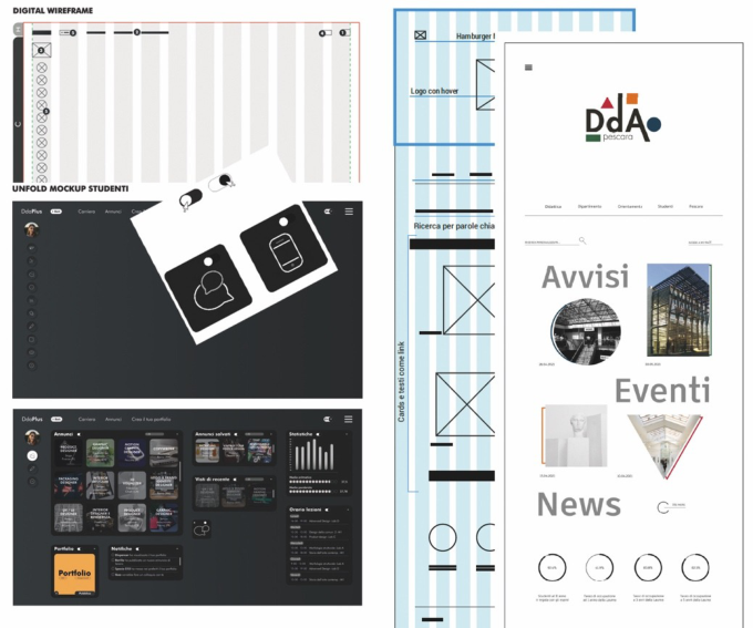
consists of the intersection of multiple layout types to be memorable - for example, through the use of background image or video background types in the area above the fold - but also to show multiple contents with easy management of hierarchies - such as card elements within a grid layout. To succinctly exemplify the design results, it is useful to compare two different project proposals: Customizable layout (Fig. 1): inclusion intended as customization of the experience, allowing users to decide functionalities and remove what they deem not useful. The layout adapts to the changing priorities and needs of users, ensuring an interface that conforms to their preferences and eliminating redundant information not relevant to the experience phase they are in. Some experiments push the boundaries of customization, envisioning a wide range of personalization options for both functionalities and accessibility criteria.
Rigid layout (Fig. 1): inclusion intended as the elimination of elements of distraction or frustration, with a strongly hierarchical and priority struc- ture that provides gradual access to secondary information with an increase in detail as one progresses in exploration. This entails selecting a few basic accessibility criteria and careful planning of the information architecture.
Figure 1: Left: Customizable layout. Customization of the UX: users can “hide or add” every single topic. The closed topic will appear as an icon and will be positioned at the bottom of the page. Right: Rigid layout. Design as web interface. The simplicity and linearity of the elements (which do not fill the total surface of the pages) facilitate and speed up navigation, allowing for easy information search.
166 Massacesi
Media The approach to the use of media by the experimentation group is extremely diversified and includes the integration of elements such as images, videos, texts, streaming. With a wide range of nuances. Images and texts can be ani- mated, or they can be synthesized and generate icons. Icons can be abstract, suggesting interaction. But images can also represent figures and, conse- quently, allow identification and empathy. In particular, we can highlight two innovative approaches:
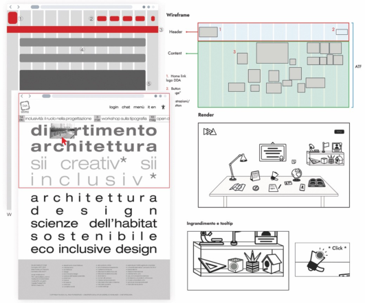
Big type style (Fig. 2): use text as the main communication tool, based on the “big type style” or “bold typography”. The inclusive approach is based on the observation that the “text” element is the one that most easily adapts to customization by users. On the other hand, the text element can, if cor- rectly designed, acquire “image value” and visually characterize the design proposal.
Images only (Fig. 2): in this experimentation, inclusion is thought of as the synthetic and illustrated recreation of a familiar environment - my desk, my room, my objects -. The interface is the digital reflection of everyday reality, the conventional structure of the site pages is completely transformed. Design patterns and grids are not visible; the user must “learn” how to navigate and use the contents, but this process is facilitated by easy memorization of the elements.
Figure 2: Left: Big type style - an inclusive layout. Interaction between typography and the user on mouseover - appearance of micro images that follow the mouse movement. Right: Images only.
Interactions Visual design for the web must take into account the fundamental elements of interaction: movement, time, space, visual appearance, consistency, and
Visual Design for Diversity and Inclusion in Web Design 167
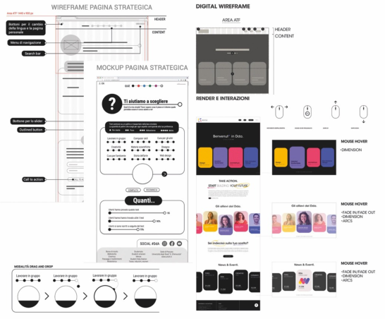
sound (Saffer, 2010). During the visual prototyping phase, managing inter- action and micro-interactions is extremely complex to represent and test. Moreover, the project brief required designing for both desktop and mobile, leaving students the freedom to adopt an adaptive or responsive solution. In this context, inclusion is manifested through the reduction of actions nec- essary to navigate the site. For example, organizing content in a sequential flow (Fig. 3, left), or configuring the layout so that interaction occurs exclu- sively through “swipe” on mobile devices and directional mouse movement on desktop (Fig. 3, right).
Figure 3: Left: sequential flow drag and drop interaction for a step by step comprehen- sion in ‘What is my path?’ Interactive activity for orientation. Right: interaction and gestures: Experimentation with an innovative navigation flow. Desktop mouse move- ments – mobile swipe movements, without clicking, allow for scrolling, opening, and closing content.
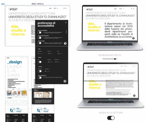
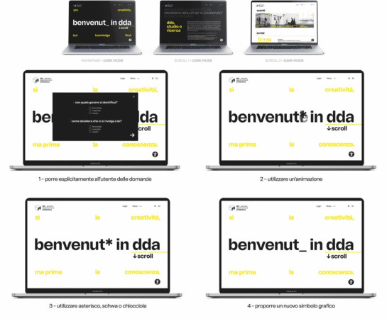
Functionality and Language With the aim of allowing broad accessibility to content, we can integrate numerous functionalities within a website that act at the visual, motor, or auditory level. High contrast and screen readers, voice assistants; customiza- tion of colors, contrasts, fonts, and the size and weights and line spacing of texts, textual descriptions of images. From this point of view, the main theme investigated from a visual standpoint is how these functionalities can be integrated without the design losing narrative capacity and distinctive characterization compared to “competitor” sites. In this example, we see a more institutional approach to the theme of inclusion. The strategies adopted involve using a broad range of accessibility criteria (Fig. 4), but with elements of experimentation and innovation in language use. The project explores not only the theme of “memorability” in visual design and how to capture the
168 Massacesi
user’s attention, but also design hypotheses on the theme of language inclu- sivity, such as innovative and gender-neutral ways of writing claims and calls to action (Fig. 5).
Figure 4: Web design and inclusion, accessibility preferences.Figure 5: Web design and inclusion. From left to right, from top to bottom: alternative project proposals related to the theme of gender inclusion in language.
Visual Design for Diversity and Inclusion in Web Design 169
CONCLUSION
The projects presented do not aim to identify a generic solution to the theme of design for inclusion in web design, but each project poses a single challenge, attempting to define a theme and seeking a possible answer.
Facing the multidisciplinary challenges related to designing an inclusive web has guided us towards identifying target user communities and inter- preting inclusivity through students’ interactions with visual design and web interface functionalities. This has led to the adoption of a methodology based on defining a main value strategy, which has guided the development of indi- vidual projects from a multidisciplinary perspective, solving design challenges through the use of visual tools. The solutions proposed, through visual pro- totyping, address recurring themes of inclusion, identifying and resolving potential non-inclusive dynamics that students may encounter during their academic journey. The use of inclusive design strategies, such as analysis, interviews, users personas, and use cases, has led to the identification, for each project, of a unique value strategy, which permeates the entire website involv- ing visual aspects, layout, and interactions. The proposed solutions constitute a catalog of cross-sectional approaches that can be successfully applied to university department websites, contributing to promoting accessibility and inclusion in this context.
ACKNOWLEDGMENT
This paper shows an extract of the research results contained in the Bachelor’s dissertation in Communication Design (Advisor: Prof. Raffaella Massacesi) edited in the final laboratory of design, at the Department of Architecture of d’Annunzio University from Chieti-Pescara, Italy.
Fig. 1, left: Martina Pagano - Customization of the User eXperience on the Department of Architecture website Fig. 1 right: Chiara Calò - Design as web interface: the DdA website Fig. 2 left: Nina Dell’Osa - Big Type Style, an inclusive layout for the DdA website
Fig. 2 right: Marco Altamura - DDA Workspace: the new website for the Department of Architecture Fig. 3 left: Erika Prosperi - “What is my path? “ Interactive activity for orientation on the website for the Department of Architecture.
Fig. 3 right: Aurora Asia Negro - Interaction and gestures: Experimenta- tion with an innovative navigation flow for the DDA website. Fig. 4-5: Ilaria Gasparo - Web design and inclusion: design research for the Department of Architecture website
REFERENCES
AIGA Academic Design Education. Website: https://www.aiga.org/resources/acade mic-design-education. Bottà, D. (2018), User experience design: Progettare esperienze di valore per utenti e
aziende. Hoepli. Brown, T. (2009). Change by Design: How Design Thinking Transforms Organizations and Inspires Innovation. HarperBusiness.
170 Massacesi
Coleman R., Clarkson J., Cassim J. (2008) Design for Inclusivity. A Practical Guide to Accessible, Innovative and User-Centred Design. Routledge. ISBN 9781315576626. Cooper A. (2004), The Inmates Are Running the Asylum: Why High Tech Products
Drive Us Crazy and How to Restore the Sanity, Pearson Education. Holmes K. (2018) Mismatch: How Inclusion Shapes Design. MIT Press. Massacesi, R. (2022). Dematerialized meeting places and digital design for interaction and participation. In: Tareq Ahram, Waldemar Karwowski, Pepetto Di Bucchianico, Redha Taiar, Luca Casarotto and Pietro Costa (eds) Intelligent Human Systems Integration (IHSI, 2022): Integrating People and Intelligent Sys- tems. AHFE (2022) International Conference. AHFE Open Access, vol. 22. AHFE International, USA. http://doi.org/10.54941/ahfe100961 Norman, D. (2023). Design for a Better World. Meaningful, Sustainable, Humanity
Centered. The MIT Press. ISBN 9780262373845. Norman, D. A. (2013). The Design of Everyday Things: Revised and Expanded Edition. Basic Books. Saffer D. (2010) Designing for Interaction. Creating Innovative Applications and
Devices. New Riders Ed. Sinni G., Sgarro I. (2022) L’Atlante della trasformazione digitale della PA. Website: https://medium.com/designers-italia/latlante-della-trasformazione-digitale-d ella-pa-cc1c47960759.
LISTED IN THE AHFE DIGITAL BOOKSTORE CATALOGUE
Explore the complete digital volume
Design for Inclusion
Read this individual research paper free through the original publisher, or explore the full digital proceedings book.
ISBN 978-1-964867-04-5
Explore this ISBN in the AHFE Bookstore ↗Listed in the July 2026 bookstore catalogue; search by ISBN to confirm current availability · Digital book purchase optional