Atsushi Kido, Takashi Sakamoto, Toshikazu Kato (2024). Color Impressions in Images of Decorated Interiors and Furniture Are Influenced by Differences in Color Vision. In: Human Factors in Design, Engineering, and Computing. AHFE Open Access, vol. 159, pp. 453–461. https://doi.org/10.54941/ahfe1005611
The objective of this study is to investigate how impressions derived from multiple colors differ depending on the diversity of color vision. We have already conducted research on color impressions using abstract images as visual stimuli containing multiple colors. In this report, we will conduct a similar study using images of decorated interiors and furniture, which include more familiar subjects. Globally, 2% to 10% of men have color vision deficiencies (protan or deutan color vision), and many studies have been conducted to consider color discrimination. However, there are few comprehensive survey results on how people with color vision deficiencies perceive various color impressions. In the study on color impressions perceived from single colors by Ichihara (2018, 2019), it was reported that people with protan or deutan color vision perceive colors like red and green as dark, sober, and dull, whereas colors like blue, purple, yellow, orange, and yellow-green are perceived as bright, flashy, and lively. Furthermore, in the study by Sakamoto et al. (2019) focusing on abstract images containing multiple colors, it was reported that the structure of color impression evaluation could be explained by three factors, including a factor related to "harmony." In this experiment, we targeted individuals with normal color vision (both male and female) and those with dichromatic color vision deficiency (both protanopia and deuteranopia). The experiment was conducted from January 10, 2024, to April 20, 2024. Images of decorated interiors and furniture with various color combinations were displayed on an LCD monitor (EIZO CG279X) connected to a MacBook Pro. We calibrated the color and brightness of the EIZO LCD monitor using color management software (EIZO ColorNavigator 7). We collected color impression data using the Semantic Differential (SD) method. Subsequently, we employed Principal component analysis to investigate which principal components significantly influenced judgments across different types of color vision. The results of the Principal component analysis extracted four principal components for each type of color vision. Specifically, these principal components are Activity (associated with liveliness and flashiness), Harmony (associated with beauty and elegance), Potency (associated with weight and strength), and Sharpness (associated with the sharpness of color combinations). It was suggested that color vision differences (normal color vision, protanopia, and deuteranopia) affect the evaluation of Harmony differently. Our results also suggest that when impressions of highly salient colors in interior design are similar across different types of color vision, the design tends to evoke the same impression. On the other hand, when impressions of highly salient colors differ across different types of color vision, the design tends to evoke different impressions.
This study investigates how impressions derived from multiple colors differ depending on the diversity of color vision. We conducted an experiment in which participants with different types of color vision were shown photographs of designed interiors and furniture with various color combinations. The participants’ impressions were collected using a questionnaire survey and the Semantic Differential (SD) method, and overall trends in the received impressions by different color vision types were analyzed using principal component analysis.
The majority of color vision can be represented by three types: normal color vision, protan color vision, and deutan color vision. These three types cover almost 99.99% of all color vision variations. Globally, 2% to 10% of men have color vision deficiencies (protan or deutan color vision). It
is known that normal, protan, and deutan color vision differ in how they perceive colors. Furthermore, most visual environments in the real world are constructed based on normal color vision. Consequently, there are many color combinations that are difficult to distinguish for those with protan and deutan color vision.
Many studies have been conducted to consider color discrimination for protan and deutan color vision. However, there are few comprehensive surveys results on how people with color vision deficiencies perceive impressions from various colors. The real world we live in is filled with colors, and colors are a major factor in determining the impression of things. If the way colors are perceived differs depending on differences in color vision, it is expected that the impression of colors will also differ. In this case, designs that don’t consider the diversity of color vision may not convey the concept intended by designers and manufacturers to people with color vision deficiencies. Therefore, it is necessary to proceed with the investigation of impressions perceived from colors and their combinations.
RELATED STUDIES In the study on color impressions perceived from single colors by Ichihara (2018, 2019), it was reported that people with protan color vision or deutan color vision perceive colors like red and green as dark, sober, and dull, whereas colors like blue, purple, yellow, orange, and yellow-green are perceived as bright, flashy, and lively. The results of the factor analysis identified two factors: Activity and Potency. Ikeda et al. (2013) and Ichihara (2018) dealt with single color impressions; consequently, the investigation of impressions of multiple colors remained an issue.
Thereafter, Sakamoto and Ichihara (2019) focused on multiple colors in abstract paintings and images. They found that the structure of color impressions for the three major types of color vision could be explained by three factors, including a factor related to “Harmony.” They also suggested that although protan and deutan color vision have similar characteristics, they evaluated impressions differently.
METHOD
Participants Participants were comprised only of males with normal color vision and those with protanopia (congenital dichromatic protan color vision) and deuteranopia (congenital dichromatic deutan color vision). We collected data from 10 individuals of each color vision type. All participants with protanopia or deuteranopia received a color vision medical examination before participating in our experiment to verify their types and the severity of their color vision deficiencies. The participants with normal color vision were only university students. All participants agreed to participate in our experiment, and they signed an informed consent form in accordance with the rules of the Ethics Committee of Chuo University.
Color Impressions in Images of Decorated Interiors and Furniture 455
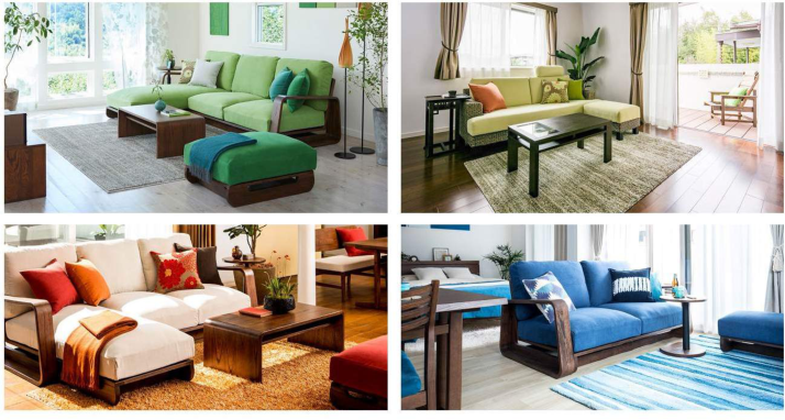
Stimuli We selected and used 20 photographs of designed interiors and furniture with various colors from webpages provided by C-SQUARE Co., Ltd. Figure 1 shows examples of the photographs. We displayed the photographs to the participants one by one in random order. The photographs were presented on an LCD monitor (EIZO CG279X) using a MacBook Pro. We calibrated the color and brightness of the LCD monitor using color-management software (EIZO ColorNavigator 7).
Figure 1: Photographs of designed interiors and furniture with various colors.
Rating Method We collected color impression data using the Semantic Differential Method (SDM) with 15 pairs of adjectives, as shown in Table 1. To compare with previous studies, we used the same and additional adjective pairs validated in the previous study (Sakamoto and Ichihara, 2019).
1. We created impression profile graphs using averaged data obtained from 15 pairs of adjectives according to color vision types. Based on these graphs, we identified unique colors and their combinations that possibly gave the same or different impressions for different types of color vision. 2. We used principal component analysis (PCA) to aggregate 15 adjective pairs and determine which elements influence the impression of colors and their combinations. For each color vision type, we also examined which elements had a significant impact on the impression and which elements were considered important.
RESULT
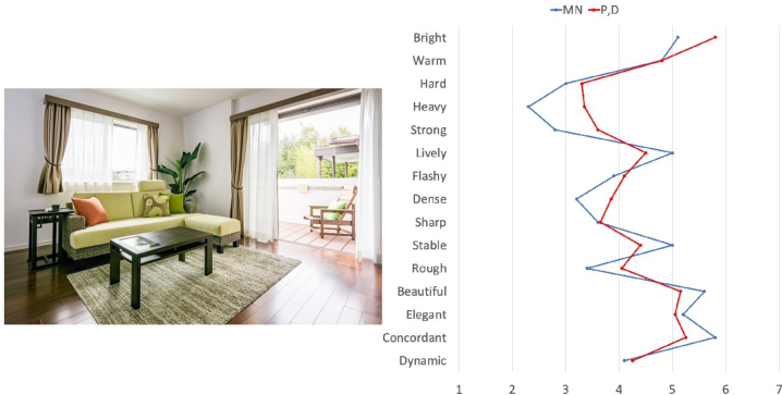
Impression Profiles It was found that Photograph No. 2 gave very similar impressions for different types of color vision. Figure 2 shows impression-profile lines of Photograph No. 2. In detail, the blue line represents the impression profile for normal color vision, and the red line represents the impression profile for protanopia and deuteranopia.
Figure 2: Photograph no. 2 and its impression profile graph.
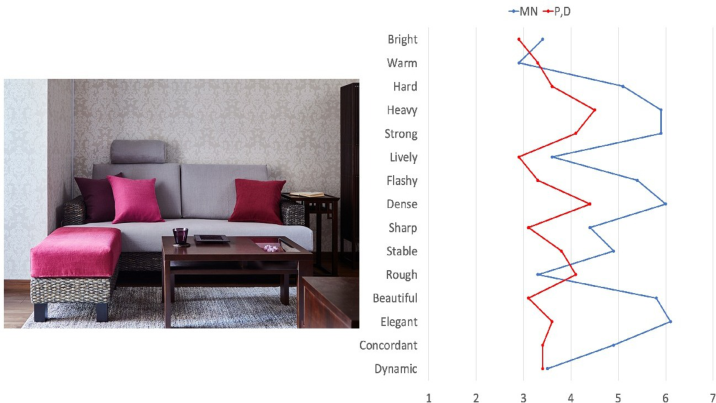
It was found that Photograph No. 17 created quite different impressions for different types of color vision. Figure 3 shows impression-profile lines of Photograph No. 17. In detail, the blue line represents the impression profile for normal color vision, and the red line represents the impression profile for protanopia and deuteranopia.
Color Impressions in Images of Decorated Interiors and Furniture 457
Figure 3: Photograph no. 17 and its impression profile graph.
Principal Component Analysis (PCA) We conducted a principal component analysis (PCA) to aggregate 15 adjective pairs. Table 2 shows the matrix of principal component loadings.
Table 2. Matrix of principal component loadings.
Table available in the original PDF paper.
The 15 adjective pairs used in the SDM were aggregated into four principal components. The contribution rates in the PCA were 0.26 for the first, 0.17 for the second, 0.13 for the third, and 0.10 for the fourth principal component. Up to the fourth principal component, the cumulative contribution rate was 0.66.
Considering what each principal component represents, we gave the four principal components the following associated names: PC1: Activity (associated with liveliness and flashiness) PC2: Harmony (associated with beauty and elegance) PC3: Sharpness (associated with the sharpness of color combinations) PC4: Potency (associated with weight and strength)
DISCUSSION
Protanopia and Deuteranopia Simulations We identified several photographs that create the same or different impressions according to different types of color vision. In this section, we discuss the chromatic features of the photographs that created the same or different impressions for each type of color vision, using protanopia and deuteranopia simulations (Asada, 2011).
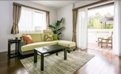
Figure 4: (Left) original image, (Middle) protanopia simulation, and (Right) deuteranopia simulation of photograph no. 2.
Figure 4 shows the protanopia and deuteranopia simulations of Photograph No. 2 mentioned earlier in this paper. According to our experimental results, Photograph No. 2 gave very similar impressions across different types of color vision. Specifically, the sofas and carpets in Photograph No. 2 appeared as a luminous yellow-green to those with normal color vision, while those with protanopia and deuteranopia saw them as an accentuated yellow. We suggest that the impression of the salient colors was maintained because yellow gives a positive impression, such as being warm, lively, and flashy, to those with protanopia and deuteranopia, as mentioned by Ikeda et al. (2013).
Figure 5: (Left) original image, (Middle) protanopia simulation, and (Right) deuteranopia simulation of photograph no. 17.
Color Impressions in Images of Decorated Interiors and Furniture 459
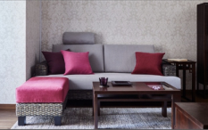
Figure 5 shows the protanopia and deuteranopia simulations of Photograph No. 17 mentioned earlier in this paper. According to our experimental results, Photograph No. 17 created quite different impressions for different types of color vision. This image features a large area of gray, with a high-saturation red footrest and cushions. Red often appears to be a highly salient color to those with normal color vision, giving an impression of being flashy and elegant. In these simulations, the furniture that appeared conspicuous to those with normal color vision appears without the reddish tint. The loss of the reddish tint results in an emphasized impression of being plain, sober, and dull to those with protanopia and deuteranopia, giving a different impression compared to normal color vision.
We suggest that when impressions of highly salient colors in interior design are similar across different types of color vision, the design tends to evoke the same impression. On the other hand, when impressions of highly salient colors differ across different types of color vision, the design tends to evoke different impressions.
Principal Component Analysis (PCA) Based on the principal component analysis (PCA), we suggested that the four principal components were extracted and they represent Activity, Harmony, Sharpness, and Potency, respectively.
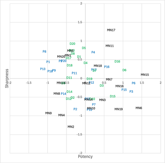
Figure 6: Scatter plot diagrams with principal component scores: (Black) normal color vision, (Blue) protanopia, and (Green) deuteranopia.
We plotted the principal component scores on a two-dimensional plane to clarify how impressions from multiple colors differ depending on the types of color vision. Figure 6 shows the scatter plot diagrams with principal component scores averaged for each type of color vision and for each image.
According to Figure 6, Activity, Sharpness, and Potency are widely distributed regardless of the types of color vision. It is considered that the differences in the evaluation of impressions from multiple colors are small for Activity, Sharpness, and Potency. For Harmony, normal color vision is plotted more in the positive positions, while deuteranopia is plotted more in the negative positions. Protanopia is plotted slightly more in the positive position. It is considered that the evaluation of impressions from multiple colors is different for Harmony depending on the types of color vision. This result was also obtained in the research by Sakamoto and Ichihara (2019). Therefore, it is suggested that Harmony results in different impression evaluations for multiple colors depending on the types of color vision.
CONCLUSION
In this study, we investigated the impressions received from multiple colors in images of decorated interiors and furniture and identified the chromatic features when the impressions are the same or different depending on the types of color vision. We conducted a principal component analysis to
Color Impressions in Images of Decorated Interiors and Furniture 461
investigate what components form the impressions from multiple colors. We also clarified how impressions derived from multiple colors differ depending on the types of color vision.
We found that when the appearance of the colors in the design was similar for each type of color vision, they tended to give the same impression. In cases of different color appearances, we found that the similarity in the impression of the highly salient colors in the design tends to influence the overall design impression.
As a result of principal component analysis, it was found that the impression of interior design for each type of color vision is formed by four principal components: Activity, Harmony, Sharpness, and Potency. In addition to the results of Sakamoto et al. (2019), it was suggested that each type of color vision (normal color vision, protanopia, and deuteranopia) evaluates Harmony differently.
In the near future, the application of this study will enable us to consider color vision diversity in design to ensure that intended impressions are effectively conveyed to all individuals.
ACKNOWLEDGMENT
I would like to express my deepest gratitude to Dr. Toru Nakata (National Institute of Advanced Industrial Science and Technology) for his valuable research guidance and manuscript review. Furthermore, I would like to extend my heartfelt thanks to all my laboratory members of Chuo University, for their enthusiastic research discussions and cooperation in experiments. This research was supported by JSPS KAKENHI Grant Number 21H03534.
REFERENCES
Asada, K. (2011) Color vision tools to improve quality of life of people with color vision deficiency. Keio University Graduate School of Media Design, Ph.D. thesis. https://koara.lib.keio.ac.jp/xoonips/modules/xoonips/detail.php?koara_id =KO40001001-00002010-3436 Ichihara, Y. G. (2018) Impression evaluation between color vision types. Procs. of
the 4th international symposium on affective science and engineering, ISASE2018, pp. 1–4. https://doi.org/10.5057/isase.2018-C000033 Ichihara, Y. G. (2019) Impression Evaluation between Color Vision Types –Blue Considered Lively by Elderly People–. Electronic Imaging, 31, art00015, pp. 1–7. https://doi.org/10.2352/ISSN.2470–1173.2019.14. COLOR-092 Ikeda, T., Ichihara, Y. G., Kojima, N., Tanaka, H., Ito, K. (2013) Color Universal
Design: Analysis of Color Dependency on Color Vision Type (4). Proc. SPIE 8652, Color Imaging XVIII: Displaying, Processing, Hardcopy, and Applications, 86520G. https://doi.org/10.1117/12.2001582 Sakamoto, T., and Ichihara, Y. G. (2019) Exploring Color-Universal Design Considering Kansei Differences: Color-Vision Types and Impressions of Color Images. HCI International 2019: Lecture Notes in Computer Science. 11786, pp. 62–72. https://doi.org/10.1007/978-3-030-30033-3_6
LISTED IN THE AHFE DIGITAL BOOKSTORE CATALOGUE
Explore the complete digital volume
Human Factors in Design, Engineering, and Computing
Read this individual research paper free through the original publisher, or explore the full digital proceedings book.
ISBN 978-1-964867-35-9
Explore this ISBN in the AHFE Bookstore ↗Listed in the July 2026 bookstore catalogue; search by ISBN to confirm current availability · Digital book purchase optional