Duan Wu, Peng Gao, Ying Zhang (2022). Optimization of the Emergency Evacuation Sign’s Color Cognition for Color Vision Deficiency Users. In: Industrial Cognitive Ergonomics and Engineering Psychology. AHFE Open Access, vol. 35, pp. 94–100. https://doi.org/10.54941/ahfe1001607
Color has the characteristics of fast reading and fast recognition, with this reason, information in environments needs color to help fast communication, especially in the situation of emergency evacuation. The colour and graphic symbols on emergency evacuation signs(EES) help direct people to safety and provide emergency information quickly.(Barry Gray. 2012)But according to statistics, about 8% of the world population are suffered by color vision deficiency(CVD). While they are not resolved all colors, just easy to confuse some color. Today, different countries or organizations have different standard for EES, and many research shows, the color recognition of EES still has the phenomenon of uneven benefits of different groups of people, which means there are significant differences in the color recognition efficiency of EES between CVD and normal vision groups, especially deuteranomalous vision group (G, Landini, G. Perryer.2009).While the appropriate color selection can substantially improve CVD groups’ color recognition and at the same time not affecting the normal users’ color recognition rate. Therefore, to explore appropriate EES color design optimization for the CVD population has the social and scientific significance.With this background, this research intends to study the EES color recognition of CVD people and try to build optimize EES color model for this group of users. The research start with different selections of EES color standard among countries and organizations. Through the comparison of these standard colors, some color samples are sorted out with the help of the recognition models of CVD people. Then totally 57 CVD people participated the research as experimental volunteers to test the recognition of selected samples. The final ranking of samples were influenced by both the color hue and also the color lightness contrast between EES background and the icon or text. The objective of the research is to build a more inclusive practical color model for improving EES and other safety sign design. The result of this research could assist color design optimization and help the EES design to select appropriate color, without affecting the recognition rate of normal color vision people, while greatly improving the recognition of CVD group. The research conforms to the design thinking of universal design, inclusive design and human-centred design. The results could be used to optimize or review EES and other signage color design, could also apply to other visual information communication field.
Optimization of the Emergency Evacuation Sign’s Color Cognition 95
Table 1. The color cognition difference showed through CVD simulations.
Table available in the original PDF paper.
Color Normal Deutan Protan Tritan Pantone 368C
Pantone 7465C
INTRODUCTION
It is estimated that approximately 4% of the world population (8% of the male population) suffer from inherited color vision deficiency (CVD) (Judd, 1943; Alpern et al., 1983a,b; Brettel et al., 1997), in China this popula- tion is more than 60million. Except that, age-related macular degeneration, eyes affected, cataracts, diabetic retinopathy and glaucoma also affect a large population.
Several studies have highlighted the potential negative impact of CVD while performing some specific critical tasks of modern times (Rigby et al., 1991; Poole et al., 1997). Steward & Cole (1989) reported range of color- related difficulties experienced in everyday life. In one of the most important studies in the field, almost all subjects with CVD reported difficulties with everyday tasks that involved color and in their current jobs. Some expe- rimental studies of colored signal recognition, often involving simulations, have indicated that CVD people make more errors recognizing the colors of road traffic signals than those with normal color vision (Nathan et al. 1964; Verriest et al. 1980a, 1980b; Freedman et al. 1985).
Color has the characteristics of fast reading and fast recognition, with this reason, information in environments needs color to help fast communication, especially in the situation of emergency evacuation. In many countries, colors were used extensively for safety purposes. For emergency evacuation signs (EES), color play a huge role in making sure that signs are instantly recogniza- ble at a mere glance The color and graphic symbols on EES help direct people to safety and provide emergency information quickly. (Barry Gray. 2012).
MOTIVATION While according to the Young-Helmholtz three-component theory, CVD people are not resolved all colors, just easy to confuse some colors. The appropriate color selection can substantially improve CVD groups’ color recognition and at the same time not affecting the normal users’ color recognition rate (table 1).
Today, different countries or organizations have different standard for EES, and many research shows, the color recognition of EES still has the pheno- menon of uneven benefits of different groups of people, which means there are significant differences in the color recognition efficiency of EES between
CVD and normal vision groups, especially deuteranomalous vision group (G, Landini, G. Perryer.2009).
Therefore, through research and experiments, there is significance poten- tial to explore appropriate EES color design optimization for the CVD population and improve their color reading experience. The research team hope that through study of CVD population’s recognition of EES colors, opti- mization suggestion could be find out and guide Chinese EES standard to a more inclusive and all mankind friendly one.
METHODS
With the desk research, it is showed that different countries or organizati- ons have different standard for EES. Among them, we took the EXIT sign as a research sample. In most regions, including the European Union, Japan, South Korea and China, exit signs have green lettering. European sign dire- ctive 92/58/EEC of 24 June 1992 indicates that the signs should be green in color to indicate a safe place of exit. BS EN 1838:1999, BS 5266-7:1999 also governs the emergency lighting applications. The 2010 Canadian national building code required green “running-man” signs on a contrasting back- ground spelling EXIT or SORTIE. Newly installed exit signs in Australia are green with white “running man” figure (AS2293).
Above all, green fluorescent signs can be seen better in dark conditions than other colors, as the human rod cell is more sensitive to these wave- lengths. But the “GREEN” color in different standard shows huge difference as the table 1 shows below, not to mention those ones didn’t follow any standard.
This study presents the following research question: Is the proposed re- coloring exit sign a valid approach to improving cognition for users with CVD, while not having a detrimental impact on normal color vision users?
To answer it, experiments were conducted on two groups of human subje- cts: a normal color vision group and a CVD group. The groups evaluated emergency evacuation signs with potentially confusing color schemes and re-colored counterparts. Using the results of the experiments to test the hypo- theses.To support the experiments, following materials and methods are very important.
Color Models The most commonly known of color model is additive RGB, used in computer and television displays, where red, green and blue components are added up to form new colors. While HSB color model (hue–saturation–brightness), encodes image information in a different manner: the hue defines the color and is represented in a circular space. The beginning (red) and end (blue) of the scale meet to form a color, the saturation encodes the amount of white in the color and brightness encodes the amount of light present in the color. Such encoding can be visualized in a cylindrical space rather than the traditional RGB cube. Some of the advantages of using HSB modelling to alter colors are that their three components can be manipulated separately when compare with RGB model.
Optimization of the Emergency Evacuation Sign’s Color Cognition 97
Figure 1/2: The replacing color sample on CIELab model.
The CIELab color model is a color space defined by the International Com- mission on Illumination (CIE) in 1976. It expresses color as three numerical values, L* for the lightness and a* and b* for the green–red and blue–yellow color components. CIELab was designed to be perceptually uniform with respect to human color vision, meaning that the same amount of numeri- cal change in these values corresponds to about the same amount of visually perceived change. Thus, it can be used to make accurate color balance cor- rections by modifying output. That’s why the current CVD confusion colors research are all addressed in CIELab model. However, many parts of the experiments need computer to assisted and also have color printing require- ment, these three color models are all needed and the color transformations between them are also crucial.
We propose, based on the research of CVD confusion lines on CIELab diagram, choose verified replacing color samples to conduct the experiment (figure 1\2). There are two guidelines to achieve the color samples: (1) try to collect colors across the confusion lines for CVD observers, (2) span the perceptual range of the L*(lightness) level of the samples cause most CVD observers are remaining sensitive to lightness and contrast. With the guide- lines above and study of EES color standard in different regions, we choose 7 color samples to accomplish the experiment. Conversion between color models can be calculated, then we could get the color sample attributes for further using (fig1/2 and table 3).
CVD Simulations Vi’enot and collaborators (Vi’enot et al., 1995, 1999; Brettel et al., 1997) derived a number of color transformations to simulate images that CVD observers might perceive. This has found several interesting uses that include color previews in desktop publishing software and drawing packages to pre- vent using potentially confusing colors in documents and electronic resources. We used the Vischeck J 1.1 module (Dougherty &Wade, 2006) to create simulated images for testing and verification during the study. Some free downloadable modules to produce these simulations have been written (see http://www.vischeck.com/) for popular imaging platforms like Photoshop (Adobe Systems Inc., San Jose, CA, USA).
When the image is processed to simulate what is seen by a CVD observer, we could understand the vision stimulate factors for CVD. This will help in
Table 2. The color samples’ data in three color models.
Table available in the original PDF paper.
Color HSL RGB CIE lab H S L R G B L* a* b* 1 120.00 1.00 0.50 0 150 0 87.73 -86.18 83.18
choosing the replacing color samples such as the brightness contrast leads to the important selection of replacing color.
Experiment Participants The selection of qualified participants is crucial and also a difficult task, cause CVD people with CVD are usually very sensitive and resistance to any pos- sible exposure. Finally, with the help of Shanghai Tenth People’s Hospital and Tongji Hospital Affiliated Tongji University Branch, 54 adults (persons of 18 years of age and older) and three teenagers participated online and 61 adults participated offline in the lab (Table 4). Participants’ color vision sta- tus was determined using online and offline versions of the Farnsworth D-15 arrangement tests.
Optimization of the Emergency Evacuation Sign’s Color Cognition 99
Figure 1: process of the experiments.
EXPERIMENTS The experiments present three hypotheses: The first is that the CVD group performs differently when recognizing the re-colored exit signs with color samples and they perform better with some sample than the original ones. The second is that normal color vision group’s performance stay stable when changing exit sign’s color.
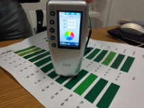
In order to minimize the error caused by printing output, the colorimeter is used in the preparation phase to adjust the printing color. After several round of color calibration, the printing output samples’ error parameter was controlled within 5%.
During the offline experiment process, after color vision test participants were invited to the lab, in which exit sign samples were hanging randomly on a white background.
The participants then evaluate the samples according to following sectors: color chroma sensitivity, sign cognition speed and comprehensive tendency.
Although the description of the required task was somehow subjective, most of our participants acted very serious and dedicatedly to the ranking results. After the first phase of experimental task, participants were asked to select the samples in seven-pair testing signs, in which they could better compare any two samples to make more accurate result.
Online participants conducted color sample comparison questionnaire based on their own screen display. Due to the difficulty in controlling the error caused by the difference display equipment, the data of online experi- ment was only used as a reference and not included in the final experimental data.
FINDINGS AND DISCUSSION A total of 61 individuals’ experimental data were recorded and analyzed. 64% CVD participants took color sample 6 as their first choice, and 21% of them chose color sample 1. 85% of the normal color vision group preferred color sample 1, and there was limited difference between their color cognition data. The average preference of the test lead to the result of color sample 6 and 1. And the result proved the initial hypothesis:
1. The color samples have a positive impact on CVD participants. Compa- ring with the original exit sign, they performed better with some color samples.
2. The color samples’ impact on individuals with normal color vision were almost negligible.
Through experiments, this research studied the EES color recognition of CVD people and try to optimize EES color for this group of users. The results were positive, CVD participants performed better when using color sample 6 and the color influence to normal color vision participants could be negligi- ble.But the research is still in an early stage and some other factors such as the sign illumination or environment lighting will also influence the performance of CVD group.
ACKNOWLEDGMENT
The authors would like to acknowledge the help and support of Shanghai Tenth People’s Hospital and Tongji Hospital Affiliated Tongji University Branch.
REFERENCES
Bowmaker, J K; Dartnell. Visual pigments of rods and cones in a human retina.
Journal of Physiology. 298: 501–511.1980. Brettel, H., F. Vi’enot, and J.D. Mollon, Computerized simulation of color appearancefor dichromats. Journal of the Optical Society of America A. 1997. Dougherty, B. and A. Wade , Vischeck. URL http://vischeck.com/vischeck/vischeck
Image.php. Online; 2011. Gretchen M. Culp. Increasing Accessibility for Map Readers with Acquired and Inherited Color Vision Deficiencies: A Re-Coloring Algorithm for Maps. City University of New York (CUNY).2016. Howden, L.M. and J.A. Meyer, Age and Sex Composition: 2010. Technical report,
United States Census Bureau, Washington, DC, URL https://www.census.gov/pro d/cen2010/briefs/c2010br-03.pdf. 2011. The Industrial Accident Prevention Association. Safety Signs and Color, Industrial Accident Prevention Association, 2000.
LISTED IN THE AHFE DIGITAL BOOKSTORE CATALOGUE
Explore the complete digital volume
Industrial Cognitive Ergonomics and Engineering Psychology
Read this individual research paper free through the original publisher, or explore the full digital proceedings book.
ISBN 978-1-958651-11-7
Explore this ISBN in the AHFE Bookstore ↗Listed in the July 2026 bookstore catalogue; search by ISBN to confirm current availability · Digital book purchase optional