George White, Richard Steinberg (2023). Aligning User Experience with Communication Theory to Explain Why We Love and Hate Hotels. In: Usability and User Experience. AHFE Open Access, vol. 110, pp. 542–549. https://doi.org/10.54941/ahfe1003230
Rhetorical theorist Sonja Foss introduced a theory of visual rhetoric in 1971 (Foss,2004). Aligning Applied Human Factors Engineering (AHFE) with visual rhetoric can provide the field of UX with a deeper understanding of how a design can impact the effective performance and usability of products. According to Foss, visual objects are not inherently rhetorical, but when they are organized to express symbolic action, allow for human intervention, and target a specific audience, these visual systems gain rhetorical significance (Foss, 2004). All the various user interfaces (UI) that humans interact with day to day include attempts by a user experience (UX) designer to "guide" the user to the proven, most effective, lowest-risk means of accomplishing a specific goal. Aligning user experience (UX) with the principles of rhetorical theory establishes an important facet through which the designer can understand why a UI design fails or succeeds. Aristotle taught that the speaker accomplishes persuasion accomplished by appealing to the three pillars of rhetoric: logos (appealing to logic), pathos (appealing to emotions), and ethos (appealing from authority).Similarly, Don Norman stated (2013), "Cognition provides understanding, and emotion provides value judgement." Norman also discussed (2003) that trust in the UI is damaged when UI doesn't meet these cognitive and emotional expectations. Consider an experience many Americans have in common, staying overnight in a hotel. Every hotel works similarly, understood through the hotel business's well-established practices and expectations built on previous experiences. But imagine what transpires when the experience breaks convention and the unexpected happens. Incorporating rhetorical principles in design considers how users identify and communicate to others in their user group. Appealing to the users through logos, pathos, and ethos helps the designer communicate more effectively, meeting the user's needs. When these pillars work together to communicate with the user more accurately, it improves a user’s discoverability of product features, and system affordances become a pleasant, straightforward experience to enhance the usability of products. High-usability products correlate to reduced cognitive load, task time reduction, and reduced fatigue time. Foss et., Helmers, Marguerite H., and Charles A. Hill. Defining Visual Rhetorics. Mahwah, N.J: Lawrence Erlbaum, 2004. Web.Norman, Donald A. The Design of Everyday Things. Revised and expanded edition. New York, New York: Basic Books, 2013. Print.
Rhetorical theory and practice, since its inception, has focused primarily on spoken and written mediums, having little or nothing to do with visual com- munication or design. Aristotle, the author of “Rhetoric” in the 4th century
Aligning User Experience With Communication Theory 543
BC, was concerned primarily with defining rhetoric, the art of persuasion, the eloquence of speech, the pillars of rhetoric, ethics, and achieving political goals through effective dialogues. According to rhetorical theorist Richard Buchanan, “Aristotle’s remarks on the rise of rhetoric as an art of persuasion have relevance to the art of design.” (Buchanan, 1985) Buchanan commented that since it is possible to discover the art of effective rhetoric, it seems that it is possible to discover the art of successful design. Every product communica- tes its use and to its user through visual and non-visual language. Therefore, incorporating rhetoric theory into how products communicate affordances is essential to conducting effective human factors engineering (HFE) and user experience (UX) design.
Three years after Buchanan wrote Declaration of Design, Don Norman wrote the book The Psychology of Everyday Things, later retitled The Design of Everyday Things (Norman, 1988). Norman presents the design philoso- phy that products succeed or fail because the designer does not understand the psychology of the user. Norman wrote, “Human cognition is extre- mely complex and difficult to understand, but a better understanding of this will allow us to design better systems with less human error.” (Norman, 2013). Since Norman wrote this keystone book, Psychology has become the predominant informant of HFE and UX design principles. Psychology has revealed rich insights into how human cognition and emotional processing work. Psychology’s experimental rigor has provided designers with objective human factors standards and principles. Yet, applying rhetorical theory to HFE and UX design provides a critical bridge between the objective, measu- rable behaviors that psychology is adept at evaluating and the individualized subjectivity of two people talking about existential ideas of feelings, desires, and beliefs within their unique contexts.
USING PRINCIPLES OF RHETORICAL THEORY TO INFORM USER EXPERIENCE DESIGN Imagine throwing a rock into a still pond. The ripples are the output of the impact of the stone upon the surface of the water. The researcher can under- stand a world of information about the water by studying the ripples as a function of the rock’s impact. Likewise, a world of information is availa- ble by studying the means of the impact as well. Here, rhetoric focuses on a design philosophy featuring the elements that impact the user. 1951, Kenneth Burke wrote an article for the Journal of General Education called “Rhetoric: Old and New.”
“If I had to sum up in one word the difference between the ‘old’ rhetoric and a ‘new’ (a rhetoric reinvigorated by fresh insights which the “new sci- ences” contributed to the subject), I would reduce it to this: The key term for the old rhetoric was ‘persuasion,’ and its stress was upon the deliberate design. The key term for the “new” rhetoric would be ‘identification,’ which can include a partially “unconscious” factor in appeal (Burke, 1951).
According to Burke, based on the progress in sciences like cognitive and behavioral psychology, neuroscience, and biology, to name a few, the paradigm of “identification” more accurately represents a rhetoric beyond Aristotle’s vision.
544 White and Steinberg
Concerning “identification”, or maybe more aptly, “the pursuit of iden- tification” Burke states, “men in their symbolic quandaries has led to the invention of miraculously ingenious symbolic structure” (Burke, 1951). These words articulated by Burke are perhaps the fulcrum upon which the concept of ‘visual language’ and its associated “symbolic structures” become adopted into design principles and practice.
In 1971, rhetorical theorist Sonja Foss introduced a theory of visual rheto- ric to the communications field. In a journal entry in 2004, Foss wrote about how visual objects are not inherently rhetorical, but when they are organi- zed to express symbolic action, allow for human intervention, and target a specific audience, these visual systems gain rhetoric significance (Foss, 2004). Although it’s not clear that Foss was addressing a digital medium specifically, the various user interfaces (UI) that humans interact with daily are an attempt by a UX designer to communicate with the user in a way that correlates with the user groups’ s “identification”. The designer’s goal is to express to the user, through a visual language, the products affordances in a way that maxi- mizes the user’s capacity to complete their task in the most effective, lowest risks means possible.
The UX designer’s job is to understand and leverage the rhetorical function of the visual language. Thus, visual rhetoric gains its application. Foss defined visual rhetoric as having “two meanings in the discipline of rhetoric. It is used to mean both a visual object or artifact and a perspective on the study of visual data. In the first sense, visual rhetoric is a product individuals create as they use visual symbols for the purpose of communicating. In the second, it is a perspective scholars apply that focuses on the symbolic processes by which visual artifacts perform communication” (Foss, 2004). The first definition defines visual objects as tangible artifacts, the actual symbols, that designers use to communicate with the users. Visual objects have no inherent meaning within themselves. But are agreed upon within the user group, which Burk describes as “their symbolic quandaries” (Burke, 1951).
The second definition of visual rhetoric refers to the study of how visual objects communicate. The linguist Saussure separated the signifier from the signified. That is, separating the symbol from the meaning (Saussure, 1966). The second definition of visual rhetoric is concerned with how and what is being communicated.
In fine art, compositional elements like line, shape, form, and repetition guide the eye around the canvas. These elements communicate to the biolo- gical hardwiring of the human. The artist organizes these elements on the canvas, sometimes very subtly, so that art moves one’s focus around the canvas; much like how one’s understanding moves from thought to thou- ght when listening to a story. Successful art is an art that is not only creative in content but also contains a skillful use of compositional elements. Rheto- rical elements communicate in a similar fashion. But rather than using the biological attraction to elements, rhetorical elements rely on agreed meaning that has been established by users who identify with the same user group.
The reinvigoration of rhetoric through “identification” emphasizes the importance of Aristotle’s groundwork to establish the rhetorical elements of pathos, logos, and ethos. The visual objects are not pathos, logos, and ethos
Aligning User Experience With Communication Theory 545
much like how Saussure separated the sign from the signified, but are veh- icles to carry the rhetorical elements to the user. As mentioned earlier, the rhetorical elements themselves are not symbols but, going back to the stone and pond analogy the “momentum and density” of the “stone” that impacts the user.
Pathos deals with the emotional appeal to the user. Often, designs that sli- ghtly push the boundaries of a convention are captivating and delightful and initially produce a rush of excitement and novelty. But push the boundaries too much, and the user’s experience can become distasteful. Norman’s cogni- tive design philosophy enhances our understanding by describing three types of emotional processing: visceral, behavioral, and reflective.
Of the visceral level, Norman said, “The most basic level of processing is called visceral… These are part of the basic protective mechanisms of the human affective system, making quick judgments about the environment: good or bad, safe or dangerous. The visceral response allows us to respond quickly and subconsciously without conscious awareness or control. Concer- ning the behavioral level, “The behavioral level is the home of learned skills, triggered by situations that match the appropriate patterns. Action at this level is largely subconscious.” And of the reflective level, he said, “The refle- ctive level is home of conscious cognition. As a consequence, this is where deep understanding develops, where reason and conscious decision-making take place”(Norman, 2014). Every product incorporates some degree of each emotional processing level (Norman, 2003). Designing products to access the appropriate level of processing is essential for good design.
Logos deals with the logical architecture of a design. In his book The Elements of User-Centered Design, Jesse Garrett teaches a product design doctrine that emphasizes information architecture (IA) before implementing visual design (Garrett, 2010). For example, following conventional design patterns that are well established, developing a strategy of organizing infor- mation before developing a scope of features, and maintaining consistent stylization standards throughout a product. It is almost unnoticeable when a product has good IA, but when it fails to communicate good logos, the user’s experience with a product quickly becomes frustrating when a feature is not where it is expected.
Ethos deals with not only the perceived authority of the design but also the character and authority of the designer. Buchanan wrote about ethos in design, “Products have character because in some way they reflect their makers and part of the art of design is the control of such character to per- suade potential users that a product has credibility in their lives” (Buchanan, 1985). For example, users often report having a bad experience when encoun- tering dark patters, or an interface takes away control, or an algorithm auto selects an option for the user. The interaction is perceived as “socially rude” since the machine did not request permission of the user to take such an action. A lack of ethos reduces trust in the design, deeming it unworthy for all tasks and usefulness.
Pillars of Rhetoric and the UX of Staying in a Hotel The current HFE and UX design paradigm features a unidirectional commu- nication pathway, with the designer as the intermediary. In this paradigm,
546 White and Steinberg
signifiers are limited to, “Press here for this, this button does this, here is that feature.” However, rhetorical theory views communication as a bidire- ctional pathway. An exchange between the speaker and the audience. Foss commented, “A rhetorical theory once restricted to linear linguistic symbols thus explodes into one characterized by multidimensionality, dynamism, and complexity as visual units of meaning.” (Foss, 2004) A paradigm shift in pro- duct design could look like an interface that is empathetic to the user’s needs, able to ask through visual language, “What are you looking for? Does this help you?”. A bidirectional communication pathway such that visual objects’ impact carries an individualized, unique experience.
According to Norman, a designer’s understanding cannot separate cogni- tion and emotion. Cognitive thoughts produce emotions, while emotions lead to cognitive functions. Every action carries with it expectations, and those expectations drive emotions. Additionally, positive or negative emoti- onal experiences apply values judgment, determining whether a product is trustworthy and of good character. (Norman, 2013) The appeals of pathos, logos, and ethos are distinguishable rhetorical elements. But the impacts they make on the user are intricately intertwined. As psychology has demon- strated, the interoperability of users’ cognition, emotions, and trust display behaviors correlated to an extensive range of experiences, preferences, and desires. Applying visual rhetoric, with its psychology counterpart, to the field of HFE and UX design promises to provide the designer with an even dee- per understanding of how to design products that push the discoverability of affordances to achieve a higher level of usability.
Most Americans can relate to staying overnight in a hotel room. A custo- mer doesn’t have to be an “expert” in the field of hotel use to know what to expect during their stay. As a result, because of the salience of one’s expe- ctations from a hotel room is so widely understood by the user group when an experience doesn’t meet one’s expectations, the emotional responses can be significant factors in creating an unpleasant user experience. “You build up expectations of behavior based upon prior experience, and if the items with which you interact fail to live up to expectations, that is a violation of trust, for which you assign blame, which can soon lead to anger.” (Norman, 2004). Rhetoric and psychology work together to help designers understand why some users love their hotel experiences, and others hate them.
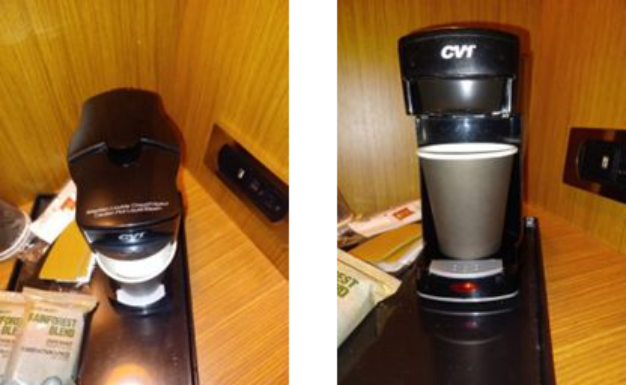
Hotels are prime examples of how visual rhetoric can be applied to design. Consider the following coffee maker (Figure 1). The conventionality of a drip coffee maker is why they are found in many hotel rooms. The average coffee drinker has probably used this type of electric device before. However, when the average male height of 5’9” looks down at the coffee maker, there is no apparent feedback that the coffee maker is brewing. Unless the user kneels so their eye is at a 20–40-inch level, the light signalling that the coffee is brewing is not visible. This mis-signalling causes users to press the brew button several times, turning the coffee maker on or off each time, never having confidence they are going to receive what they expect.
The logos requires a precise and intuitive method of providing feedback to the user, possibly an audible sound, a more appropriately situated light, or both. Good logos requires the designer to understand the user group and the
Aligning User Experience With Communication Theory 547
Figure 1: The top down and profile view of a hotel room coffee maker. The brewing light is not visible from the top-down view but can be seen when looking at the profile of the coffee maker.
symbols and meaning they understand. Each user group is as unique as the unique individuals that make up the group. Therefore, the meaning behind a visual language that communicates with the user group is just as unique. Good logos will communicate effectively across the entire span of the user group.
Users have an emotional attachment to the products they use. Think about what it feels like when using a favorite pen or sitting in a favorite chair. What is it about favorite objects that make them enjoyable to use? Usually, it’s the product’s ergonomic shape, intuitiveness of its use, reliability, and integra- tion into larger contexts. The pathos that impacts the user through the visual object of the coffee pot is vital to craft with a sophisticated level of intuiti- veness. Because drip coffee pots are so ubiquitous in American culture, the designer could incorporate design elements that the user wouldn’t expect but are still slightly familiar with—for example, using saturated and warm colors rather than flat black to communicate freshness and invitation. Or, incorpo- rating longer, smooth arcs and shapes into the design profile is easier on the eye. Sharp, jagged edges communicate expedience and immediacy. The logos also impact the pathos of the coffee pot.
Good logos and pathos ensure that the coffee pot also imparts good ethos. Aligning the visual design of the coffee pot with products and colors that represent familiarity and comfort helps the user to operate under a low cogni- tive load and therefore experience emotions at the appropriate emotional processing level that the task requires. Pathos, logos, and ethos all work to create a pleasant, understandable, stress-free experience. When the user feels that a brand or product has met their needs, it communicates a sense of ethos, safety, and trust upon which the user relies. These delightful experiences deve- lop expectations of how products should work in the future. The product and brand trust can be damaged when the logos and pathos are dysfunctional and do not meet expectations.
548 White and Steinberg
Consider these handy bottles of bath soap, shampoo, and conditioner fixed to the inside wall of the hotel shower (Figure 2). The contrast ratio of the text and background colors makes it difficult for a user to read. What’s more, given that a user with degraded eyesight needing glasses usually does not wear eyeglasses while taking a shower, thereby the problem is exacerbated. Steam in the shower compounds the problem, even further obscuring the visibility of the text.
Figure 2: Body wash, shampoo, and condition bottles hanging inside the shower. The text at the bottom of the bottles is very hard to ready, especially in a steamy shower.
In this case, the designer is attempting to impart comfort and familiarity of use. Usually, hotels offer small bottles of their products, yet at home, users own larger bottles. Offering the larger bottles is an attempt to impart a pathos of comfortability and familiarity. However, the issue is the inability to reco- gnize the visual language itself. Even though the text is present, the color contrast makes the words disappear into the background, inhibiting identif- ying what each bottle contains. The logos is working against the pathos in this example. Even though the product’s placement is unique and convenient, the packaging prevents the content of the bottles from being communica- ted. Even though the intended rhetorical element is not being imparted, there is still a rhetorical element being imparted, which is a lack of logos. When logos suffers and cognitive load increases, the pathos of the experience can be drastically limited. The emotions of frustration and confusion can reduce emotional processing to the visceral level. The visceral level is not negative per se, but when an experience is not expected, emotion, as processed in the visceral level, is black and white, good or bad, trustworthy or not (Norman, 2013). It is significantly easier for a user to evaluate a product as unsati- sfying in the visceral level. Yet, when a product communicates effectively with the user when the user later reflects upon their experiences, the user remembers the ease and comfort of the experiences, esteeming the product as valuable.
Aligning User Experience With Communication Theory 549
FUTURE WORK
The next step in our research is to systematically align the language and the- ories of rhetoric with the principles and concepts that HFE and UX. The goal is to align the two disciplines to include a theory of visual rhetoric into the design process and develop insightful design principles. The authors would like to expand the research to leverage the social communication aspe- cts of rhetoric theory involved in two-way communication to enhance using machine learning to provide a more complete interactive communication experience with our user interfaces.
CONCLUSION
Aligning rhetoric with HFE and UX can support the designer in better under- standing why users love some designs and hate others. The goal is to create better human-centered products through a greater understanding of human faculties, to which communication is central. A theory of visual rhetoric introduces a philosophy of design that strives to provide the most relevant, contextual visual objects as signifiers in a way that identifies with user groups. And two, to understand the processes that transmit meaning to the user. In the future, products with high usability will induce a conversation with the user that best supports an operator’s interactive workflow and operational performance. The visual language of a product can communicate with the user providing the complement of logos, pathos, and ethos so that the user feels the product is inseparable from the user group’s “identification” and how they communicate about their tasks and experiences. Designing produ- cts through the lens of rhetorical principles can provide higher-performing, more satisfying, and better-selling products.
REFERENCES
Norman, Donald (1988). “Preface to the 2002 Edition”. The Design of Everyday Things. New York: Basic Books Buchanan, Richard. “Declaration by Design: Rhetoric, Argument, and Demonstra-
tion in Design Practice.” Design issues 2.1 (1985): 4–22. Web. Buchanan, Richard. “Design and the New Rhetoric: Productive Arts in the Philosophy of Culture.” Philosophy & rhetoric 34.3 (2001): 183–206. Web. Burke, Kenneth. “RHETORIC—OLD AND NEW.” The Journal of general educa-
tion (University Park, Pa.) 5.3 (1951): 202–209. Print. Foss et., Helmers, Marguerite H., and Charles A. Hill. Defining Visual Rhetorics.
Mahwah, NJ: Lawrence Erlbaum, 2004. Web. Garrett, Jesse James. Elements of User Experience, The: User-Centered Design for the Web and Beyond. United Kingdom, Pearson Education, 2010. Norman, Don. Emotional Design: Why We Love (or Hate) Everyday Things. New
York: Basic Books, 2003. Print. Norman, Donald A. The Design of Everyday Things. Revised and expanded edition.
New York, New York: Basic Books, 2013. Print. Saussure, Ferdinand de. Course in General Linguistics. New York: McGraw-Hill Book Co., 1966. Print.
LISTED IN THE AHFE DIGITAL BOOKSTORE CATALOGUE
Explore the complete digital volume
Usability and User Experience
Read this individual research paper free through the original publisher, or explore the full digital proceedings book.
ISBN 978-1-958651-86-5
Explore this ISBN in the AHFE Bookstore ↗Listed in the July 2026 bookstore catalogue; search by ISBN to confirm current availability · Digital book purchase optional