Yifang Wang (2025). The Impact of APP Icon Design Aesthetics on User Downloads. In: Intelligent Human Systems Integration (IHSI 2025): Integrating People and Intelligent Systems. AHFE Open Access, vol. 160, pp. 728–737. https://doi.org/10.54941/ahfe1005879
With the rapid development of the Internet, understanding the popularity of APP icon is crucial for designers and R & D personnel. People 's daily life, work and entertainment are inseparable from downloading APP application software. People pay more and more attention to the design effect and experience effect of mobile products. At present, the research on APP icon mainly focuses on program operation and text attributes, and less attention is paid to the design aesthetics of APP icon,how to make users feel the attraction of app itself to users in addition to considering the necessity of app when downloading app icon is a problem that needs to be studied. This paper uses literature analysis, case analysis and interview to study the impact of APP icon design aesthetics on user downloads. The researchers collected the top three APPs of 12 different types of APPs from the seven-wheat data download list, and used the theory of interface design to analyze their design aesthetics commonalities from the perspectives of color, element complexity and symmetry, and proposed four hypothetical questions. Finally, through the interview method, it is concluded that app icon is more popular with users if it follows the principle of conciseness and clarity, the principle of multiple colors, the principle of multiple colors, the principle of balanced U-shaped and the principle of slight complexity, and the download volume will increase significantly. It is hoped that through the research of this paper, the overall design level of APP icon will be further improved.
Icon is one of the visual design factors related to the product. It is a unique visual component of the brand identity, which helps to distinguish products, improve brand awareness, and influence product selection (Small, Melewar, Ewing & Jevons, 2007). In the context of mobile applications, the APP icon is a concrete and essential representation that contributes greatly to the visual design of the application. Based on the investigation of Shu and Lin in the article “The Emotional Characteristics of White for Applications of Product Color Design”, it was found that icon attributes (including balance, complexity, depth and organic value) help explain the functionality of the application (Shu & Lin, 2014). The icon attribute is considered by the user of the application. Based on the findings of Bohmer and Kruüger in “Study on the single color for the industrial design: Focus on the single color based on the emotional words”, it is shown that icons can affect users’ application search and launch behavior (Bohmer & Kruger, 2013). But there is limited research in the industry on how to attract users through the design aesthetics of APP icons.
The Impact of APP Icon Design Aesthetics on User Downloads 729
APP ICON CONCEPT AND CLASSIFICATION INTRODUCTION The Concept of APP Icon
In the entire UI system design concept, icon graphic design has always played a vital and important historical position. Icon icon refers to a modern computer graphic that is used to convey the inner meaning of a specific graphic and serve as a guide. Although the original origin of computer icon design can at least be traced back to a totem in ancient my country, but in fact modern computer icons are still more fundamentally different from this ancient totem symbol (Lindgaard, Sumegi & Noonan, 2011).
With the rapid development of mobile devices, icon design has realized various aspects, whether on the computer or on the mobile phone. Various effects. These illustrations convey information in many aspects such as shape, meaning, and design, carrying a large amount of information and making the visual effect more beautiful. In addition, the illustrations also use text and symbols in the form of graphics and symbols. Information is displayed to effectively restore the real scene of user experience. Therefore, icon design plays an important role in UI design. It not only conveys information, but also enhances the realism of user experience.
Classification of APP Icon From a functional perspective, it can be divided into the following two categories: one is an icon used directly as an office software logo, and the other is an icon used for other functional logos. These functional icons are mostly derived from various graphic symbols that appear in users’ daily life scenes, and therefore play an important role in promoting the graphical development of computer vision application functions. For example, the image of a little lion is used in Suning.com, the song logo in QQ Cloud Music application, the word “Tao” used in Taobao purchase, the word “Zhi” used in Alipay purchase, and the black character in Tmall shopping application. Cat form. These user image designs are all derived from local life, full of local characteristics and easy for users to recognize.
Figure 1: Five APP icons divided by function (self-drawn by the author).
Figure available in the original PDF paper.
From the physical perspective, it can be divided into the following five categories: the first is graphical representation, the second is silhouette representation, the third is flat representation, the fourth is micro-texture representation, and the fifth category is quasi-physical representation. The pixelated logo only focuses on the outline graphic design and color selection without any smooth lines, such as the image of the gamified check-in application “Habit Island”. Second, the silhouette logo combines the main color gradient of the background with the solid color change of the base
730 Wang
image. It is often used in APP page design for various mobile phones, website homepage selection, and logo design. The third type, flat logo design is mostly widely used in the page selection of various mobile phone APPs, including flat logos such as pure horizontal, light texture, micro-three- dimensional, long shadow, wrinkles plus light texture, or wrinkles plus micro-three-dimensional. design style. Fourth, micro-texture icons, such as those based on the IOS interface, do not completely adopt a flat product design and have some translucent effects similar to frosted glass. Fifth, quasi- realistic materialized illustrations have relatively diverse decorative effects. For example, effects such as projection, perspective, gradient, texture, 3D, etc. Although these six types of materialized icons are realistic and lively and interesting, their use is poor compared to the interface functions.
Figure 2: Five types of APP icons divided by shape (self-drawn by the author).
Figure available in the original PDF paper.
Development History and Current Situation of APP Icon The APP icon is not just a simple control, it is a symbol with strong instruction and guidance meaning. Through concise design elements, it can convey rich semantic information, allowing users to quickly identify and learn the content. In addition, its simple appearance is also conducive to the memory, dissemination and promotion of icons. The development process of App icon can be divided into three important stages (Areni & Kim, 1994). In the early stages, due to limited device storage capacity, poor screen display quality, and the immature App application market with relatively few types of applications, App icon design mainly uses concise images to convey its basic functional information. The icon design at this stage usually uses basic graphics with additional outlines, presenting a simple and rough style.
With the continuous development and popularization of mobile devices, the number and types of App applications have begun to increase, and the quality and style of icon design have also become diversified. At this stage, skeuomorphic icon design has become increasingly popular. Designers incorporate elements such as color, light, shadow, and texture of real objects into icon design, allowing users to quickly identify their functions through skeuomorphic icons. However, due to the widespread use of skeuomorphic icons, the user interface has become messy and complicated, which also increases the burden of device operation and display.
In the third stage, influenced by the minimalist style, App icon design began to develop in a flat direction. The flat App icon design is simple and beautiful, which improves the efficiency of identification and conforms to the public’s aesthetic rule of “from complexity to simplicity”. This design style emphasizes simple, clear and easy-to-understand icon design to adapt to the display needs and user experience of modern mobile devices. Generally
The Impact of APP Icon Design Aesthetics on User Downloads 731
speaking, APP icon design has gone through the development process of “conciseness-realism-simplicity”.
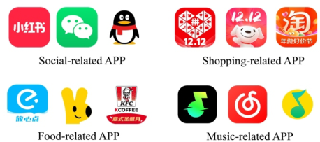
Analysis of Common Features of APP Icon Design Aesthetics Inspired by the role of icons in aesthetic design, and with the support of image processing technology, this study examines the aesthetic impact of APP icon design on user downloading behavior. Based on the review of HCI aesthetics research, three factors affecting the aesthetic design of APP icons are identified, namely color, complexity and symmetry. Many studies have demonstrated the importance of color in user downloading behavior. Color and its composition play a unique role in aesthetic evaluation and can lead to different emotional perceptions. Complexity refers to the variety or richness of a graph. Symmetry is aesthetically appealing and can serve as a cue to direct visual attention. Helps keep the icon balanced and forms a regular structure, thereby improving user understanding. Therefore, color, complexity and symmetry are necessary components of the aesthetic design of the APP icon. According to the “Qimai Data”ranking content, the researchers collected the third-ranked APP among the four major APP categories to summarize their common design aesthetics (Jiao, 2018).
Figure 3: The top three APPs among the four major APP categories (self-drawn by the author).Table 1. App icon design aesthetics common analysis (self-drawn by the author).
Table available in the original PDF paper.
Colour Element Composition Symmetry Chinese script Center font Slight asymmetry
Planar figure Center font Slight asymmetry Chinese script Geometric figure Combination of digit Center pattern Center font asymmetry
Planar figure Center pattern asymmetry (Continued)
732 Wang
Table 1. Continued Colour Element Composition Symmetry
Table available in the original PDF paper.
Cartoon pattern Combination of digit
Center pattern Center digit Slight asymmetry
Chinese script Dazzling background
Center font Slight asymmetry
Chinese script Geometric figure
Center font Slight asymmetry Cartoon pattern Center pattern Slight asymmetry
Center pattern Center font asymmetry
Chinese script English script Linear icon Planar figure Center pattern Slight asymmetry
Planar figure Center pattern Slight asymmetry Planar figure Center pattern Slight asymmetry
From Figure 2, it can be concluded that from the style analysis, the top three APP icons are all flat style. The flat interface style can try to realize the intuitive expression of the spatial concept through the language in the graphic design and the metaphorical design in the interaction. In this way, the user will be able to directly feel the real existence of the spatial elements in the interface in addition to the focus of consciousness in the information.
From the colour analysis, the colour types of the top three APP icons are no more than three. In the previous research topics related to interface colour, the researchers found through interviews that the user hopes that the number of colours on the interface should not exceed three. More than three colours will increase the user’s recognition difficulty and cause the user’s visual burden. Therefore, the control of colour types is also applicable in APP icon design. According to the colour psychology model, users often feel the colour images of flame, sun, stove, hot blood and so on in the face of red, red purple and orange red, and feel a warm and warm emotion. The APP with warm colour has the visual effect of outward radiation and expansion, and is full of vitality and vitality.
From the perspective of element complexity, based on the flat style foundation, the composition of icon elements is not complex, showing four combinations. First, font design is the main element, icon has more white
The Impact of APP Icon Design Aesthetics on User Downloads 733
space, and the background is mostly pure colour or gradient. Second, icon is presented as an animal or IP silhouette, helping to deepen the user’s memory of the product. Third, carefully refine the product graphics from the perspective of functional services, accurately display the product information at a glance (Di & Xinhua, 2012). Finally, the design icon of geometric graphics is used to bring a new visual communication experience of simplicity, modernity, individuality and space sense, which meets the diverse aesthetic expression needs of young users, from a single figurative graphics to a complex and abstract overall space sense.
From the perspective of element symmetry, only one of the 12 popular download APP icons maintains a completely symmetrical design on the graph, so the researchers can assume that adding a slight asymmetry can make the icon vibrant and attractive, help enhance the user’s aesthetic preferences, and increase downloads.
Overall, the common study of design aesthetics shows that popular icon design has a high degree of similarity in common, summarized as flat style, high colour, high brightness and low saturation colour, uncomplicated element composition and slight asymmetry. It is proved that the design of APP icon will affect the number of downloads. Users will care about the appearance of the APP icon and regard it as part of the APP. If an APP wants to be successful in the mobile application market, it should consider the aesthetic design of the APP icon and test the design quality of the icon appearance according to the aesthetic elements.
Research and Analysis of the Impact of APP Icon Design Aesthetics on User Downloads APP Icon Design Aesthetic Considerations Through the theoretical research and case analysis of APP icon’s design aesthetics, we should think first and then design when designing APP visual design. We should first think deeply and examine the following four questions: Will the style of APP icon affect the download amount? Do users prefer flat style or micro-texture style? Will bright color APP icon attract users to download? Does a slightly asymmetric APP icon increase the user’s downloads? Is the APP icon with complex or simple elements more in line with user preferences?
Design of Interview This user interview will be conducted in a combination of online and offline methods, avoiding the use of rigid questionnaires. Instead, participants will be guided to answer the proposed questions in a relaxed and smooth way, accompanied by recording and verbatim recording. Researchers will ask a series of open questions, mainly around the design aesthetics of APP icon, asking them about their preferences for APP icon’s style, color matching, symmetry and graphic complexity. Participants will freely express their ideas and opinions according to their actual situation. The purpose of this interview is to study the impact of APP icon design aesthetics on user downloads.
734 Wang
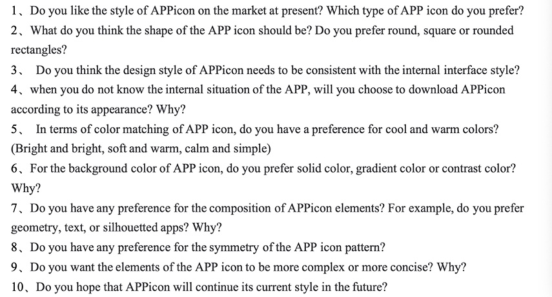
The Content of Interview The interview is divided into ten questions. Firstly, the design style is asked, and the color, element composition and symmetry of APP icon are asked and discussed step by step. The specific questions are as follows:
Figure 4: Interview draft questions (self-drawn by the author).
Interview Results Users today favor app icons designed in a flat or slightly textured style. These styles remove excessive shadows and 3D effects, offering a cleaner, more streamlined appearance that emphasizes clarity and ease of interaction. Flat icons, by their nature, are visually simple, reducing complexity and improving usability across various screen sizes and devices. They also provide faster loading times and adapt well to different environments. Users have expressed a preference for icons that look “tiled” without too much shadow or detail. This minimalistic approach is especially appealing because it helps users quickly identify the app and its function. In terms of color, brightness is a key visual element (Areni & Kim, 1994). Studies have shown that users are more likely to be attracted to brighter, highly saturated colors. For example, one interviewee mentioned the yellow of the Meituan app as being particularly eye-catching, leading to frequent use. Bright colors also increase visibility in app stores or on home screens, making apps easier to locate. Research supports that adults tend to prefer brighter hues, and websites or app icons with higher brightness levels are more attractive to users. Symmetry in icon design is another factor (Palmer, Schloss, & Sammartino, 2013). Respondents favored a degree of symmetry, noting that it brings balance and stability to the design. However, too much symmetry can make an icon feel rigid and dull. Users preferred some level of asymmetry to introduce uniqueness and creativity, as it adds visual interest without compromising the overall harmony. The balance between symmetry and asymmetry can keep designs visually appealing and engaging. Lastly, simplicity in design elements is highly valued (Papachristos, Tselios & Avouris, 2006). Users prefer icons with no more than three components, such as fonts, geometric shapes, or silhouettes. The simplicity makes icons easier to understand, more memorable, and
The Impact of APP Icon Design Aesthetics on User Downloads 735
recognizable at different sizes. Icons that are simple and clean also maintain clarity across varying backgrounds and themes, which is crucial for branding and usability.
The Conclusion of the Influence of APP Icon Design Aesthetics on User Downloads Based on user interviews, the researchers concluded that an excellent APP graphic design can usually be widely recognized, and its icon has a flavor of life and is easy to understand. Excellent APP icon design can combine the connotation of icon with the beauty of form on the basis of popularity, creating novel and changing elements. This artistic design highlights the distinct personality, making the icon unique and avoiding the similarities with other mobile APP icons. Researchers have also sorted out four principles that APP icons that can increase user downloads should meet.
The Principle of Simplicity and Clarity Due to the limited size of the mobile phone screen, APP icon needs to grasp the concise and clear design principles within the appropriate range. The current popular flat style wins more with less, and wins more with simplicity. The flat style is easier to adapt to different screen sizes and devices than the light texture style, and maintains a consistent user experience. At the same time, simple graphics are usually used to reduce page elements and visual noise, which helps to improve page loading speed. Flat design allows icon to convey rich content information with the least design elements, which helps users to memorize and disseminate APP icon. However, it should not be too simple. The internationalist style is a case of failure. Too simple will only lose the human touch and push the distance between APP and users.
Multiple Color Principles The color scheme of an app icon can vary based on brand style. Monochrome uses different hues of one color for simplicity, while contrast colors increase visual impact. Similar colors create harmony, and gradient adds depth if applied smoothly. Brand colors enhance recognition and consistency. Designers should carefully manage contrast, hue, brightness, and temperature (warm/cool) to emphasize primary colors and improve icon recognition. This enhances overall brand identity and helps make the app icon more distinctive and memorable. Effective color use can improve both visual appeal and functionality in an app’s design.
Balanced U-Shaped Principle A slightly asymmetric APP icon design may attract the user’s attention, thereby increasing the user’s downloads in some cases. This is because asymmetric design can break the traditional symmetrical beauty and arouse the curiosity and interest of users. However, designers should pay attention to finding a sense of balance in asymmetry. Although it is an asymmetric design, they still need to maintain an overall sense of balance and avoid too messy or uncoordinated effects. According to the research, the APP icon design that meets the U-shaped curve will be more popular with users (Shuai, 2019).
736 Wang
The Principle of Slight Complexity A slightly complex app icon can stand out among simpler designs, boosting exposure and click rates in app stores. It helps convey the app’s concepts or functions, enhancing user understanding. Additionally, complex designs can increase visual appeal, creating more refined and professional icons, which leave a positive first impression and encourage downloads. However, such designs risk causing confusion or making the icon harder to understand. Therefore, balancing complexity with clarity is key to ensuring a good user experience while maintaining the icon’s effectiveness and appeal.
CONCLUSION
The icon of the APP is very critical. A well-understood icon is not complicated but can obtain a higher visual value in its aesthetic design. At the same time, it should also help to deliver product information to its target users in a simpler, accurate and efficient way, so as to attract more potential target users to click, download and use (Wei, 2023). This may also be a final design purpose of making mobile APP icons, and it is also the ultimate meaning of designing an APP icon. According to the use characteristics and design style of the APP product of the mobile phone itself, the appropriate icon and its expression design method are selected, and the icon diagram of the mobile phone APP product that is more suitable for the software’s own characteristics is developed. It is the key step to design a good mobile phone APPicon to enter the mainstream market application (Shuai, 2019).
REFERENCES
Areni, C. S., & Kim, D. (1994). The influence of in-store lighting on consumers’ examination of merchandise in a wine store. International Journal of Research in Marketing, 11(2), 117–125. Bohmer, M., & Kruger, A., (2013). A study on icon arrangement by smartphone
users. In Proceedings of the SIGCHI Conference on Human Factors in Computing Systems. April 27–May 2, Paris, France. Guo Wei. (2023). Information transmission of graphic design - taking mobile phone App as an example. Art Appreciation (09), 54–57. Jiao Jiao. (2018). master ‘s degree thesis on graphic design and analysis of mobile
phone APP, Xi ‘an University of Engineering). Liu Di & Chen Xinhua. (2012). Visual design of mobile phone interface icon. Design (02), 162–163. Lindgaard, G., Dudek, C., Sen, D., Sumegi, L., & Noonan, P. (2011). An exploration
of relations between visual appeal, trustworthiness and perceived usability of homepages. ACM Transactions on Computer–Human Interaction, 18(1), 1–30 Ni Shuai. (2019). Research on icon graphic design of mobile phone application software. Chinese writers and artists (11), 103–104. Palmer, S. E., Schloss, K. B., & Sammartino, J. (2013). Visual aesthetics and human
preference. Annual Review of Psychology, 64, 77–107. Papachristos, E., Tselios, N., & Avouris, N. (2006). Modeling perceived value of color in web sites, Advances in artificial intelligence. Berlin: Springer.
The Impact of APP Icon Design Aesthetics on User Downloads 737
Small, J., Melewar, T., Pittard, N., Ewing, M., & Jevons, C. (2007). Aesthetic theory and logo design: Examining consumer response to proportion across cultures. International Marketing Review, 24(4), 457–473. Shu, W., & Lin, C.-S., (2014). Icon design and game app adoption. In Proceedings
of 20th Americas Conference on Information Systems. August 7-9, Savannah, Georgia, USA.
LISTED IN THE AHFE DIGITAL BOOKSTORE CATALOGUE
Explore the complete digital volume
Intelligent Human Systems Integration (IHSI 2025): Integrating People and Intelligent Systems
Read this individual research paper free through the original publisher, or explore the full digital proceedings book.
ISBN 978-1-964867-36-6
Explore this ISBN in the AHFE Bookstore ↗Listed in the July 2026 bookstore catalogue; search by ISBN to confirm current availability · Digital book purchase optional