Del Coates (2021). Reconciling Affective and Ergonomic Objectives of Product Design. In: Advances in Affective and Pleasurable Design. AHFE Open Access, vol. 14. https://doi.org/10.54941/ahfe100567
This paper describes a methodology for optimizing the pleasurable affects of a product's design without mitigating ergonomic imperatives. Drawn from well-established principles of psychology and information science, it has been developed and applied in both educational and professional settings. A designer employs it by manipulating just four of a product's visual properties: contrast (objective information); novelty (subjective information); and two properties called objective concinnity and subjective concinnity that facilitate a viewer's ability to process the design's inherent information quickly enough to derive affective pleasure and/or ergonomic benefit from it.
Reconciling the affective and ergonomic objectives of product design is a topic best considered in the context of information theory—even though that word information has acquired many meanings while passing back and forth between common usage and technical or scientific usage: “knowledge,” for example, or “news” are popular everyday meanings. But it also refers to “a collection of data” (statistics); “bits” and “bytes” (computer science), “uncertainty” (physics and communication theory); and “reduction of uncertainty” (psychology and ergonomics).
All those notions regard information as a commodity to be sought, gathered, processed, stored and regurgitated by nervous systems, computers and other information processors. But digging down to the word's Latin roots it also pertains to a process; informare means “to fashion,” “to shape,” or “to give form to” something.
Figure 1. Squeezing a tack informs the finger with affective and ergonomic consequences.
Figure available in the original PDF paper.
An ordinary tack (Figure 1) informs the person squeezing it as surely as a speaker informs a listener. Its point embodies more information than its cap because the curvature of its surface changes in a more pronounced and abrupt fashion than the cap's. The point thus informs the flesh more as it is squeezed and evokes more sensations than the cap—even though Newton's Third Law assures that both ends of the tack exert the same reactive force on each finger. The point increasingly preoccupies the attention and thoughts of the person doing the squeezing as the sensations go from uncomfortable to painful. Squeezing even more tightly would lead to the aesthetic and ergonomic calamity of injury if the mounting urge to back off were not heeded soon enough.
Note: "Aesthetic" replaces "affective" here, but not merely as a synonym for "beautiful." One of the ergonomic objectives guiding design of a tack is to make the cap as anesthetic (devoid of feeling or sensation) as possible by minimizing its curvature and, thus, its inherent information.
PRODUCTS AS MASS MEDIA
Figure 2. A product considered as a mass medium.
Figure available in the original PDF paper.
Table 1. Information Classes and Communication Modes employed by designers.
Table available in the original PDF paper.
Information in a designer's head (knowledge, concepts, ideals, managerial directives, etc.) informs a product's design with three kinds of information: essential; collateral; and discretionary (Figure 2). The product then serves as a communication medium—literally in between the designer and several audiences: users; the public (including potential consumers and users); the press and other media who shape public impressions of the product; and corporate decision makers and designers who are influenced in their shaping of future products. Designers employ linguistic, graphic and empathic (body language) modes of communication to convey three classes of information (Table 1): Essential information, determined by ergonomic objectives, is most critical to users. The hands of an ordinary analog watch provide sufficient essential information to tell time by. They are graphic in nature but also empathic by "pointing out" the time.
Collateral information provided by numbers and minute marks reduce uncertainty further. So they are useful ergonomically, but not essential. They would be essential if the watch were used to time sporting events. The visible knob informs the user where to reset the time. It communicates empathically by tapping cultural stereotypes to "invite" the user to take hold of it and turn it clockwise to advance the time.
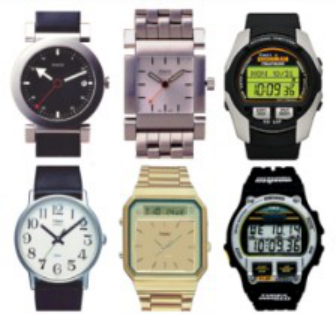
Discretionary information satisfies aesthetic and any other non-essential communication objectives. A watch's brand name is not essential to the watch's purposes. So it is discretionary and could be omitted (although the CEO and marketing manager might argue otherwise). The wave-like symbol suggesting water resistance is also discretionary and expendable. The case's shape is discretionary information. So are its color and the band's material and color. All these visual elements empathically express a watch's semantic profile (Figure 3): whether it is expensive or cheap, accurate or inaccurate, heavy or light. Discretionary information answers all these questions and any others that come to a viewer's mind.
Figure 3. Each watch empathically expresses a different semantic profile via discretionary information Information Budgets
The nervous system can process only so much information at any given moment. So it is important to budget the information load imposed by a product on its user to ensure that non-essential information does not overwhelm essential information. The watch on the lower left of Figure 3 is easy to use because it is dominated by essential and collateral information. The one to its right is dominated by discretionary information. It serves best as jewelry, which can be devoid of essential information. The low contrast between essential elements and their background make it more difficult to use under low ambient lighting conditions. Its rectangular face violates analog principles by forcing reference marks to be unevenly spaced.
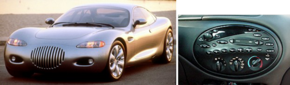
Car designers have almost as much latitude in the use of discretionary information as jewelry designers. The exterior form of a Chrysler concept car (Figure 4) consists almost entirely of discretionary information. Its designers were virtually as free as fine artists to make it empathically express any set of emotions and meanings they saw fit. The turn signals and brake lights were the only sources of essential information that had to be shaped, sized and placed according to legal and ergonomic requirements. Practical requirements dictated things like wheel size and placement of the windshield. But those didn't involve information issues.
Designers achieved a degree of visual harmony inside the 1996 Ford Taurus by setting some displays and controls within an ellipse that harmonized with the discretionary elliptical theme of the car's exterior design. They also exercised the reasonable discretion by including elliptical buttons. But the elliptical arrangement of the buttons introduced considerable uncertainty that made them difficult to use and caused excess driver distraction.
Figure 4. Use and misuse of discretionary information.
INFORMATION AND AROUSAL In a sense, whatever rouses the nervous system, draws attention, and evokes the affective, cognitive and physiological reactions known collectively as arousal is de facto information. The following properties have hardwired or learned arousal potential (Berlyne, 1971):
certain spectral regions (red light has more arousal potential than blue light; sounds in the 500-800 Hz region have less arousal potential than those on either side).
acquired importance (a person’s name, a recognized threat, symbols or signs associated with important matters).
A bright red car is more arousing than a blue one. And a Ford might interest and excite someone named Ford more than a Chevrolet. A bright light and loud horn make effective warning signals. But there is none of the uncertainty normally associated with information. A driver already knows what a red traffic signal means.
They also lack the variance cited as the hallmark of all information in the seminal publication on information theory (Shannon, 1948). The flashing of a car's turn signal is more compelling and informative than its red color.
There are two general categories of information characterized by variance:
Novelty (subjective information) (see Figure 5) arises from comparison of a product's design with its stereotype, a mental model stemming from all similar products seen in the past, especially most recently. The design's novelty is a measure of how much it varies from its stereotype.
Contrast (objective information) (see Figure 6) arises from comparison of simultaneously perceived properties of a product's design. Contrasts can be objectively measured by standard instruments and mathematical means.
Novelty: Subjective Information
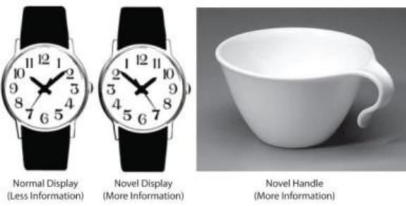
A novel counterclockwise watch (Figure 5) is loaded with the additional uncertainty because it differs from the typical. Like a joke, it's affectively amusing but a burden ergonomically. It requires more time and effort to tell time with it—until its novelty dissipates with practice and the user can tell time with it as easily as with a standard watch. Note that the user has been informed as his watch stereotype has been re-formed; the user has learned something and the watch is no longer novel.
Figure 5. Examples of novelty: a counterclockwise watch and a cup with an unusual handle.
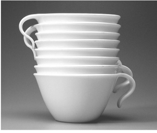
Corning's Corelle cup (Figure 5) seems quite normal except for its novel handle, which grabs attention and compels the viewer to ponder the uncertainty associated with it: "Why is it shaped like that?" and "Can the cup be held securely?"
Contrast: Objective Information The tack's point (Figure 1) provides an example of contrast. It is objective information because the curvature of its surface and its change of curvature can be measured. The tack's cap embodies less information because its surface has less curvature.
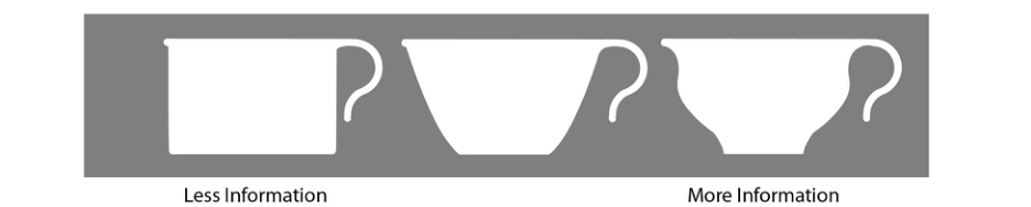
Except for its novel handle, the Corelle cup (middle profile in Figure 6) is quite ordinary. The more complex curve with three changes of direction, which defines the profile to its right, has much more information as contrast. As a result it holds a viewer's attention more surely than the other, less informed profiles. Its body language empathically expresses a more active, emotional, baroque personality. The less informed profile on the left, with its unvarying, straight sides, projects a cooler, more rational personality typical of the German Bauhaus' Modern design.
Figure 6. the variance (contrast) of a cup's profile increases its objective information.
Aesthetic Valence and the Affective-Cognitive Lag Information ignites arousal with its attendant emotions, urges, thoughts and the host of other psychophysical reactions that characterize aesthetic experience. The brain's very rapid affective system, largely responsible for feelings and emotions, is mediated largely by the amygdala, which has been called the seat of fear. Indeed, some studies of brain function suggest that fear is the prototype of all emotions (LeDoux, 1996).
Even the most beautiful design, it seems, frightens if only for milliseconds before it pleases. This is especially so if the emotional kick is due to novelty. The brain makes an instantaneous, “quick and dirty” appraisal of a novel stimulus, usually defaulting to a negative one—unless and until the cognitive system uncovers reason enough to do otherwise. The initial, instantaneous urge is to flee the offending thing by turning away or to fight it by hurling invectives at it like “Ugly!” This is good, of course, because it has implicaitons for survival. Most threats come in the form of something unexpected. Best to shun the unknown until there's time to figure it out. Better safe than sorry.
Arousal persists and increases as long as uncertainty lasts. Brief "arousal jags" associated with a joke quickly gotten and "arousal boosts" associated with beautiful things feel good (Berlyne, 1971). But not the prolonged arousal associated with a joke not gotten while everyone else in the room is laughing.
Unfortunately, the cognitive system, with the cortical means for figuring out the answer to the questions "What is it?" and "Why?" is ponderously slow. Affective and cognitive processes begin simultaneously but cognition always lags behind racy affect. A short affective-cognitive lag associated with a product's design feels good; the viewer likes the design and is drawn toward the product. A long lag feels bad and repels the viewer.
Skilled designers instinctively incorporate a property called concinnity to accelerate cognition and shorten the lag enough to ensure a positive aesthetic result. Basically, the more inherent information a design has, the more concinnity it must have to make sense of it and ensure positive aestehtic valence.
CONCINNITY Most dictionaries define concinnity simply as “harmony,” “symmetry,” or “elegance." Ancient Romans who coined the word had in mind "skillfully arranged parts." Nineteenth century rhetoricians referred to concinnity as a “a close harmony of tone as well as logic among the elements of a discourse.” A concinnous poem about a babbling brook, for example, might phonetically remind the listener of the sounds (tone) emanating from the brook being (logically) described. So it is useful to consider two kinds of concinnity, subjective and objective:
Objective concinnity speeds cognition by facilitating pattern finding (compare with Gestalt psychology’s Principle of Prägnanz).
Subjective concinnity speeds cognition by means of logical and emotional appropriateness.
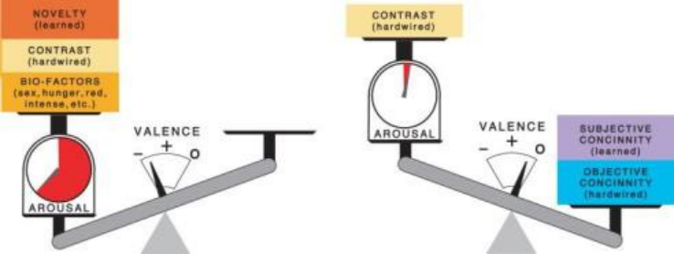
Figure 8: A design's positive aesthetic valence results from an appropriate balance of information and concinnity.
Figure available in the original PDF paper.
A design with positive aesthetic valence (Figure 8) is attractive or, in the extreme, beautiful. Some combination of contrast, novelty and suggestions of biological importance in a design triggers arousal. Some combination of objective and subjective concinnity help the viewer to cognitively "make sense" of the design quickly enough to Affective and Pleasurable Design (2021) keep the associated affective-cognitive lag short enough. Things change over time, of course. Contrast and biological factors remain constant. But, since nothing can remain new forever, novelty begins to dissipate immediately. Arousal, indicated by the "arousal meter" on the left decreases and the design becomes less exciting. Valence swings toward neutral, indicated by the zero. Objective concinnity also remains constant, but subjective concinnity can increase or decrease as the viewer's mindset is changed by the design or changes in such things as trends of cultural values.
Figure 9: Negative valence (left) and neutral valence (right).
Negative valence results from insufficient concinnity (Figure 9). The design continues to be exciting due to lots of information and resulting arousal, but in the wrong way. It is repulsive or, in the extreme, ugly. Since novelty does dissipate, the negative reaction can soften over time. A designer might also fix such a design by reducing contrast (making it simpler) or reducing any arousing biological factors (by changing its color from red to blue, for instance).
A design with neutral valence (Figure 9), which is neither attractive nor repulsive, is the third extreme possibility. While it is dominated by concinnity, it can never be entirely devoid of information. It will always embody some contrast; otherwise it would be invisible. While it might be unexciting aesthetically, a relative excess of concinnity guarantees that it will not be ugly. Indeed, it might find its way ultimately into museaums as a classic. Neutral Valance, might be thought as an "anesthetic" base for outstanding ergonomic quality.Assuming that whatever information does exist serves only essential or collateral needs, neutral valence can be ideal for ergonomic purposes.
Increasing Objective Concinnity
symmetry
horizontal, vertical, orthogonal and parallel relationships
simplicity (minimal number of elements)
mathematically definable by continuous functions of the lowest possible degree (a straight line is more objectively concinnous than a circular, elliptical, or parabolic curve, which are in turn more concinnous than third degree curves)
minimal number of intersections of elements (done by extending lines beyond their end points, and by passing lines through such landmarks as centers of circles)
aligned and flush elements
redundancy (minimal number of unique, one-of-a-kind elements that do not resemble other elements)
minimal variety of elements (shapes, lines, surfaces, colors, proportions, etc.)
proportional relationships limited to integers 1 through 5 (1:1, 2:1, 2:3, etc.) and 1.618:1 (the so-called "Golden Ratio”)
Figure 10: Objective concinnity achieved with symmetry and repetition.
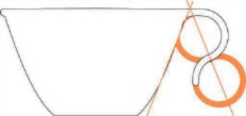
The Corelle cup's handle is part of a virtual combination of two identical circles whose aligned diameters are symmetrical about a vertical axis with the nominal side of the cup.
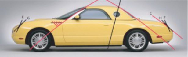
Figure 11: Objective Concinnity achieved with symmetry and repetition.
Several examples of objective concinnity are obvious in the side view of the 2002 Ford Thunderbird (Figure 11). The windshield pillar lines up with one of the front wheel's spokes and passes through the wheel's center. It is also symmetrical with the rear profile of the top, which is, in turn, parallel with the tail (C). The rear edge of the door is aligned with the center of the porthole and the break in the top. The plane of the headlights (E) is symmetrical with that of the taillights (F). The openings for the lights (G & H) are also symmetrical.
While it is impossible to imbue a design with too much subjective concinnity, it can have too much objective concinnity (Figure 12). A symmetrical car, front to rear, slows empathically to a stop, which is out of character with the whole notion of a car.
Figure 12: Excessive objective concinnity can diminish subjective concinnity.Figure 13: Objective concinnity of left ring increased by aligning notch vertically with center or by adding a symmetrical notch.
It is tempting to think of objective concinnity as negative information. But, in fact, the objective concinnity of a design can be increased by adding information (Figure 13). The objective concinnity of the ring on the left is increased by rotating the notch to alight with the vertical diameter of the circle as in the center design. Or, it can be increased by adding a second notch (more information) as in the design on the right.
Subjective Concinnity Essentially any thing in the product’s form that brings to mind thoughts or feelings consistent with the beliefs, values and other aspects of the viewer mindset constitutes subjective concinnity. Subjective factors include:
Clichés. Once a cliché is established it can become so commonplace that it seems essential. So designers consider nothing else for a modern car's design but cast aluminum wheels with an odd number of spokes, which seem more active and sportier than an even number. Consumers are likewise reluctant to consider anything else. Skirts that cover the rear wheels could reduce aerodynamic drag and increase fuel economy but are even less acceptable to designers and consumers than old-fashioned disk wheels (Figure 14). But a cliché can be displaced by a new one overnight and embraced just as fervently. When aerodynamic efficiency becomes truly important again, watch for a return of skirts and wheels with fewer and smaller openings.
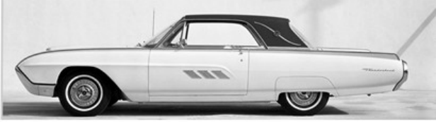
Figure 14. Timely cliché (cast, spoked wheels) and untimely cliché (rear-wheel skirts).Figure 15. 1963 Ford Thunderbird with timely cliché (rear-wheel skirts).
Nostalgia. Much of the appeal of Ford's 2002 Thurderbird stemmed from its nostalgic recall of earlier Thunderbirds like the 1963 T-Bird (Figure 15). Note the simpler wheels, whitewall tires and skirts, which were dominant clichés of the period. It would have seemed declasse without them.
Zeitgeist. An era's zeitgeist (time's ghost) is the stuff of styles, fashions and fads of the day. It changes as a culture's values, concerns and preoccupations change, but usually at a slower rate than the popularity of clichés wax and wane. You can sense that the 2002 T-Bird belonged to a different era than the 1963 version. Neither would have as much appeal today as in their own times.
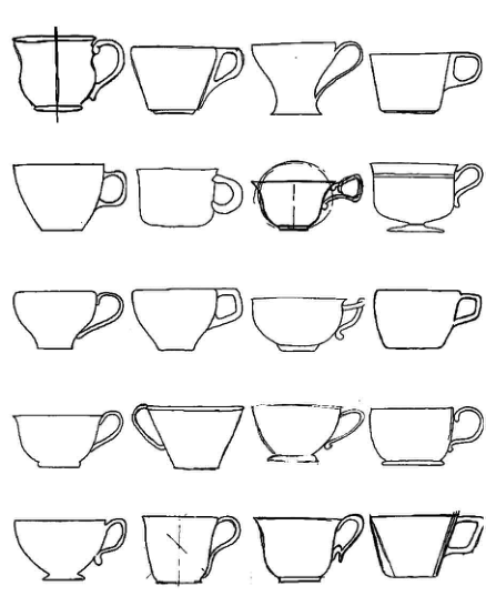
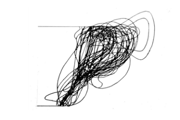
Stereotypes. As part of the study of the Corelle cup's design, a class of 20 first-year industrial design students were asked produce actual size sketches of "the typical coffee cup." It was stressed they should not design a cup but merely depict the typical cup. Best approximations of vertical centerlines were added to each of the 20 sketches. The heights of the sketches were resized as necessary to align the rims and bases of the cups. The one handle oriented to the left (probably drawn by a left-hander) was flipped to the right. Otherwise, the sketches were remarkably similar in size (Figure 16) and needed very little adjustment to normalize them. The ghost of a visual stereotype is quite obvious in the resulting compilation of the 20 sketches (Figure 17). A comparison of a profile drawing of the Corelle cup and a computer-derived mean of the sketches reveals that the actual cup is quite close to the stereotypef. Except for the Corelle cup's novel handle, it is quite normal in appearance. It has a lot of subjective concinnity in this regard.
Figure 16: Sketches of "typical" cups drawn from memory.Figure 17. Visual Stereotypes derived from combined students' sketches (left) and computer-generated average of sketches compared with Corelle cup profile.
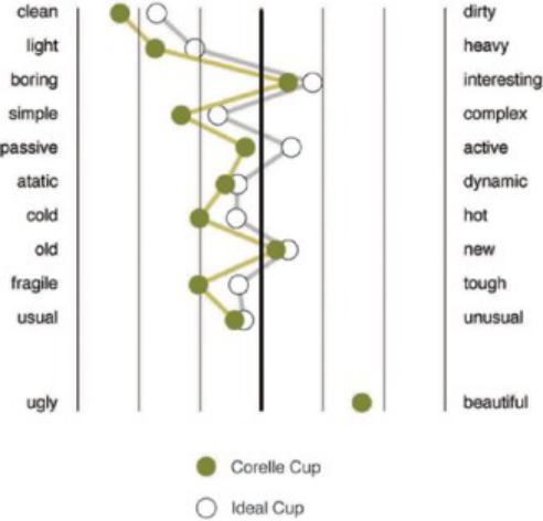
Ideals. A measure of empathic expression of the Corelle cup was obtained by analyzing its design using the semantic differential survey tool developed by Charles Osgood (Osgood et. al., 1955). A different group of students did this several years after the visual stereotype was devised. The resulting semantic profile of the actual cup was compared with a profile of an imaginary "ideal cup" derived by yet another group of students using the same semantic differential survey sheet. The adjective pairs of the survey were randomized left to right and top to bottom. Results were rearranged to place the most significant judgments at the top (Figure 18). They were also rearranged to place adjectives most highly correlated with increased information on the right. An ugly-beautiful scale, added to the Corelle cup's survey, shows that most subjects judged it beautiful, which is consistent with the fact that subjects judged its semantic profile to lie quite close to that of the ideal cup.
The Corelle cup hardly seems in need of more subjective concinnity. It could be tweaked, however, by judiciously changing the mix of information and concinnity enough to bring its semantic profile more in line with that of ideal cup. For example, it would seem heavier, more interesting and more complex with additional contrast. Its profile might be made more baroque, as the example in Figure 6. But this might make it dirtier, which could be counter-productive. A cup should surely seem as clean as possible.
Figure 10. Semantic Differential surveys of Corelle cup and Ideal Cup compared.Figure 16: Sources of Subjective Concinnity in the novel shape of the handle.
Agency. We never lose a basic regard for what can best be called agency, from a Latin word meaning, “to do.” The maxim that “form follows function” is as venerable as any other guiding principle of design. A product's form should express what it does—or at least not contradict its purpose. The Corelle cup's novel handle makes sense and thereby contributes subjective concinnity to the overall design in three ways (Figure 16): (1) the handle holds the user's fingers away from the hot body of the cup; (2) the handle mimics the Coanda effect, a physical phenomenon that causes a fluid to hook back onto the container it flows from (as in the case of a dribbling teapot); and (3) because it permits cups to be nested, many more of them can be stored in a given space.
CONCLUSIONS
With just four powerful and readily quantifiable factors to juggle (contrast, novelty, objective concinnity and subjective concinnity), virtually any product design can be optimized with respect to both affective and ergonomic objectives. Because these factors are definable and quantifiable in terms of information theory, they lend themselves to incorporation into computer-aided design (CAD) technology.
REFERENCES
Berlyne, D. E. (1971). "Aesthetics and Psychobiology". New York: Appleton-Century-Crofts. LeDoux, J. (1996), "The Emotional Brain: The Mysterious Underpinnings of Emotional Life". New York: Simon and Schuster. Osgood, C. E., Suci, G & Tannenbaum, P (1957). "The Measurement of Meaning". Urbana, IL: University of Illinois Press. Shannon, C. E. (1948), "A mathematical theory of communication". The Bell System Technical Journal, Vol. 27.
LISTED IN THE AHFE DIGITAL BOOKSTORE CATALOGUE
Explore the complete digital volume
Advances in Affective and Pleasurable Design
Read this individual research paper free through the original publisher, or explore the full digital proceedings book.
ISBN 978-1-4951-2109-8
Explore this ISBN in the AHFE Bookstore ↗Listed in the July 2026 bookstore catalogue; search by ISBN to confirm current availability · Digital book purchase optional