Nan Zhai, Xiaojun Liu, Miaomiao Zhou (2021). Color Laws and User Preferences in Product Color Design. In: Human Systems Engineering and Design (IHSED2021): Future Trends and Applications. AHFE Open Access, vol. 21. https://doi.org/10.54941/ahfe1001160
Morandi colors are popular in architecture, home furnishing, clothing, and other applications. The laws of Morandi colors will be summarized in this paper, at the same time, its color matching is applied to the design of products to explore the factors affecting user preferences. Morandi colors of different hues have medium and low saturation and lightness. Also, the color matching is harmonious, which can bring people comfortable and pleasant visual feelings. Furthermore, Morandi colors on products of modern, elegant, and exquisite visual characteristics are the factors of user preferences, and the color matching can satisfy the basic requirements of function, interaction, and safety. The results can provide guidance for the application of Morandi colors in product design.
Human Systems Engineering and Design (IHSED 2021) https://openaccess.cms-conferences.org/#/publications/book/978-1-7923-8987-0
INTRODUCTION
The colors in the works of the famous Italian oil painter Giorgio Morandi are known as "Morandi color". These colors are attached to the bottle, box, and other simple geometries, showing a high level of beauty. In recent years, the application of Morandi color matching in the design of costume in films and TV plays and home decoration has attracted people's attention. Morandi color is a kind of low-saturation gray color that is understated and elegant, becoming the new aesthetic trend (Xie, 2018). The reason why Morandi color is popular with users is that the ratio of hue, lightness, and saturation has a good coordination relationship. Therefore, this paper aims to find out Morandi color laws and Morandi color preference factors of users. In terms of Morandi color application, colors with moderate gray tones are applied, which are elegant and attractive. Its color matching gives designers great inspiration. Designers select representative colors from these elegant gray colors for color matching which has been well used in painting, clothing, and home decoration (Feng, Yan, Tang, and Zhang, 2018). However, the application and research of Morandi color in product color matching are few. In this paper, the Morandi color is introduced into daily products. A set of tableware and a water cup are taken as examples to verify users' preference for Morandi color matching and analyze its influencing factors to provide theoretical references for the Morandi color matching of products.
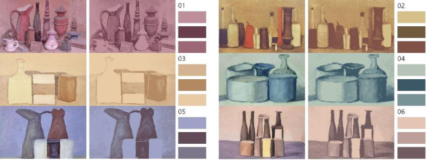
COLOR EXTRACTION AND COLOR LAWS To explore Morandi color laws, colors are found at their source in painting works. This color system has been applied in some fields, so it has formed some color combinations that are popular with users. The color extraction is carried out by selecting Morandi's paintings. Six different colors of hue (red, orange, yellow, green, blue, purple) can be selected as representatives of the hue ring. Six paintings are selected according to six different colors to ensure that the hues of colors in the six paintings are different (see Figure 1).The representative colors extracted from these pictures are composed of color cards as references for color matching. Pictures with 256 colors are modified and optimized into a three-color picture by editing the color table command in Photoshop. The three colors in each group are used to represent the entire image and form a set of color cards. The principle of image color simplification is as follows. First, the image with rich colors is pixelated. The image color can be simplified to a few after constant optimization of extracting the average color in each pixel (Sun, 2018). The image colors are simplified into three main colors, which can best represent the image in terms of hue and saturation. The lightness of the three colors is also composed of dark, light, and middle tones. Three colors extracted from each picture are used as a color card for color matching. A total of six color cards are obtained (see Figure 1).
Human Systems Engineering and Design (IHSED 2021) https://openaccess.cms-conferences.org/#/publications/book/978-1-7923-8987-0
Figure 1. Color exaction and color cards. (Adapted from Duitang website, 2018, 2019, Huban website, 2018, and Sohu website, 2018)
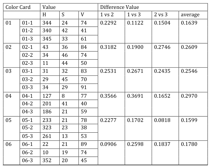
HSV color model is a color space model with the color placed in the hexagonal cone model (Lai, Chen, Shih, Liu, and Hong, 2010). H (Hue) represents the color information and the position of the spectral color. It is measured by angel which ranges from 0° to 360°. The color is calculated in the counterclockwise direction starting from red which value is 0°. S (Saturation) represents the Saturation range of 0% ~ 100%, and the higher the value is, the more saturated the color is. V (Value) represents the brightness of the color, which ranges from 0% (black) to 100% (white). HSV color model can intuitively represent the attributes of color, which is more similar to the way people describe and explain color and has better perceptual consistency (Lai, et al. 2010). Therefore, this model is chosen for analysis and comparison of Morandi color cards. HSV values of each color card were taken out respectively (see Table 1), which are used to compare and analyze three color attributes. The following conclusions can be drawn through the analysis. First, the six groups of color cards have differences in hue. Second, the saturation value is between 8 and 45, all less than 50%, indicating that the color selection is of medium and low saturation. At the same time, the color of the same color card has similar saturation values, which proves that Morandi color is a kind of color scheme with similar saturation. Third, the overall distribution of lightness values is between 40 and 80, which belongs to the color combination of medium and low lightness although the low, medium, and high degrees of lightness in the picture are retained.
In the HSV color model, each color is placed at a position in the hexagonal cone model space where there is a spatial distance between colors that can be defined as the difference between the two colors (Lai, et al. 2010). The difference value be- tween two colors (H1, S1, V1) and (H2, S2, V2) is usually expressed as equation 1, which can be used to show whether the two colors harmonize (Lai, et al. 2010). For the calculation of lightness and saturation in the formula, the values within the range of 0-100 are converted into the measurement range of 0-1 for calculation. In this way, the difference between the two colors calculated by the formula ranges from 0 to 1. When the result is close to 1, the perception of the two colors is very different. On
Human Systems Engineering and Design (IHSED 2021) https://openaccess.cms-conferences.org/#/publications/book/978-1-7923-8987-0 the contrary, the result of two similar colors is close to 0 (Lai, et al. 2010).
2 2 2 2 1 1 1 2 2 2 2 1 1 1 2 2 1 ) sin sin ( ) cos cos ( ) ( 4 1 H S V H S V H S V H S V V V C [Equation or mathematical symbol available in the original paper PDF][Equation or mathematical symbol available in the original paper PDF][Equation or mathematical symbol available in the original paper PDF][Equation or mathematical symbol available in the original paper PDF][Equation or mathematical symbol available in the original paper PDF][Equation or mathematical symbol available in the original paper PDF][Equation or mathematical symbol available in the original paper PDF] (1) Based on this formula, the color difference of the three colors in each color card is calculated pairwise, also the mean value of the difference of each color card is calculated. The calculated results are shown below (see Table 1). The mean value of the color difference of each color cards is less than 0.3 which is a small value close to 0. It indicates that, in general, the color harmonization degree of Morandi color matching is relatively high, which can bring people a comfortable and pleasant visual feeling.
Table 1: HSV values and difference values of color cards Color Card Value Difference Value H S V 1 vs 2 1 vs 3 2 vs 3 average 01 01-1 344 24 74 0.2292 0.1122 0.1504 0.1639 01-2 340 42 41
Human Systems Engineering and Design (IHSED 2021) https://openaccess.cms-conferences.org/#/publications/book/978-1-7923-8987-0
THE EXPERIMENT OF USER PREFERENCE FOR THE APPLICATION OF MORANDI COLOR IN PRODUCTS The preferences theory was first studied as a branch of philosophy. Aristotle defined it as the tendency of the subject to compare the relationship between two phenomena or states (Dang, Zheng, and Ming, 2016). User preference is a word that describes the psychological state of users. It is a perceptual factor, also it represents the qualitative research of users' likes or dislikes (Dang, et al. 2016). However, the influencing factors of user preference can be studied quantitatively. They are affected by users' culture, cognition, gender, using habits, the environment of the target object, and their own characteristics. These factors can be further analyzed by the data obtained from users' subjective evaluation (Hsu, Chuang, and Chang, 2000). This experiment aims to explore the influence of product color matching on user preference and its influencing factors.
Experimental Preparation Different types of products have different requirements which meet different levels of user needs for color matching. Morandi color, with its low saturation, is easy to create a comfortable and elegant atmosphere and increase the pleasure of users. Since Morandi color itself is popular with the public, the application object of this experiment is tableware that can often be contacted by the public in daily life.
Product color matching is related to human physiology, psychology, and user behavior attributes, and the color is also the emotional appeal of users (Tang, 2010, Lin, 2016). Colors need to meet the requirements of function, structure, and ergonomics when they are used on the product (Lin, 2016). The influencing factors of product color matching and user preference are obtained based on the research of relevant literature and color matching of daily necessities. User preference for product color focuses on four perspectives: visual sense, function, interaction, and safety (see Table 2). There are several groups of adjectives corresponding to the four angles. 11 typical pairs of adjectives were selected by asking several designers, students, and other professionals to select and score these adjectives to eliminate repetition and cross-meaning words.
Materials and Methods
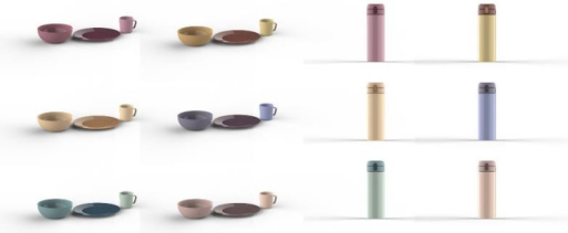
A set of dishes (There are three objects in a group in which each product is given a color that matched with the color on the color card.) and a water bottle (A water bottle is given three colors on the color card.) are selected as the application objects (see Figure 2). The experiment was carried out by questionnaire survey. The subjects are required to have good vision, no color blindness, and no color weakness. At the same
Human Systems Engineering and Design (IHSED 2021) https://openaccess.cms-conferences.org/#/publications/book/978-1-7923-8987-0 time, in order to avoid too subjective test results, the subjects are required to have no personnel in art, design, or construction industries. The experimental materials were imported into the questionnaire, and a seven-level semantic difference questionnaire was set up. Descriptive adjective pairs are derived from the factors that influence user preferences. The subjects are asked to rate these aspects expressed by the product color matching. Then the scoring data were imported and analyzed by SPSS software.
Figure 2. The application of Morandi color matching
Results
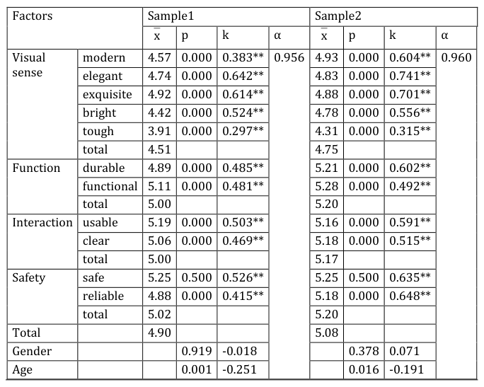
A total of 170 valid questionnaires were collected after the invalid questionnaires were eliminated, including 150 from online tests and 20 from offline tests. The samples ranged in age from 18 to 60 and are equally distributed between men and women. The experimental data were imported into SPSS software for analysis. Firstly, reliability analysis was conducted. Cronbach α coefficient are 0.956 and 0.960, which are both greater than 0.8, indicating that the results had high reliability (see Table 2).
The preference values of sample 1 and sample 2 are 4.90 and 5.08 respectively, indicating that color matching can basically meet users' demands for use. The score of sample group 2 was generally higher than that of sample group 1. The product of sample 1 has single shapes in a group, and the color is spread on the geometry in a large area. While the water cup in sample 2 has multiple parting surfaces matched with different colors. Multiple colors in one shape can be more appealing to users. So, in terms of Morandi color matching, it is easier to create a sense of hierarchy and be more liked by users when the contrast of different col-or areas is larger.
The score of the sample 1 and sample 2 in semantic difference measurement have some consistency. From the median level, except for "bright" and "tough", the value is around 5, indicating that the color matching can express the meaning conveyed by the adjectives. On the contrary, this kind of color matching also gives people a little dark and soft feeling. See Table 2 for specific values.
From the perspective of visual sense, semantic word description has a significant positive correlation with overall preference. The scores of "modern", "elegant" and
Human Systems Engineering and Design (IHSED 2021) https://openaccess.cms-conferences.org/#/publications/book/978-1-7923-8987-0
"exquisite" are higher, indicating that the modern, elegant and exquisite style conveyed by the Morandi color matching on products is favored by users. A low score for toughness indicates that users like its softer look on the product. In terms of function, semantic word descriptions are positively correlated with the overall preference, indicating that the color matching can reflect the durability and function of products. As for the interaction, semantic word descriptions are significantly positively correlated with the overall preference, which can ensure that the product is easy to use. From the perspective of security, the correlation between the semantic word security and the overall preference is not significant, indicating that this has a small impact on the user preference. According to Table 2, the Pearson coefficient (P) between the user's preference for Morandi color matching and the gender is 0.919 and 0.378 respectively, far greater than 0.05. So, there is no obvious relationship between user preference and gender. However, in terms of age, P values are 0.01 and 0.016, showing a strong correlation. The correlation coefficient is negative, indicating that the older the age, the smaller the degree of preference. The younger group is more interested in Morandi color.
Table 2: Preference factors Factors Sample1 Sample2 [Equation or mathematical symbol available in the original paper PDF]x p k α [Equation or mathematical symbol available in the original paper PDF]x p k α
Human Systems Engineering and Design (IHSED 2021) https://openaccess.cms-conferences.org/#/publications/book/978-1-7923-8987-0
CONCLUSIONS
Morandi colors of different hues have medium and low saturation and lightness. The color matching is harmonious, which can bring people elegant and pleasant visual feeling. Morandi color matching can be applied to product design and be welcomed by users. It is easier to create a sense of hierarchy and be more liked by users when the contrast of different color areas on products is larger. Further-more, Morandi colors on products of modern, elegant, exquisite visual characteristics are the factors of user preferences. Also, the color matching can satisfy the basic requirements of function, interaction, and safety. The Morandi color laws and the results of the user preference experiment can provide guidance for the application of Morandi colors in product design. Designers can use Morandi color scheme to convey exquisiteness and elegance. This color scheme is also easy to fit into the usage environment and not easy to produce visual fatigue and aesthetic fatigue.
REFERENCES
Culture and Arts Newspaper. (November 1, 2018) Morandi's concept of abstraction and concreteness. The Sohu Website: https://www.sohu.com/a/272594863_556618/ Dang Y., Zheng S., Ming, J. (2016) Research on the Construction of Mobile Library
User Preference Model under the Multi-dimensional Perspective. Information Theory and Practice. 39, 104-108 Feng X., Yan H., Tang X., Zhang C. (2019) Morandi’s Application in Hone Space.
Furniture and Interior Design. 11, 104-105 Giorgio Morandi. (March 13, 2018) The Huaban Website: https://huaban.com/pins/1550748222/ Hsu, H., Chuang, C., Chang, C. (2000) A semantic differential study of designers’
and users’ product form perception. International Journal of Industrial Ergonomics. 25(4), 375-391 Lai, C., Chen, P., Shih, S., Liu, Y., Hong, J. (2010) Computational models and experimental investigations of effects of balance and symmetry on the aesthetics of text-overlaid images. Human-Computer Studies. 41-56 Lin, X. (2016) Color Interaction and Originality Projection in Design Innovation.
Packaging Engineering. 37(22), 48-51 Morandi. (May 3, 2018) The Duitang Website: https://www.duitang.com/blog/?id=921238507/ Pingexueyuan. (December 26, 2019) Morandi: I guess I've always been a believer in
art for art's sake. The Duitang Website: https://www.sohu.com/a/363095515_99958671/ Sun, Y. (2018) Research on local color tampering detection of digital image. Tianjin Polytechnic University, Tianjin Tang, C. (2010) From Color Composition to Color Design. Art and Design. 05,82-83
Human Systems Engineering and Design (IHSED 2021) https://openaccess.cms-conferences.org/#/publications/book/978-1-7923-8987-0
LISTED IN THE AHFE DIGITAL BOOKSTORE CATALOGUE
Explore the complete digital volume
Human Systems Engineering and Design (IHSED2021): Future Trends and Applications
Read this individual research paper free through the original publisher, or explore the full digital proceedings book.
ISBN 978-1-7923-8987-0
Explore this ISBN in the AHFE Bookstore ↗Listed in the July 2026 bookstore catalogue; search by ISBN to confirm current availability · Digital book purchase optional