Jorge Gil Tejeda, Lorena Olmos Pineda (2024). Cultural perception of dominant color in static systems. In: Design for Inclusion. AHFE Open Access, vol. 128, pp. 40–48. https://doi.org/10.54941/ahfe1004789
Color is a fundamental component of various systems as well as a crucial aspect of everyday life for members of a given culture. Numerous studies have been conducted on how humans distinguish different colors, the effects of color on human behavior and risk factors, cultural differences in color perception, among many others. The goal of this empirical study was to evaluate how certain language components affect the perception of dominant color in certain static objects. To this end, a categorization of the static objects to be analyzed was generated, for which 18 digital works by Van Gogh were chosen. Additionally, the dominant color of each work was determined based on a color sample from each image, and color cards were generated using the hexadecimal system. Sixty-six volunteers were surveyed, who provided self-reported data on their age and context, and were given the freedom to select the color card that they believed corresponded to the dominant color in each presented image. Additionally, users were allowed to individually explore each image and its components. The findings show that there is a variation in the perception of the dominant color in the category of components integrated by textures in relation to the perception of color in the category of components integrated by people-animals, and everyday objects.
Color perception is a relevant topic as it is a part of our daily lives and has been approached in various fields of knowledge such as art, design, architec- ture, among others, from an artistic perspective to a greater extent. However, color perception in certain contexts can affect people’s daily lives, the objects they interact with, the information to which they delegate attention among multiple factors. There is research related to modifying human behavior linked to this factor. From this perspective, studies conducted by Babin et al. (2003) suggest that consumers process atmospheric characteristics holisti- cally (Babin et al., 2003). Similarly, Babur and Connolly (2011) studied how color perception can be affected not only by other colors but also by other atmospheric factors such as hypoxia in certain contexts, which focused on
Cultural Perception of Dominant Color in Static Systems 41
studying the effects of hypoxia on color perception, visual acuity, and con- trast sensitivity (Barbur & Connolly, 2011). Likewise, Babur has contributed to other studies on detecting vision loss (Vemala et al., 2017). On the other hand, impairments related to color perception can impact people’s safety in certain contexts. From this perspective, there are studies that have shown that color enables performing specific and specialized tasks in contexts such as aviation (Rodriguez-Carmona et al., 2012), navy, military, police, medicine, and other visually demanding work environments (Barbur & Rodriguez- Carmona 2017). Likewise, color can generate a categorization of products into hedonic and utilitarian in certain virtual contexts (Cai & Xu, 2011), and color appreciation determines certain behaviors in specific sectors related to particular objects (Boon & Dain, 2015). On the other hand, studies have detected alterations in color perception due to age. In this sense, studies con- ducted by Babur & Rodriguez-Carmona (2016) have been relevant, where they found that the thresholds for Red and Green; Yellow and Blue colors gradually decrease with age (Barbur & Rodriguez-Carmona, 2016). Addi- tionally, plasticity in color perception has also been explored in individuals with a level of deficiency in it (Isherwood et al., 2020). New quantitative methods have been introduced to better understand the impacts of color and its impact on daily life. This includes the methodology employed by Rabin, Gooch, & Ivan (2011) for measuring color vision using the Cone Contrast Test (CCT) (Rabin et al., 2011), as well as detecting deficiencies in color perception through the Color Perception Deficiency Severity Index (CGDI) (Rodriguez-Carmona et al., 2012). Likewise, given the qualities of color and its influence on human behavior, color can be approached as a type of language that is affected by other languages. This is the case with Schir- illo (2001), who reviewed literature on how color is perceived and used as a language in different cultures (Schirillo, 2001); Regier, & Kay, (2009) ana- lyzed Whorf’s hypothesis on how language influences the way we think and perceive the world from the perspective of color (Regier & Kay, 2009); Kay & Regier, (2006) observed that there is a close relationship between naming color and perception of it (Kay & Regier, 2006); and Hardin & Maffi, (1997) highlighted that the way people categorize and name colors varies worldwide and how this language categorization related to color influences a person’s cognitive processes (Hardin & Maffi, 1997). Based on the literature review, color is a factor that affects people in multiple dimensions, including cogni- tive, psychological, physiological, and cultural. However, many studies still need to be done to better understand how color affects us in each of these dimensions, especially in an era where the influence of digital media has led to the perception of intercultural objects. In this sense, this study focuses on the study of color from the perspective of a local culture, where the aim is to observe how people perceive the dominant color in objects that are not part of their culture and have the quality of being static. For this purpose, paint- ings by an internationally recognized artist such as Van Gogh were chosen as static objects. However, we encountered the problem that these types of objects are integrated by a complex structure of visual signs such as shapes, colors, and textures (Wolfflin, 2015), which led us to approach them as static
42 Tejeda and Pineda
systems. Therefore, we decided to observe how the perception of the dom- inant color is affected by its interrelation with other visual components of the painting, such as shapes and textures. For better control, the indepen- dent variables were categorized into landscapes; category linked to textures, people-animals; category linked to shape recognition, and everyday objects; category linked to object recognition. Regarding the dependent variable, a sampling of the dominant color of a group of 18 digital paintings by Van Gogh was generated. The study only focused on Mexican volunteers at this stage. Furthermore, it was found that people must perform at least two types of processes in selecting the dominant color: visual perception and shape identification. In this sense, the study will not focus on analyzing the inter- nal process; however, it is based on recognized positions that refer to these specialized processes being carried out naturally in people.
METHODOLOGY
The study was divided into six phases: In the first phase, an empirical approach was used where volunteers self-reported their age, mood, medica- tion or alcohol consumption conditions, cultural context, level of education, disciplinary field, and gender. The context was classified into five regions based on the geographic location of the states and their proximity to the Pacific Coast, Gulf of Mexico, and Caribbean Sea. The regions were: North Region, Pacific Region, Central Region, Gulf Region, and Southeast Region. In the second phase, perceivers were assigned the task of observing a series of digital images and then detecting the dominant color in the image. The dom- inant color for this exercise was determined by the color that occupied the largest area in each image. For this purpose, the 50% of colors that integrated each image were obtained from a sample. Based on the data obtained, the dominant color was determined according to the highest percentage of color coverage obtained from the color sample, and this procedure was carried out with the 50% of predominant colors in each artwork. Based on this infor- mation, color cards were generated relative to the image in the hexadecimal system. In the third phase, a series of digital artworks were presented to the participants along with the color cards relative to each image, which were pre- sented in the same order and with the same dimensions. In the fourth phase, the participants selected the color identified as dominant. In the fifth phase, the results were analyzed, with special attention given to the perception of the dominant color and its relationship with certain components of the image as part of a structured language configured by the artist. In the sixth phase, the interaction between objects in the images with higher and lower assertiveness was analyzed. The exercise was carried out in Mexico. It is important to men- tion that the technological devices used for color reproduction were personal. There is no single calibration standard for all devices, as each manufacturer uses their own calibration and color adjustment methods. However, some manufacturers have adopted industry standards to ensure that their devices reproduce accurate and consistent colors. Based on this, only those devices that comply with the sRGB and P3 standards were selected, taking into con- sideration those devices under these standards where users had not modified
Cultural Perception of Dominant Color in Static Systems 43
the color settings and they were set by the factory. Likewise, the devices under both standards are not older than 2015. Based on some recent studies, it has been observed that modern screens are capable of displaying images much closer to reality (Masia et al., 2013).
PROCESS DESCRIPTION Of the total volunteers, it was observed that 54.6296% selected the correct Dominant Color (DC), of which 34.2592% were women and 20.3703% were men. Four images were detected with the highest percentage of DC assertiveness: IM2, IM10, IM12, IM17. Similarly, two colors were detected as having the highest assertiveness: yellow (IM2) and gray (IM10, IM12, IM17). In the case of IM2, the dominant color covered a total of 34.90% of the surface area; for IM10, DC = 44.20%; for IM12, DC = 41.10%; and for IM17, DC = 31.80% See Table 1. Therefore, the image that obtained the highest percentage of coverage with the gray color was IM10 with 44.20%, but it was not the most assertive. The most assertive one used a yellow color language with a difference of 9.3% coverage on the surface. On the other hand, it was also observed that the image with the highest assertiveness in the dominant color was the one with the highest illumination based on CIE-Lab standards, with L = 75.5.
Table 1. Color identification. Where: C=Category; IM=Image; CD=Assertiveness of Dominant Color; CDM=Dominant Color by Sampling; SH=Hexadecimal Sys- tem; NC= Color’s Name; I=Illuminance CIEL*ab.
Table available in the original PDF paper.
C ID CD CDM SH NC I CIE-L*ab PAISAJE IM1 71.21212121 23.70% #769cd1 Blue 63.533 PAISAJE IM2 98.48484848 34.90% #cebb45 Yellow 75.51 OBJETO IM3 74.24242424 40.70% #c0a657 Brown 68.873 PAISAJE IM4 54.54545455 38.60% #555346 Grey 35.123 PAISAJE IM5 18.18181818 65.00% #43433e Grey 28.262 PAISAJE IM6 40.90909091 72.10% #4f3f30 Brown 27.929 OBJETO IM7 25.75757576 36.40% #44352e Grey 23.581 OBJETO IM8 72.72727273 23.60% #c8b599 Grey 74.59 OBJETO IM9 75.75757576 33.00% #2d3155 Violet 21.617 PERSONA IM10 95.45454545 44.20% #636b59 Grey 44.074 PERSONA IM11 84.84848485 28.80% #6d402d Brown 32.052 PAISAJE IM12 93.65079365 41.10% #b3b1a4 Grey 72.033 PERSONA IM13 3.03030303 22.50% #3e392d Grey 24.129 PERSONA IM14 27.27272727 19.40% #8bb6c5 Blue 71.538 OBJETO IM15 37.87878788 22.70% #495b77 Blue 38.252 OBJETO IM16 15.15151515 33.10% #262822 Black 15.722 PERSONA IM17 92.42424242 31.80% #868d6f Grey 57.334 PERSONA IM18 6.25 21.30% #8a5b2e Brown 42.89
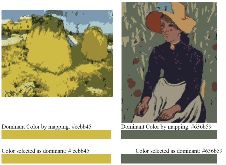
This behavior correlates with scientific studies that suggest that brighter colors appear to occupy more space (see Fig. 1). Therefore, some factors that clearly influence the perception of the dominant color are its level of
44 Tejeda and Pineda
luminosity and percentage of coverage. However, it was observed that these are not the only components of the images presented in this study; other factors detected were textures and shapes. For this reason, we proceeded to analyze people’s behavior in relation to the perception of the dominant color and the structural components of the image, classified into three categories: landscapes (where textures are perceived to a greater extent), people-animals (where there is a defined formal component), and everyday objects (where there is a defined formal component). Based on this classification, it was detected that landscape images had the highest assertiveness in relation to the dominant color, with a total of 20.9435%, of which 13.3838% were women and 7.3232% were men. Additionally, there is another quality in the language of the image related to horizontal and vertical orientation (see Fig. 1).
Figure 1: Images resulting from color mapping. Based on Van Gogh’s paintings. Dominant colors by sampling from IM2 left, and IM10 right. Likewise, the image clas- sification IM2=Landscape, IM10=Person (Elaboration Olmos & Gil 2023 by Tineye).
The presentation by sampling was clear regarding the dominant color of the image; however, the results show that there is a difference in the assertive- ness of the dominant color when two types of visual languages are used in the image: textures and shapes. In the case of IM10, unlike assertiveness, it is probably not determined by the color that expands most perceptually or the brightest, but by the focal attention that the person gives to the components of the image, in this case, the human form. In IM10, the dominant color corresponds to the tone #606958 with 45.6% coverage; however, 15.1515%
Cultural Perception of Dominant Color in Static Systems 45
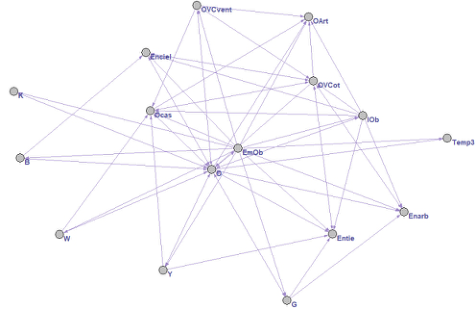
of people chose the tone #22202e corresponding to the color of the person’s blouse represented as the dominant color, suggesting an affectation derived from the representation. The mapping helps to perceive that the highest per- centage of color does not lie in a fragment of the representation of the person but in the background. Since it was observed that there is an effect derived from the configuration of the elements of the image in relation to the percep- tion of the dominant color, it was determined to analyze how the components of the image with higher assertiveness interact and their relationship with the dominant color (IM2), as well as with the components of the image with lower assertiveness (IM13). The process was described and analyzed using static networks, so the factors to be analyzed in IM2 were identified in the image: Objects (O), Object-Object Interaction (IOb), the colors Black (K), White (W), Green (G), Blue (B), Yellow (Y), Gray (Gr), Everyday Life Objects (OVCot): Windows (OVCvent), Elements of Nature: Trees (Enarb), Natu- ral Elements: Earth (Entie), Natural Elements: Sky (Enciel), Objects: Houses (Ocas), Objects identified as handcrafted or artisanal (OArt). According to the analysis of the IM2 network (Fig. 2), the factor with the highest input and output centrality was diverse typologies of objects, among which stand out: colors, W, K, Y, G, B, OVCvent, OArt, Enciel, Entie, Enarb, Ocas. The typology of objects with the greatest influence were those related to every- day life and color. The colors that most affected other components were Y and G, the latter not appearing in a pure form but in combination with yel- low tones. It can be observed in the network that the color component is very close to other objects that make up the image, such as Entie, Ocas, OVCvent, Enciel, and Enarb. In general terms, an interaction between objects (IOb) is distributed among homogeneous factors (typologies of objects).
Figure 2: IM2.v112. Static network where the interrelation of elements in the painting can be observed. Image with higher assertiveness. Modeled in Pajek.
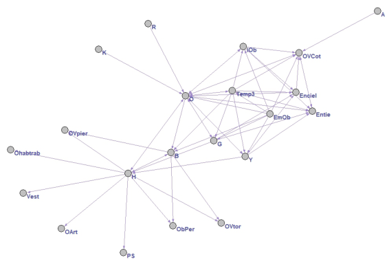
The factors to analyze in IM13 (Fig. 3) were those identified in the image: Man (H), Objects (O), Object-Object Interaction (IOb). The colors: Black (K), Red (R), Green (G), Blue (B), Yellow (Y), Gray (Gr)., Daily Life Objects (OVCot): Natural Elements: Earth (Entie), Natural Elements: Sky (Enciel),
46 Tejeda and Pineda
Objects identified as handmade or artisanal (OArt). According to the analysis of the IM13 network, two factors with the highest input and output centrality were observed: the first was the representation of a Man (H) with qualities such as being silent (PS), dressed (Vest), working (Ohabtrab) and the second factor were various typologies of objects including colors; K, R, Y, G, B, Gr; Natural objects: Enciel, Entie, Enarb; the qualities of objects such as Artisanal Objects: OArt and the interaction between objects (IOb). The typology of objects with the greatest influence were those referring to everyday life and color. The colors that most affected other components were Y and G, with the latter not appearing in a pure form but in combination with yellow tone. It can be observed in the network that the color component is very close to other objects that integrate the image, such as: H, Entie, Enciel. In general terms, an asymmetric interaction between objects (IOb) is observed, determined by the influence of two nodes with greater centrality: H and O. From these nodes, it is perceived that the greatest interaction occurs with the O node and to a lesser extent with the H node. The color B is perceived as an important link. In general terms, an interaction between objects (IOb) is observed, distributed among heterogeneous factors (H and O).
Figure 3: IM13.v226. Static network where the interrelation of elements in the painting can be observed. Image with lower assertiveness. Modeled in Pajek.
CONCLUSION
The process of selecting the dominant color, taking as an example the cul- tural behavior observed in Mexican volunteers, was perceived as complex, where the results obtained correlate with studies conducted by other authors. In this sense, it was observed that women perform better in color detec- tion compared to the male sector. This is related to studies conducted by Abramov, Gordon, Feldman, & Chavarga (2012), where possible differences in color perception by gender are shown using different methods for the study (Conway, 2009). Additionally, it was observed that the perception of
Cultural Perception of Dominant Color in Static Systems 47
the dominant color is modified according to the qualities of the static system, where the interaction between homogeneous and heterogeneous objects plays a fundamental role in the perception process. Based on this observation, vol- unteers performed better in detecting the dominant color with homogeneous static systems compared to results in detecting the dominant color with het- erogeneous static systems. On the other hand, the distribution of the same color in the static system also impacts the process of detecting the dominant color, where the proximity between similar tones makes it difficult to dif- ferentiate them since there is a tendency to perceive them as a unity, and the fragmentation of colors of the same tone also makes their perception difficult since there is a tendency not to consider them as a unity.
REFERENCES
Babin, B. J., Hardesty, D. M., & Suter, T. A. (2003). Color and shopping intentions: The intervening effect of price fairness and perceived affect. Journal of business research, 56(7), 541–551. Barbur, J. L., & Connolly, D. M. (2011). Effects of hypoxia on color vision with
emphasis on the mesopic range. Expert Review of Ophthalmology, 6(4), 409–420. Barbur, J. L., & Rodriguez-Carmona, M. (2016). Color vision changes in normal aging. Barbur, J. L., & Rodriguez-Carmona, M. (2017). Colour vision requirements in
visually demanding occupations. British medical bulletin, 122(1), 51–77. Boon, M. Y., & Dain, S. J. (2015). The development of color vision and of the ability to appreciate color in picturebooks. In Learning from Picturebooks (pp. 71–95). Routledge. Cai, S., & Xu, Y. (2011). Designing not just for pleasure: effects of web site
aesthetics on consumer shopping value. International Journal of Electronic Com- merce, 15(4), 159–188. Color Research & Application: Endorsed by Inter-Society Color Council, The Colour Group (Great Britain), Canadian Society for Color, Color Science Association of Japan, Dutch Society for the Study of Color, The Swedish Colour Centre Foundation, Colour Society of Australia, Centre Français de la Couleur, 26(3), 179–192. Conway, B. R. (2009). Color vision, cones, and color-coding in the cortex. The
neuroscientist, 15(3), 274–290. Hardin, C. L., & Maffi, L. E. (1997). Color categories in thought and language. In Color Categories, Oct, 1992, Asilomar, CA, US; This volume is based on the” Color Categories” conference, held in Asilomar, California, Oct 25–28, 1992. Cambridge University Press. Isherwood, Z. J., Joyce, D. S., Parthasarathy, M. K., & Webster, M. A. (2020).
Plasticity in perception: insights from color vision deficiencies. Faculty reviews, 9. Kay, P., & Regier, T. (2006). Language, thought and color: recent developments. Trends in cognitive sciences, 10(2), 51–54. Masia, B., Wetzstein, G., Didyk, P., & Gutierrez, D. (2013). A survey on computa-
tional displays: Pushing the boundaries of optics, computation, and perception. Computers & Graphics, 37(8), 1012–1038. Rabin, J., Gooch, J., & Ivan, D. (2011). Rapid quantification of color vision: the cone contrast test. Investigative ophthalmology & visual science, 52(2), 816–820. Regier, T., & Kay, P. (2009). Language, thought, and color: Whorf was half right.
Trends in cognitive sciences, 13(10), 439–446.
48 Tejeda and Pineda
Rodriguez-Carmona, M., O’Neill-Biba, M., & Barbur, J. L. (2012). Assessing the severity of color vision loss with implications for aviation and other occupational environments. Aviation, space, and environmental medicine, 83(1), 19–29. Schirillo, J. A. (2001). Tutorial on the importance of color in language and culture. Vemala, R., Sivaprasad, S., & Barbur, J. L. (2017). Detection of early loss of
color vision in age-related macular degeneration–with emphasis on drusen and reticular pseudodrusen. Investigative ophthalmology & visual science, 58(6), BIO247-BIO254. Wolfflin, H. (2015). Principles of Art History: The Problem of the Development of Style in Early Modern Art: One Hundredth Anniversary Edition. Getty Publications.
LISTED IN THE AHFE DIGITAL BOOKSTORE CATALOGUE
Explore the complete digital volume
Design for Inclusion
Read this individual research paper free through the original publisher, or explore the full digital proceedings book.
ISBN 978-1-964867-04-5
Explore this ISBN in the AHFE Bookstore ↗Listed in the July 2026 bookstore catalogue; search by ISBN to confirm current availability · Digital book purchase optional