Amic Ho (2025). Urban Colour Palettes and Emotional Responses. In: Human Dynamics, Product Evaluation and Quality. AHFE Open Access, vol. 172, pp. 39–47. https://doi.org/10.54941/ahfe1006268
Emotional mapping is crucial in understanding the impact of urban colour palettes on psychological states. The study employs both qualitative and quantitative methods to analyse participants' subjective emotional responses to various colour palettes in cities. Physiological assessments evaluate emotional arousal to understand how visual cues influence emotions. Statistical analysis examines patterns and relationships between colour combinations and emotions. Preliminary studies show that people are drawn to specific colours and forms, with warm hues evoking vitality and optimism, and cool tones being perceived as relaxing. Communities should be involved in neighbourhood planning to ensure that decisions reflect the views and concerns of residents. Strategic urban mathematics design that prioritises emotional wellness aligns the perceptual and emotional experience of the environment. The findings will inform colour psychology recommendations for urban design to improve citizens' quality of life and psychological resiliency.
The psycho-social effects of urban environments are now firmly on the agenda of architecture, urban planning, and environmental psychology, as cities across the globe struggle to manage the tension between well-being and the pressures of rapid urbanisation, growth in density, and social flux. Colour is a powerful, yet often overlooked, ingredient among the many elements that give texture to the lives we live in the city (Kress & Van Leeuwen, 2002). Although the psychological and cultural aspects of urban colour have been appreciated for some time, scholars in the last decade have rediscovered colour’s profound impact on emotional and experiential states, as well as its physiological effects. Urban colour palettes, the colours, saturations, and brightness of buildings (Jonauskaite et al., 2019), streetscapes, and public spaces, are key to the atmosphere and identity of a city and subtly influence its residents’ moods, social behaviours, and interactions. Still, the incorporation of colour psychology into urban design practice is uneven and often based more on tradition or individual preference than on empirical findings (Yuriev, Dahmen, Paillé, Boiral & Guillaumie, 2020). We aim to fill this gap by rigorously examining how urban palettes mediate emotional well-being,
using a mixed-methods study design that integrates self-report measures of affect and objective biophysical indicators of emotional responses. Through understanding how different colour environments shape the felt and lived experiences of urban dwellers, these research findings have the potential to significantly inform more psychologically informed urban design strategies, and ultimately lead to the creation of healthier, more resilient and emotionally supportive urban environments.
EXISTING STUDIES ON COLOUR PSYCHOLOGY IN URBAN ENVIRONMENTS The amount of research about colour psychology in urban environments is expanding, reflecting the growing recognition among architects, urban planners, and psychologists that colour significantly influences human emotional states and well-being (Szczepa´nska, & Pietrzyk, 2022). Colour is not only a superficial attribute but a fundamental environmental cue that affects human perceptions, social interactions, and even biological processes in urban environments (Ho, 2023). Initial research in architectural and ecological psychology revealed that specific colours elicit distinct emotional reactions: warm hues, such as red, orange, and yellow, are consistently correlated with heightened arousal, activity, and optimism, whereas more fabulous shades, like blue, green, and purple, are associated with tranquillity, relaxation, and introspection. Neutrals like white or beige may convey stability or sophistication, although they also risk being viewed as dull or emotionally lacking. These links are not only anecdotal; empirical research employing both qualitative and quantitative methodologies has demonstrated that colour may influence mood, impact cognitive performance, and modify physiological indicators such as heart rate and skin conductance.
A growing body of research has sought to investigate the underlying causes, and recent studies employing neuroscientific techniques such as fMRI have demonstrated that certain colour hues are linked to the activation of specific cerebral circuits that influence emotional responses and behaviour. For instance, exposure to red has been associated with elevated heart rates and stimulation of the sympathetic nervous system. In contrast, a blue atmosphere has been claimed to reduce stress levels and enhance focus. Comparable results have been observed in the marketing, healthcare, and education sectors, where intentional colour selection has been linked to enhancing well-being, fostering trust, and improving productivity. Colour in urban environments is increasingly seen as a mechanism for placemaking and identity formation, with urban planners employing colour palettes to develop visually appealing, emotionally supportive, and culturally reflective public spaces (Fung & Ho, 2020).
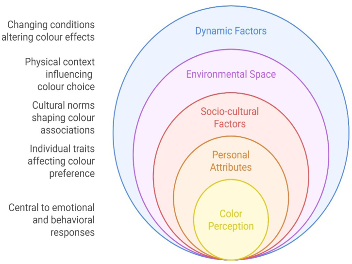
The literature recognises the intricacy of colour perception influenced by many human attributes, socio-cultural contexts, environmental factors, and dynamic aspects such as season and light. Through a comprehensive literature review of more than one hundred studies on urban colour preference (Qu, Dong & Wang, 2025), we delineate four essential categories influencing
Urban Colour Palettes and Emotional Responses 41
city colour preference: personal attributes (such as age, gender, emotional memory, and lifestyle), socio-cultural factors (including religious beliefs, historical traditions, and national customs), environmental space (comprising landform, architectural style, and urban function), and dynamic factors (encompassing climate, season, and technological change).
Recent research is beginning to address these limitations by using transdisciplinary and holistic approaches, incorporating participative and community engagement methodologies to formulate colour schemes that resonate with local identity and emotional disquietude. The integration of big data analytics and machine learning creates new opportunities for forecasting and characterising urban colour preferences at both individual and communal levels.
Figure 1: Influence of colour in urban environments.
RESEARCH METHODS AND PROCEDURE A mixed-methods technique was employed in the research to examine how the metropolitan colour palette influenced emotional responses. For each colour scheme (warm, calm, and neutral), we curated and developed visual stimuli (Ho, 2020). Depicting cityscapes to elicit the desired effects within the three distinct colour palettes; the stimuli were digitally generated to standardise brightness, saturation, and composition. Participants, selected from the local population, demonstrated normal colour vision and provided informed consent by ethical norms. Participants conducted a survey in which
42 Ho
they watched a series of urban colour palette photographs on a calibrated display, with the sequence of images randomised to mitigate order effects. Six participants were chosen for this phase, during which a procedure was executed to objectively evaluate their autonomic nervous system responses to a series of identical visual stimuli (Wang, Shen, Ye & Xie, 2021). The pre-MDP period established baseline values for average heart rate, heart rate variability, and skin conductance response. Thematic analysis of free text material generated more nuanced data, revealing standard connections, preferences, and enabling the categorisation of emotional themes arising from diverse colour schemes.
The analytical method was multifaceted and began with the amalgamation of survey results. Quantitative data from Likert scales and SAM ratings, after the observation of colour meaning ascriptions, were analysed using descriptive statistics, independent and dependent sample t-tests, and inferential analysis to identify trends and statistical variations in ratings among colour palettes. Thematic analysis of qualitative responses yielded a comprehensive understanding, revealing standard connections, preferences, aversions, and recognising recurring emotional interpretations associated with particular colour palettes. Mean heart rate (HR) and heart rate variability (HRV), often represented as RMSSD or the LF/HF ratio, together with skin conductance response (SCR) amplitude and frequency, were derived from physiological data for each experimental condition. Repeated- measures analysis was used to compare colour palettes to see if particular palettes consistently resulted in increased arousal (elevated HR and SCR, and diminished HRV) or greater calmness (reduced HR, elevated HRV, and decreased SCR).
The study’s design incorporated community interaction, recognising the importance of including local residents in the evaluation of urban environments. The study provided concrete recommendations for urban planners and architects aiming to enhance mood through intentional colour scheme choices by integrating emotional maps with subjective and physiological assessments. The study’s findings underscore the necessity of including individual preferences and wider psychological impacts in urban design, advocating for evidence-based standards that prioritise emotional well-being in constructed environments. In conclusion, the research methodologies were meticulously crafted to examine the nuanced interconnections between urban colour schemes and emotional responses, integrating rigorous experimental control with ecologically valid stimuli and a blend of quantitative and qualitative data to inform future urban design.
FINDINGS The study reveals that urban colour schemes significantly influence emotional states, with reds, oranges, and yellows associated with heightened comfort and energy. At the same time, blues, greens, and purples are linked to rest and comfort. However, the data also reveals more nuanced disparities between subjective experience and empirical physiological reaction. Warm colours, often related to high-arousal good affect, sometimes elicited complaints of
Urban Colour Palettes and Emotional Responses 43
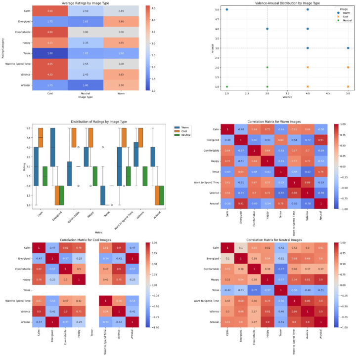
pain and anxiety that the physiological data did not adequately reflect. Conversely, chilly colours were infrequently linked to negative emotions in the survey. Still, their scores for low-arousal good affect surpassed those of warm palettes, indicating a level of hedonic difference. Neutral palettes demonstrated the most variety in both physiological data and survey outcomes. Participants who preferred low-arousal good affect assigned high ratings to greys, beiges, and whites, but those who favoured high-arousal positive affect did not.
Figure 2: Participant’s responses are shown for three images.
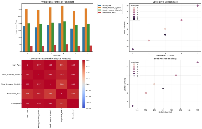
Physiological data, such as heart rate (HR), heart rate variability (HRV), and skin conductance response (SCR), often corroborated the subjective findings, although they also revealed the complexity of the body’s autonomic response to environmental colour. Warm colour palettes resulted in an accelerated heart rate and a reduction in heart rate variability, indicating heightened sympathetic activity and physiological arousal. This aligns with prior information about the stimulating physiological effects of warm colours, which elicit significant activation of the stress response system
44 Ho
and a simultaneous increase in both cardiovascular and electrodermal activity. Skin conductance responses (SCRs) following exposure to hot palaces exhibited substantially greater amplitude and frequency compared to baseline, indicating that this environment is emotionally stimulating.
In contrast, cold colour palettes were associated with a reduction in heart rate and an increase in heart rate variability, signifying parasympathetic dominance and a state of physiological calm. Stimulation of cool hues resulted in much lower skin-potential peaks of diminished amplitude, indicating a reduction in arousal and a soothing influence on the autonomic system. The objective results aligned effectively with the survey findings, as the majority of participants thought that cool palettes were more pleasant and soothing.
Neutral colour palettes produced intermediate physiological responses, with heart rate and SCR values frequently situated between those recorded for warm and cool colour palettes. The research highlighted the influence of colour saturation and brightness on emotional and physiological outcomes. Warm hues with high saturation and dazzling intensity heightened arousal, but diminished or muted pastel variants of the same hues elicited lesser reactions. These findings align with prior data indicating that saturation significantly influences psychological and physiological effects.
The combination of survey and physiological data provides factual support for the strategic application of colour in urban design and highlights the importance of adaptability and inclusiveness in planning. These findings augment the growing empirical data supporting the adoption of evidence- based, psychologically informed methodologies for colour selection in the built environment, aimed at enhancing inhabitants’ well-being and, ultimately, urban quality of life and mental health.
Figure 3: Physiological response dataset (n = 6).
Urban Colour Palettes and Emotional Responses 45
DISCUSSIONS Research into the psychological and physiological implications surrounding urban colour palettes has an essential impact on the theory and practice of urban design, as well as the broader issue of promoting psychological well- being. The study shows us that warm palettes, which include bright reds, oranges, and yellows, induce feelings of arousal, passion, and sometimes even restlessness and anxiety, whereas cool palettes, with an abundance of blues and greens, lead to feelings of calmness, comfort, and restoration. Neutrals are emotionally less charged; they are associated with stability, but also with monotony or disengagement.
From the perspective of urban planning, the findings are a strong advocate for the conscious use of colour as a mechanism for promoting mental health. Urban habitats, especially. The ramifications for strategic urban planning are profound. The evidence advocates for a transition from uniform policies to context-sensitive, evidence-based approaches, moving away from universal urban colouring strategies towards those that align with the functional and psychological requirements of specific spaces. Residential environments, healthcare facilities, and serene public spaces might benefit from a predominant use of cool and natural hues, which are consistently associated with reduced arousal and enhanced well-being. Conversely, commercial and transit hubs, as well as event or entertainment districts, can adopt a more vibrant and warm colour palette in terms of material quality, which may be acceptable or, to some extent, enhanced by incorporating soothing elements to mitigate sensory overload.
Another significant conclusion is that collaborative and inclusive design methodologies must be employed, taking into account the many tastes, cultures, and psychological issues of urban residents. The qualitative data from the study revealed significant individual differences in colour choice and emotion, associated with characteristics such as personal history, cultural connections, and prior experiences with colour in the built environment. Urban planners and designers must engage communities in the collaborative development of colour strategies to ensure that interventions resonate with local identities and inclusively address the needs of disadvantaged or marginalised people.
The results ultimately contest the perception of urban landscapes as just passive backgrounds of daily existence, instead portraying urban settings as dynamic facilitators of public mental health. Economic and social sustainability: an emphasis on mental health. Cities can enhance resilience, inclusivity, and humanity by addressing the psychological challenges of urbanisation through a focus on emotional well-being in urban planning and administration. This will require ongoing study and multidisciplinary collaboration, along with standards and regulations for design that prioritise mental well-being in urban planning.
CONCLUSION
This research demonstrates the significant impact of urban colour palettes on individuals’ emotional and psychological states, hence endorsing the
46 Ho
application of colour psychology in urban design. Warm colours are often more stimulating and invigorating, but may compromise comfort; cooler colours promote calmness and psychological restoration, while neutral colours provide stability and may induce boredom if used excessively. The application of a mixed-methods approach, alongside our evaluation of both subjective and objective colour perception, assessed via heart rate variability and skin conductance response, demonstrates that the impacts of colour in urban environments manifest not only consciously but also biologically. These findings hold significant implications for architects, planners, and policymakers, suggesting that intelligent colour design methods may be utilised to enhance psychological well-being and mitigate urban stress, so increasing the quality of life for urban inhabitants. The paper emphasises the importance of context-sensitive, participatory design in urban spaces, advocating for the incorporation of a diverse range of material and immaterial practices from the initial design phase, while also considering cultural diversity, user preferences, and the unique needs of various urban environments. As urban areas evolve to address shifting demographics, emerging technologies, and urgent environmental issues, a comprehensive understanding of the psychological implications of colour will be essential for creating urban landscapes that are not only aesthetically pleasing but also fundamentally conducive to human health and well-being.
REFERENCES
Fung, P. & Ho, A. G. (2020). Study on How Television Commercials Affect Consumer Reactions with Visual Strategies. In: Ho A. (eds) Advances in Human Factors in Communication of Design. AHFE 2019. Advances in Intelligent Systems and Computing, vol. 974. (pp. 162–173). Springer, Cham. https://doi.org/ 10.1007/978-3-030-20500-3_17 Ho, A. G. (2020). Encoding from Visual Content Analysis in Cultural Design
Research. In: Evans, Martyn, Shaw, Annie and Na, Jea, (eds.) Design revolutions: IASDR 2019 Conference Proceedings. Volume 3: People. (pp. 304–314). Manchester, United Kingdom: Manchester Metropolitan University. https://e- space.mmu.ac.uk/id/eprint/626770 Ho, A. G. (2023). Visual Interpretations of Eastern and Western Wedding Invitation Designs. In: Lau, C. S. G., Chan, K. K. Y. (eds) Conjugal Relationships in Chinese Culture. Chinese Culture, vol. 7. (pp. 119–146). Springer, Singapore. https:// doi.org/10.1007/978-981-19-9841-6_7 Jonauskaite, D. et al. (2019). The sun is no fun without rain: Physical environments
influence how we perceive yellow across 55 countries. Journal of Environmental Psychology, 66, 101350. Kress, G., & Van Leeuwen, T. (2002). Colour as a semiotic mode: Notes for a grammar of colour. Visual communication, 1(3), 343–368. Qu, C., Dong, J., & Wang, W. (2025). Bibliometric analyses of factors influencing
color preferences in urban environmental spaces. Frontiers in Psychology, 16, 1588644. Szczepa´nska, A., & Pietrzyk, K. (2022). Seasons of the year and perceptions of public spaces. Landscape Journal, 40(2), 19–35.
Urban Colour Palettes and Emotional Responses 47
Wang, Y., Shen, L., Ye, X., & Xie, Y. (2021, October). Case study on the landscape of Yuhang Entrance of Shanghai-Hangzhou expressway under the background of the park city. In IOP Conference Series: Earth and Environmental Science (Vol. 865, No. 1, p. 012025). IOP Publishing. Yuriev, A., Dahmen, M., Paillé, P., Boiral, O., & Guillaumie, L. (2020). Pro-
environmental behaviors through the lens of the theory of planned behavior: A scoping review. Resources, Conservation and Recycling, 155, 104660.
LISTED IN THE AHFE DIGITAL BOOKSTORE CATALOGUE
Explore the complete digital volume
Human Dynamics, Product Evaluation and Quality
Read this individual research paper free through the original publisher, or explore the full digital proceedings book.
ISBN 978-1-964867-48-9
Explore this ISBN in the AHFE Bookstore ↗Listed in the July 2026 bookstore catalogue; search by ISBN to confirm current availability · Digital book purchase optional