Serena Camere, Monica Bordegoni (2021). The Role of the Designer in the Affective Design Process: the Principle of Accordance. In: Advances in Affective and Pleasurable Design. AHFE Open Access, vol. 14. https://doi.org/10.54941/ahfe100552
Affective Design is gaining much attention from academic research and companies. In this paper, a research framework for assessing Innovation through Affective Design is presented. Moreover, Affective Design is correlated to Participatory Design through some definitions. The importance of an Affective approach during the earliest phases of design process is motivated. This study introduces Affective Design as a powerful approach in order to manage interactive Virtual Prototyping (iVP) methodology. The paper deals with issues regarding the great variability that iVP offers: the questions raised find answer in the notion of Accordance, which is defined on the basis of Product Semantics. A tool to implement iVP methodology with this approach is here presented. Finally, the results of a pilot study, qualitatively tested to assess the tool usability, are described.
Over recent years, Affective Design gained an increasing attention from academic research. Considerable has been the effort to establish a solid theoretical framework. Since the seminal works in the field (Picard, 2000; Norman, 1988), Affective Design has been considered an effective approach for understanding not only the users’ needs, but also the design process. It pays specific attention to the subtle qualities and meanings of human-product interaction, which are useful attributes to explain some dynamics of design thinking. The great interest in Affective Design can be explained through different aspects. First, designers’ and users’ perspectives are inherently different, even though designers always tend to empathize with people. De Bono explained (De Bono, 2009): “it is always useful to evaluate new ideas with little enthusiasm coming from users. Designers always think that users will be enthusiastic of a new idea as its creators are: yet, this never happens”. In a market constantly overwhelmed by new products, companies need new strategies to differentiate from competitors and gain the preferences of consumers. The main issue is to understand how people perceive (and choose) the products to design. Secondly, a good understanding of the users’ point of view is essential to avoid potential failures: some choices may appear the most appropriate according to the design team, but they can reveal to be tremendous mistakes when the product enters the market. An example is the unsuccessful story of Alixir collection of “functional food” promoted by the Barilla company. Alixir was launched as the new line of healthy food, specifically thought for a target of wealthy, conscious and middle-aged consumers. Barilla invested 10M € in Research & Development, including the study of packaging design. However, as soon as they entered the market, they faced such a failure that within few months, the firm withdrew all the products. Among other reasons, a big mistake was the choice of using total, shiny black for the product packaging. The design team explained that black has been chosen to give a minimal and elegant appeal. Although the packaging did remind of luxury goods, its total black appearance was inappropriate, especially in in the Italian culture, where black is strongly associated with death and mourn. A total-black surface on a food packaging that is supposed to be healthy generates suspicion and doubts. In conclusion, Alixir packaging was a mistake that could have been avoided by testing consumers’ preferences.
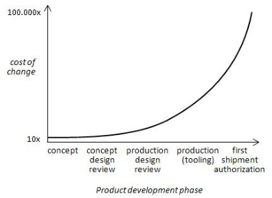
Another important aspect is timing: it is extremely important to understand users’ preferences as soon as possible (see Figure 1). The earlier design changes occur in product development, the less their impact costs (Folkestad & Johnson, 2001). User tests are useful to understand how the consumers will perceive the product, to depict their emotions, and finally to assess their preferences.
Figure 1. Cost of design changes in relation to the product development phase. (Folkestad & Johnson,
2001)
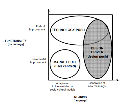
Products need to increase their perceived value to stand out from competitors’; companies must look for new strategies in order to assess innovation and create new successful products. For a long time innovation has been merely identified with the act of researching new technologies. Consumer satisfaction opened a new vision centered on people’s emotions and preferences (Rampino, 2011). Among the different theories of innovation, this study adopts the definitions introduced by Verganti (2006), who distinguished among different drivers of innovation: a market-pull for incremental innovation, a technology push and a design-driven approach for radical innovation (see Figure 2a). Incremental innovation refers to improvements within a given frame of solutions (i.e. better design of something that already exists), while radical innovation carries a change of frame (i.e. creating something that is brand new). Verganti went a step further, by demonstrating that radical innovation could come about through a change of meaning, not only from a technology finding (Norman & Verganti, 2014). The Innovation Matrix presented by IDEO (2010) similarly differentiates between incremental, evolutionary and radical innovation. The former is described as a solution built on existing offerings with familiar users; evolutionary innovation deals with creating new offerings or new users while holding the other constant. Revolutionary innovation means instead to create disruptive solutions able to tackle both new users and new offerings (see Figure 2b).
Figure 2a. Drivers of Innovation (Verganti, 2006). Figure 2b. Innovation Matrix (IDEO, 2010) Affective Design, paying attention to users’ emotions, needs and preferences reveal, is considered a good strategy in order to foster innovation. Looking at both Verganti’s and IDEO’s matrixes shown in Figure 2a-2b, Affective Design could be applied at each definition of innovation. For incremental innovation, it surely can help in understanding the fine-tuning of product features, due to its intrinsic user-centered nature. For evolutionary innovation, Affective Design may be a tool to depict people desires, giving new meanings to products; besides it may also support the introduction of a brand-new technology. Dealing with radical innovation is indeed more complex: it seems that radical innovation is not directly related with a careful analysis about people’s emotions and needs (Norman & Verganti, 2014). Yet, Affective Design and User Experience are still emerging disciplines, striving for a structured and complete modeling: it is feasible that in the next years, both of them will develop increasingly, becoming suitable to foster radical innovation too.
Affective Design and User Experience Crilly, Moultrie and Clarkson (2004) provided a useful model to describe User Experience. In that model, they distinguished from aesthetic impression, semantic interpretation and symbolic association as three different aspects of user cognitive response to the product. A product experience always encounters a reaction, i.e. a change in people’s affective state that can be attributed to human-product interaction (Russel, 2003; Desmet & Hekkert, 2007). This change results in an action, rejecting or moving forward to the product. The final consequence is, whether the product elicits positive experiences, a feeling of pleasure and satisfaction within the user.
This study focuses on the relation between product features and their semantic meaning; “there is always a meaning that goes beyond the function of an artifact”(Barthes, 1957). Products have a meaning and a language they speak with, in form of product attributes (Krippendorff, 2004). Krippendorff started from these assumptions to formulate the notion of Product Semantics. He defines Semantics as "a systematic inquiry into how people attribute meanings to artefacts and interact with them accordingly" and "a vocabulary and methodology for designing artefacts in view of the meanings they could acquire for their users and the communities of their stakeholders" (Krippendorff & Butter 1984). The second definition addresses a possible “vocabulary” made of sensory cues, i.e. product features, through which products express a particular meaning. Similarly, Hassenzahl (2004) refers to product descriptors as a range of features and attributes that equally contribute to communicate the intended product. Crilly et al. (2004) operate a distinction between product semantics and symbolic association, differentiating what the product communicate about itself (such as functions, limits, affordance) from what it tells about the external world (the user, the socio-cultural context, etc.). Although it is important to point out this difference, this study chooses to follow Krippendorff definition of Product Semantics. We will further investigate the relation between product descriptors and product meaning and how designers manage Product Semantics.
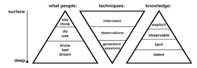
Experience evaluation and Prototyping User Experience can be described through five properties. It is subjective, as it depends on users’ personal background and feelings; it is holistic, comprising perception, action, motivation and cognition. Experiences are situated: they refer to a particular context. They are dynamic, as they change over time: in human-product interaction, there is a “before”, a “during” and an “after” attributed to a particular experience. Finally, experiences have a valence: they can be either positive or negative (Hassenzahl, 2010). The variety of approaches to the topic reflected in a great number of existing tools, which have been developed to connect the users’ preferences and perceptions to the design product (Vermeeren, Roto, Obrist, Hoonhout & Väänänen-Vainio- Mattila, 2010). These methods are of type user-centred, focusing on Affective Design. They all include users in the process of product development, in order to evaluate the User Experience and subsequently modify the product design. This can be done at different stages of the product development process: as mentioned before (see Figure 1), the sooner the better it can affect the product design. During recent years, some studies tried to introduce users’ insights soon after idea generation, by testing physical or virtual prototypes and mock-ups. From this perspective, Affective Design can be considered a participatory approach: indeed, Participatory Design aims at involving users at the very beginning of the design process, recognising in people powerful sources of inspiration. It uses different techniques accordingly to the result it is supposed to reach. Participatory Design may apply various design prototyping techniques such as storyboards, scenarios, sketches, mock-ups. It may also focus on human-product interaction within the real context, using quick ethnography tools. Starting from the surface, it is possible to dig deeper into people’s tacit and latent needs with generative techniques (see Figure 3). These tools guide the user through small steps to construct and express deeper levels of knowledge (Visser, Stappers, Van Der Lugt & Sanders, 2005).
Figure 3. Different levels of knowledge about experience are accessed by different techniques. (Visser et al., 2005)
Some case studies show how the Participatory Design approach significantly contributes to Affective Design (Gaver, Dunne & Pacenti, 1999; Battarbee & Koskinen, 2005). Involving users in the design process is useful to assess users’ preferences towards one product feature or another, but it could also give a broader view on what is meaningful for them. In generative techniques, users are seen as a source of design notions, useful to sparkle brand-new ideas. Generative sessions picture users’ insights and translate them into design guidelines. Despite the great number of methods and tools supporting generative techniques, all of them still base on a quick-and-dirty prototyping attitude, which limits their application. A greater integration with other prototyping techniques (i.e. virtual prototypes and digital mock-ups) and a systematic approach would largely benefit to Participatory design, in order to find application in Affective Design studies.
INTERACTIVE VIRTUAL PROTOTYPES AND AFFECTIVE DESIGN Interactive Virtual Prototyping (iVP) emerged during recent years as an evaluation methodology for product concept phase (Bordegoni, Cugini & Ferrise, 2013). Interactive Virtual Prototypes can be used either for verifying the behavior of a designed product and for evaluating possible variations in interaction experiences. In this way, experience is assessed understanding users’ preferences. In both cases, iVPs increase their potential if used in a continuous design-validation loop, where users’ opinions directly influence product design. iVPs are significantly increasing their realism and fidelity, through the setting of multimodal and multisensory environments that stimulate different sensory channels. In this way, users are able to test a virtual prototype obtaining a real-time feedback. iVPs offer the great opportunity to change quickly and without effective costs the product features, such as the shape, the color, the sound, the force feedback of interactive components etc. In addition, it is possible to measure the response of the users to these changes, combining iVPs with users’ preference evaluation methods (Ferrise, Ambrogio, Gatti, Lizaranzu & Bordegoni, 2011). However, this system offers a limitless variability, for product features can get any value or configuration, which of course is neither practically feasible nor measurable with users. So a major question for interactive Virtual Prototyping methodology is to understand if (and how) it is possible to set the range of variables to be tested. This study proposes to answer some questions of the like: how can we manage variability? How can the designer set the correct range of parameters?
Managing the Affective Design Process The problem of variability in interactive Virtual Prototyping corresponds to the intrinsic ambiguity of design thinking. Peirce defined abduction as the form of reasoning that best describes design thinking (Roozenburg & Eekels, 1995). In abduction, the challenge is to figure out “what” and “how” to create “something” that leads to the aspired value we want to communicate with the product. Dorst (2011) reports that, if students and novice designers seem to randomly generate answers for both the “how” and the “what”, experienced designers tend to have much more effective strategies to tackle the creative challenge. He introduces also the general concept of frame: “framing is the term commonly used (…) for the creation of a standpoint from which problematic situation can be tackled” (Dorst, 2011). Although frames are often mistaken with simple metaphors, they are in fact complex notions that include a specific set of values. Dorst compares frames to the phenomenological concept of themes, which are essentially sense-making tools. The definition of frames is an important activity for designers, because it influences all the subsequent choices within the product development. Yet, it is largely considered as an informal activity. Designers find this activity particularly useful to get the “richness of the problem area” (Dorst 2011). A frame, according to the values it has to communicate, refers to a specific imaginary of expressive qualities. These qualities are declined coherently to the design frame within the product development.
In this framework, we define the principle of Accordance, used by Design Team to manage all the subsequent steps of product development. Accordance is essentially a principle of coherence that is followed by designers in declining all the product features through a chosen Design Strategy. Design Strategy corresponds to the notion of frames expressed by Dorst, but we introduce this term to emphasize the systemic aspect of frames and their driving role through the design process.
Design Team and Accordance We define Design Team as the people actively working in the product development. During recent years, the complexity of Experience Design required the participation of experts from various disciplines, such as psychologists, anthropologists, neuroscientists, bio-medics and others. In this paper, we have decided to focus only on the role of the following three actors, i.e. marketing, design and engineering experts. Designers and marketing experts are used to design thinking, although they start from different points of view. Marketers express a project frame with metaphors, mainly in the form of linguistic expressions. Designers usually integrate metaphors with a visual approach, through the use of sketches, inspirational images, moodboards, mock-ups etc. Engineering experts traditionally suffer from a difficulty in translating these apparently vague and ambiguous metaphors into product characteristics. We would like to point out that, due to representation issues, this paper consider marketing, design and engineering skills as separated entities. During last years, however, boundaries have been fading out, paving the way for a greater integration among the disciplines, and, finally, for a profitable cooperation between the members of Design Team. Until now, however, it is widely recognized that there is a lack of communication within the Design Team: backgrounds are so different that the members simply do not share the same specific language.
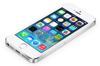
Because of such different perspectives, we can define three categories of Accordance, which correspond to each point of view. Marketing experts follow a principle of accordance, which is different from designers’ and engineers’. They look for Placement Accordance: a product must be coherent to its brand vision, specific for a target, distinguished by competitors. Apple’s iPhone is a perfect example of Placement Accordance, where every single detail gives the feeling of high-tech, luxury and outstanding quality that corresponds exactly to the Apple marketing strategy. Engineers and R&D departments follow instead a principle of Technical Accordance, where all the functional and technological parameters must be coherent to each other. Proper examples are mechanical instruments, such as the Planetarium of Milan star projector, where all the parts are technically and functionally coherent to each other. Designers, ultimately, apply a Semantic Accordance approach: once the Design Strategy has been defined, the product must express a specific character. In order to make it explicit, product features and attributes must be declined accordingly to their semantic meaning. The Bombino refrigerator by Smeg, for example, has been inspired by an iconic imaginary of the 60s: all the product features communicate a vintage appeal, recalling the soft and rounded shapes typical of the 60s style (see Figure 4).
Figure 4. Examples of Placement, Technical and Semantic Accordance From these examples we can understand that there is a common principle of coherence among Design Team members. However, while Placement and Semantic Accordance share the metaphoric attitude and an intrinsic qualitative nature, Technical Accordance refers to pragmatic and quantitative parameters. These differences generate the difficulties we mentioned above.
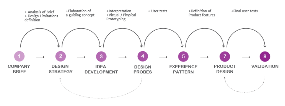
Accordance in Design Methodology In order to further explain the concept of Accordance, and how it can affect the interactive Virtual Prototyping methodology, it is necessary to contextualize it in the product development process (see Figure 5). After the company launches the project Brief (1) and the limitations are defined (2), the Design Team proceeds in defining a Design Strategy that will guide all the subsequent stages of the project. During the Idea Development phase (3), the Design Strategy is deconstructed into a set of sensory qualities and inspirations that describes it. Usually, designers perform this step through moodboards and styleboards. At this point, a Virtual Prototype or a Digital Mock-up is built, in order to proceed with user testing and assess users’ preferences. This is the moment when members of the Design Team experience the greater difficulty in understanding each other: the idea is still not formalized; yet the range of parameters to be tested with users must be set. Through this research framework, we propose the integration of a tool, specifically designed to support Design Team members in this phase.
Figure 5. Product Design Methodology
MAPPING OF EXPERIENCE The tool here presented is the Experience Map, specifically aimed at facilitating the communication between members of the Desgin Team in setting an iVPs User Experience test. As mentioned before, iVPs offer an infinite range of possibilities, which has to be filtered and handled in some way: we propose to apply the notion of Accordance to support the Design Team at this stage of the process. By choosing a Design Strategy, the interaction vocabulary must be declined coherently: in this way, we limit the number of possibilities to be tested with iVPs. However, this step requires designers and engineers to translate the Design Strategy, made of visual and linguistic metaphors, into a set of quantitative parameters.
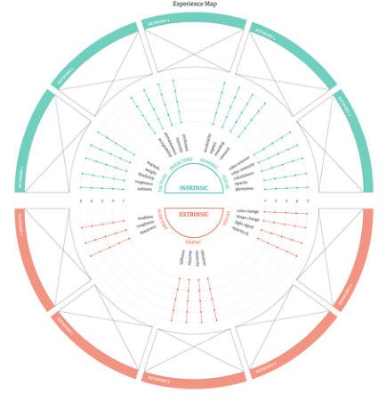
The Experience Map aims at helping designers in deconstructing the Design Strategy into a list of attributes, evaluating them from 1 to 5. These attributes are still qualitatively defined, but the main goal of Experience Map is to generate more awareness in designers and engineers while selecting the correct range of parameters. The tool is composed by different elements (see Figure 6a): - Two different hemispheres, referring to intrinsic properties (i.e. the product physicality) and extrinsic properties (i.e. related to the human-product interaction). In these hemispheres, some attributes and features are disposed in an adapted radar graph.
- An external circle of slots where designers can add inspirational images.
- An external circle of slots where designers can insert keywords referred to the Design Strategy.
Inspirational images and keywords have been added to help designers in visualizing the Design Strategy. Designers are used to work with visual content: by including images and keywords and visually connecting them to a set of features, the tool provides a greater usability for designers.
Figure 6a. The Experience Map. Figure 6b. The Experience Map describing “care” concept
Character, Properties, Attributes and Features Referring to Hassenzahl’s notion of product descriptors (Hassenzahl, 2004), we introduce properties among character and attributes. Properties group under them attributes, which are again divided into different features. This properties, attributes and features included in the map have been defined through literature review, as reported below. All the features find correspondences in quantitative parameters that can be used to set iVPs testing. Until now, the value ranked by the designer does not correspond to a quantitative range of parameters; however, a possible future development would be to undertake such a categorization, which will make the Experience Map more effective. Some of the features maintain their technical term, while others have been translated to their folk meaning.
The Experience Map (see Figure 6a) is composed by:
Acceptability, pervasiveness, intensity (Malnar, 2004), perfumed (Karana et al., 2009) o Shaping attributes:
Modularity, organic, rounding, textured; o Visual attributes:
Color contrast, color intensity, colorfulness, opacity, glossiness (Karana et al., 2009) - Extrinsic properties: o Auditory attributes:
Loudness, roughness, sharpness (Malnar, 2004) o Haptic attributes:
Vibration, elasticity, ductility, strength (Malnar, 2004) o Visual attributes:
Color change, shape change, light signal, opacity change (Colombo & Rampino, 2013) We provide an application of the Experience Map as an example, concerning the redesign of a new laundry machine. The chosen Design Strategy wishes to communicate the idea of taking care of clothes as if they were hand-washed. The Design Strategy is summarized in the word care. The concept is described with the Experience Map (see Figure 6b), which deconstructs an imaginary of soft, warm, organic and fading appearance into intrinsic and extrinsic properties.
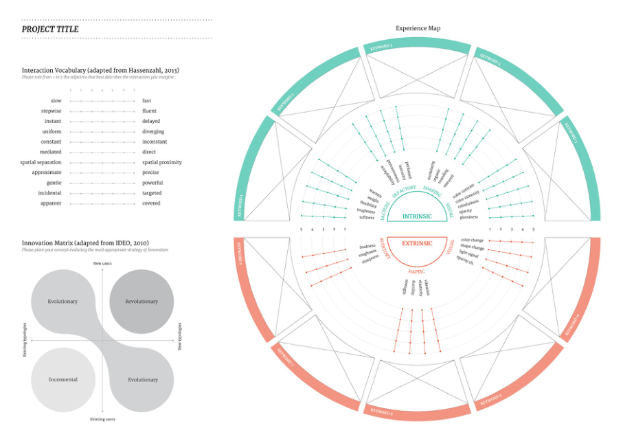
Testing the Experience Map In this Section we present a pilot study aimed at assessing designers’ feedback on the Experience Map. We chose to run a qualitative test in a reverse modality: instead of asking participants to represent a Design Strategy through the Experience Map, they were asked to describe some objects using the map. The Experience Map has been integrated with two other tools taken from literature: the Innovation Matrix (IDEO, 2010) and the Interaction Vocabulary (Diefenbach, Lenz & Hassenzahl, 2013) (see Figure 7). The latter in particular is similar to the Experience Map: however, it focuses on the human-product interaction describing its character, while the Experience Map makes a step further by analyzing the product features. The Interaction Vocabulary has been also added as a reference for evaluating possible difficulties in using the Experience Map. The test was run with 10 healthy participants, aged 24-50, 4 men and 6 women. Moreover, participants were selected to guarantee a widespread sample of design skills and expertise. They were 2 MSc students, 3 junior designers, 3 senior designers and 2 expert designers (15+ years of professional experience). Some of them are specially keen on technical aspects of product design, some others prefer the creative stage of the process, and others have interest on aesthetics and styling. The objects to describe have been picked with a variety of characters and they include: a toaster, with 60s-like style; an ergonomic and playful pen; an innovative scent dispenser made of cardboard; a smartphone. The tasks they were asked to perform are: 1. Define a keyword that describes the product character; 2. Evaluate all the product features through the Experience Map, rating them from 1 to 5, in accordance with the Likert scales. While performing the tasks, they were encouraged to think aloud, in order to take note of possible insights. At the end of the test, participants were asked to fill in a questionnaire, evaluating the Experience Map for its visual clarity, consistency, accuracy, usability and their satisfaction when using the map. Some open questions were also provided at the end of the questionnaire.
Figure 7. The Experience Map implemented for user tests.
DISCUSSION
While running the tests, some issues emerged immediately. Some of the terms describing the product features were not clearly understood. In particular, as mentioned above, we left some technical terms on purpose, while others were “translated” in common terms: the aim was to investigate which of the two semantics would make the Experience Map more usable. Almost all the participants did experience some troubles in understanding the features “ductility” (Extrinsic > Haptic), “roughness” (Extrinsic > Auditory), “opacity change” (Extrinsic > Visual), “warmth” (Intrinsic > Tactual). While the last two were not understood due to linguistic misleads (participants were all English-speaking but only 1 was English-native), the former two were instead harsh to be understood even when translated. Participants reported the map to be very clear, consistent, accurate and usable (although most of them specified that it was usable after receiving the general explanation of the methodology). All of them reported satisfaction in using it, and they stated the map would fit well into their average design process. Other meaningful insights were the following:
- Accuracy seemed to be satisfactory, even though some parameters were found to be missing. For example, participants felt the lack of smell attributes within extrinsic properties;
- Many of them stated they were not feeling comfortable at using the map for describing existing products, founding it more suitable for deconstructing a concept;
- The evaluation of features has been set from 1 to 5, as Likert scales. However, since the visual shape recalls radar graphs, participants reported the need of the “zero” value, in order to define the features that are not necessary;
- Some of them asked for a greater visual clarity in clustering the features through their attribute belonging.
These insights will be used in our future work to modify and improve the Experience Map.
FUTURE DEVELOPMENTS & CONCLUSIONS In this paper we presented a research framework to undertake interactive Virtual Prototyping (iVP) methodology with an Affective Design approach. The paper presented a tool, the Experience Map, specifically aimed at facilitating the communication between designers and engineers in setting an iVPs User Experience test. The tool developed is the first of a series of tool currently under development. The preliminary qualitative test with a group of users demonstrated that designers appreciated the Experience Map and only few modifications are needed. However, in the next future we will include the tool in a more comprehensive case study. The case study will offer not only the possibility to adopt the Experience Map during idea generation, but also to share it with the other members of Design Team. Experience Map must be indeed understood by any of them. Further developments of this study will be the integration of a correlation between the ranking in the Experience Map and iVPs parameters. This delicate step will probably increase the chances of Experience Map to constitute a bridge between design thinking and technical reasoning.
REFERENCES
Karana, E., Hekkert, P., Kandachar, P. (2009). “Meanings of materials through sensorial properties and manufacturing processes”. MATERIALS & DESIGN, Volume 30 (7), pp. 2778-2784. Krippendorff, K. (2006), “The semantic turn: A new foundation for design”. Boca Raton, FL: Taylor & Francis. Krippendorff, K., Butter, R. (2007). “Semantics: Meanings and contexts of artifacts”. In: Product Experience, Schifferstein,
Field”. INTERNATIONAL JOURNAL OF DESIGN, Volume 5 (1), pp. 3-16. Roozenburg, N. F., Eekels, J. (1995). “Product design: fundamentals and methods”, Volume 2. Chichester: Wiley. Russell, J. A. (2003), “Core affect and the psychological construction of emotion”. PSYCHOLOGICAL REVIEW, Volume 110 (1), pp.145-172. Verganti, R. (2008). “Design, Meanings, and Radical Innovation: A Metamodel and a Research Agenda”. JOURNAL OF
PRODUCT INNOVATION MANAGEMENT, Volume 25 (5), pp. 436-456. Vermeeren, A. P., Law, E. L. C., Roto, V., Obrist, M., Hoonhout, J., Väänänen-Vainio-Mattila, K. (2010). “User experience evaluation methods: current state and development needs”. In: Proceedings of the 6th Nordic Conference on Human- Computer Interaction: Extending Boundaries, ACM, pp. 521-530.
LISTED IN THE AHFE DIGITAL BOOKSTORE CATALOGUE
Explore the complete digital volume
Advances in Affective and Pleasurable Design
Read this individual research paper free through the original publisher, or explore the full digital proceedings book.
ISBN 978-1-4951-2109-8
Explore this ISBN in the AHFE Bookstore ↗Listed in the July 2026 bookstore catalogue; search by ISBN to confirm current availability · Digital book purchase optional