Carla Lobo, Puja Kumar, Luisa Barreto (2022). Defining the Complex Emotional Experiences of Depression through Visual Language – Colour as Expressive Tool. In: Human Dynamics and Design for the Development of Contemporary Societies. AHFE Open Access, vol. 25, pp. 355–360. https://doi.org/10.54941/ahfe1001408
According to survey reports by World Health Organization, depression was ranked as the third leading cause of the global burden of disease in 2004, moving into the first place by 2030. Considering this scenario, a research project has been conducted focusing on the potential of graphic design in health care as an opportunity to communicate complex emotional experiences of depression. Using colour as a design strategy, conceptualizes a methodological approach that can be adopted to develop colour palettes in graphic design by considering the focal parameters relevant to the specific project, in this case, connect the emotional dimension of colour experience with depression to visualise the illness in a new light.All works of graphic design establishes a visual communication with its audiences by connecting directly or indirectly on an emotional level, establishing a visual communication with their audiences, connecting directly or indirectly on an emotional level. This paper proposes a methodological approach that can be adopted to derive the appropriate colour for any design, based on the message it is intended to communicate.The development of the tool is based on the importance of the relationship between the relative degree of each emotion and the specific cultural symbolism for the derivation of colours, aiming to capture an individual's emotional attention and produce flawless results in the final design work.The work is based on a transversal approach, correlating different graphic design strategies, including colour and its symbolism, in this case with reference to Indian culture, with the aim of identifying and subsequently portraying the different types of depression, motivating depressed people to express themselves, and the population in general to change their perception about the disease, promoting greater sensitivity and sympathy towards the subject. The proposed colour tool ambitions to create a solution for the inability of people to put together words for their emotional experiences/ feelings when they are going through depression. The colours chosen by them would give a clearer understanding of the emotions/ feelings they might be going through and would play an indicative role to determine the type of depression.Hence, the project is an effort to channel appropriate color as a design tool to talk about depression, spread information and ultimately enrich humane diagnoses and treatment when it comes to fight depression.The development of this interactive visual medium to express complex emotion is fulfilled by incorporating colour variations as a paramount feature in the design strategy. To effectively portray depression as a serious illness using the expressive potential of colour to convey right emotions when used aptly, a colour code was designed, considering the variations in colour dimensions (saturation and light scales) as ways of expressing the degree of severity of the disease.The colour palette was achieved by theoretical research of colour concepts crossed with analytical study of survey results, which allowed the most significant associations between colours and emotions to be identified, and from these to build a functional colour code, providing a visual expressive tool to those going through depression.
Humans are social animals and advertising our problems, especially ones that have historically been misunderstood, runs counter to our social condi- tioning.
The problems get more distressing to discuss when they are related to our mental health. Despite the leap in progress made in diagnosing and treating depression, people are still afraid to talk about it or even say the word depres- sion. This acts as a major setback in diagnosing depression which, eventually, is growing at an alarming rate.
Focused on portraying depression in an empathetic way, the motivation of the research work was to study the interaction of graphic design with mental health to formulate a means to change the way it can be communicated in society. The research considers the role of graphic design in the construction and communication of mental health by emphasising colour as a design ele- ment. The aim was to express the complex emotions experienced in different types of depression through colour.
Given the incidence of the disease, India was considered as the case study for the development of the project.
ABOUT DEPRESSION As defined by the World Health Organization (WHO), depression is a com- mon mental disorder, characterized by persistent sadness and a loss of interest in activities that we normally enjoy, accompanied by an inability to carry out daily activities, for at least two weeks. It is difficult to determine what exactly causes depression, but it can occur for a variety of reasons. Research shows that it can result from a complex interaction of social, psychological, and biological factors.
There are different types of depression, according to the cause and level of complexity/severity, namely, Psychotic, Bipolar, Clinical, Persistent, Postpar- tum, Seasonal Affective, Due to Illness, Premenstrual Dysphoric, Substance Induced, Subsyndromal and Grief.
GRAPHIC DESIGN AND COLOUR Graphic design is a visual field that involves not only graphically commu- nicated ideas by also social, economic, cultural, technological, and aesthetic values. The nature of graphic design in shaping our environment, our health and our sense of self has always been both widespread and subliminal. In order to highlight this nature, various design strategies have been used star- ting from the early 16th century to till date, in preserving and enhancing our health. Some of those strategies were used to persuade, while others were meant to educate or inform and orientate people. Graphic design has emerged as making way for a new realm of expression, reproduction, and representa- tion. It illuminates and guides which links the importance of design as a tool for educating society. Creative campaigns have been successful in helping to challenge stigma and portrayal of mental illness as deserving of sympathy and sensitivity – as important any other illness or disease. The use of symbolic
Defining the Complex Emotional Experiences of Depression Through Visual Language 357
elements such as colour and typography to communicate meaning has been most successful within these campaigns.
To depressed people at times, it becomes difficult to express their inner fee- lings they are going through in words. Colour has biological, psychological, emotional, social, and cultural dimensions that can enhance – or inhibit – communication efforts (Holtzschue, 2017), and therefore provide a commu- nication tool which offers a different way of talking about how we feel. In this study we aim to points to ways in which colour can be used to develop a visual tool to assess and express our emotions, order to facilitate communication and, thereby facilitating the disease’s diagnosis.
COLOUR AS AN EMOTIONAL EXPRESSION Emotion is a complex psychophysiological experience of an individual’s state of mind in interaction with the environment. The relationship between colour and emotion is closely linked to colour preferences, and these are associated with whether a colour triggers positive or negative feelings. (Mahnke, 1996). While studies have shown that colour-mood association exists, there is no evi- dence to suggest a one-to-one relationship between a given colour and a given emotion (Schwarz and Tofle, 2005). Two main views as to what the relati- onship between colour and emotions coexist: one holds that this relationship is culturally determined, and therefore varies across people and cultures, the other suggests a more psychophysiological basis for this relationship between colour and mood, implying that it is universal. Studies seem to conclude that colour can affect mood, but they do not agree on which moods are brought out by which colours. Additionally, research has found that different shades of the same colour (e.g. pale blue and dark blue) can have completely dif- ferent connotations when people are asked to specifically relate their mood to a colour (Carruthers, Morris, Tarrier and Whorwell, 2010) meaning that our emotional response to colour is also related with its saturation and bri- ghtness (Valdez and Mehrabian, 1994). Another research highlights that the associations we make between emotion and colour go beyond mere metaphor, indicating that feeling sadness may change how we perceive colour. Specifi- cally, the researchers found that participants who were induced to feel sad were less accurate in identifying colours on the blue-yellow axis than those who were led to feel amused or emotionally neutral (Thorstenson, Pazda and Elliot, 2015).
Despite the minimal proven theories and principles, the correlation betw- een colours and emotions and how colours can create an impact on the psychology of people are undeniable. It can be used to indicate an action and cause reactions in people’s minds (Holtzschue, 2017).
METHODOLOGY
1. Identification of colour meaning from different walks of Indian culture, from mythologies to Vedic medicines, from scriptures to political history, from architecture to food and from traditions to festivals. This defined the relationship between emotions and colours from Indian cultural context.
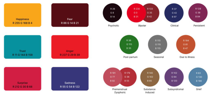
Figure 1: First color derivatives: resultant of survey analytics and color symbolism in India (left); Colours of depression (right).
2. Survey to have an insight on the societal perspective of depression and to identify the emotional significance of colours. 3. Analysis of the survey results 4. Deduce the first colour code for the basic emotions, based on both cultural meanings of colours and survey results 5. Color derivation - these colour codes were further developed with value- saturation scale/variation to obtain the individual colour identity for each depression type The theoretical contextualization established the potent of graphic design in guiding health care message with the use of bold typography, vivid colours, forms, pictorials, signs, etc. over time. It also established that appropriate application of graphic design tools in appropriate context can yield commen- dable results. Since depression is associated with emotions, usage of colour as the design strategy proved effectual given its physical, psychological, bio- logical, and emotional dimensions. The online survey gained insight of the societal perception of depression. The analytical study of survey data gave a generalized view of awareness level about depression.
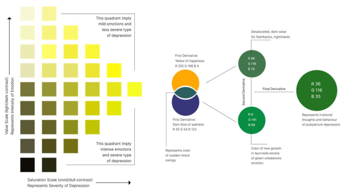
The critical analysis of survey leads to derivation of colour codes for the six basic emotions: yellow for happiness, bluish green for trust, pink for surprise, red for anger, dark red for fear, and dark blue for sadness. All the emotions experienced in different types of depression are categorized into these six emotions which helped to determine the first derivative hue (Figure 1). It was necessary to create a visible distinct edge between colours to have an individual identity for each depression type. This distinction is brought by changes in colour attribute variables, value, and saturation. In this work, value scale represented the intensity of emotion and saturation scale repre- sented the severity of depression. On the value scale, the relative degree of black and white varied depending upon the degree of an emotion in com- parison to its basic emotion whereas on the saturation scale, the gradation percentage of gray varied relative to the degree of severity of depression. The emotions listed before are, then, placed on the value saturation scale
Defining the Complex Emotional Experiences of Depression Through Visual Language 359
Figure 2: Value | saturation scale (left); Determination of the derivative for postpartum depression (right).
to extract the second derivative. In addition to that, the other derivative hue is extracted with reference to that particular emotion in Indian culture. The combination of first derivative hue, second derivative from value-saturation scale and second derivative hue with Indian connotation gives the unique resultant colour (Figure 2).
The work emphasized on creating a unique identity for each depression type to understand the differences based on the severity of depression which also contributes to the intensity of emotion. The derived hue was, later, applied in portrayal of inner thoughts through illustrations: https://vimeo. com/675875669.
CONCLUSION
The research assessed the potential of colour to effectively describe emotions of depression based on the models of colour contrast and colour appearance, considering that a change in emotions is followed by change in colour. The developed color code aims to act as a medium that would help people, fir- stly, relating the colors to a particular emotion, secondly talking about the ‘tabooed’ topic of depression and ultimately, recognize depression as worthy of deserving empathy.
This formulated color code can also follow change of emotions in terms of intensity and severity with the help of value - saturation scale. It helps visua- lizes those emotions and feeling which are in a way difficult to be expressed in words.
The present study is the result of an academic work, and should be consi- dered as the exploratory stage, needing to be tested to validate its relevance. The next steps involve assessing people’s reactions to the associations esta- blished through colour derivatives: the effectiveness of the color derivatives and the illustrations needs to be evaluated to study the reactions of the
people. The developed color codes need to be tested with people going through depression to study the practical application of color and emotion co-relationship. Similarly the implications of illustrations in communicating the message to people in general should be analyzed to study the differences in an individual’s viewpoint towards depression before and after reading the eBook.
Another expected outcome is that the developed color code would encou- rage and initiate conversations about depression, and once people start talking and accepting depression as a serious illness, the stigmas related to it will eventually be addressed and eliminated.
Colour as an expressive tool could also find application in other health- care settings, facilitating communication for patients with language barriers or those who are unable to find the appropriate words to describe their condition by describing their feelings through colour.
It is also concluded that the application of this tool could add value and effectiveness to any design. By introducing variables such as emotions and cultural symbolism in the definition of the colour scheme to be adopted, increases the emotional attention of the target audience.
Based on these findings, future studies could determine whether there are other factors, e.g. personality type, geographical location, that could be con- sidered relevant in explaining how emotions are experienced by an individual, determining whether these factors lead to variation in emotion intensity, and what possible modifications should be made to the value-saturation scale to incorporate them.
ACKNOWLEDGMENT
This research was funded by LIDA - Arts and Design Research Lab, UIDB/05468/2020, with the financial support of FCT – Fundação para a Ciência e a Tecnologia, I.P, through National funds.
REFERENCES
Carruthers, H. R., Morris, J.,Tarrier, N., & Whorwell, P. J. (February 09, 2010) The Manchester Color Wheel: Development of a novel way of identifying color choice and its validation in healthy, anxious and depressed individuals. Retrie- ved from https://bmcmedresmethodol.biomedcentral.com/articles/10.1186/1471- 2288-10-12#Abs1 Holtzschue, L. (2017) Understanding Color: An Introduction for Designers. Hoboken, NJ: John Wiley & Sons. Mahnke, F. H. (1996) Color, environment, and human response: An interdisciplinary
understanding of color and its use as a beneficial element in the design of the architectural environment. New York: John Wiley. Schwarz, B., Tofle, R. (2005) Color design in healthcare environments: Theoretical observations. Proceedings of Colordi. Thorstenson, C. A., Pazda, A. D., & Elliot, A. J. (2015) Retraction of “Sadness Impairs Color Perception”. Psychological Science, 26(11), 1822–1822. doi:10.1177/0956797615597672 Valdez, P. and Mehrabian, A. (1994) Effects of Color on Emotions. Journal of Experi-
Human Dynamics and Design for the Development of Contemporary Societies
Read this individual research paper free through the original publisher, or explore the full digital proceedings book.
ISBN 978-1-958651-01-8
Explore this ISBN in the AHFE Bookstore ↗Listed in the July 2026 bookstore catalogue; search by ISBN to confirm current availability · Digital book purchase optional