Yanyan Song, Yunfei Chen (2023). The possibility of generating color scheme based on art works for Web Design. In: Intelligent Human Systems Integration (IHSI 2023): Integrating People and Intelligent Systems. AHFE Open Access, vol. 69, pp. 734–741. https://doi.org/10.54941/ahfe1002896
With the rapid development of big data and computing power, the use of artificial intelligence in the design field is becoming more and more widespread, and web design is one of the areas that benefit significantly. And one of the extremely important elements of web design is color, where the selection and matching of colors has a significant impact on the message of a web page. However, automatic color design for web pages is challenging, as it must not only meet aesthetic goals, but also try to ensure emotional communication. In this paper, we propose a method for extracting web page color schemes from artworks. Based on the artworks where the emotional tone has been determined, the main color palette is extracted from them and applied to the web design to achieve the unity of aesthetics and emotion. The extracted color combinations were applied in a typical web color design scenario, followed by the SD semantic difference method in order to explore users' emotional responses to various color-coordinated web pages and verify the effectiveness of the method. The results show that it is feasible to extract color schemes from artworks, but the emotional tone has no direct relevance.
Artificial intelligence is being used more and more widely in the field of design with the rapid development of science and technology, and web design is one of the areas that benefit significantly. In the context of modern computer design era, automatic generation of web pages helps to reduce the simple and repetitive daily work. And color matching is an extremely important part of web design. Human mind is affected by colors greatly. By utilizing variety color and strategies web clients can be impacted to purchase and could be inspired (IONEL, 2010).
Firstly, different colors will cause different sensations and perceptions, and secondly, they will play an important role in conveying information, and also affect the psychological and emotional changes of users. And when consi- dering color matching, it is important to consider the degree of harmony of color matching, and whether it is compatible with the usage scenario and emotional expression. In web design, choosing the right color scheme is a
The Possibility of Generating Color Scheme Based on Art Works for Web Design 735
guarantee of the effectiveness of information communication, a necessary condition for design aesthetics, and also an effective way to convey emotions.
K Ferris developed a framework that helps designers to select and optimize color scheme for websites design, in light of the color theory (Ferris, 2016). Xing measures the color matching of third-party mobile payment applicati- ons. The results show that all the selected applications apply high brightness and high saturation colors (Yang, 2019). Kuo found that that the most popu- lar colors for dynamic web pages are dodger blue and cyan, and the most suitable dynamic composition is the oval design (Kuo, 2021). Lyu investiga- ted the influence of age and application type on the color design of children’s application user interfaces to obtain the tendency of children’s application interface color schemes (Lyu, 2022). Gu presents a Web tool designed to ena- ble people to reset their color schemes based on some well-established color design theory (Gu, 2013).
Although there are many advanced theories about color scheme on user interface, current methods for automatically generating color schemes with associated emotions are yet to be investigated. The purpose of this study is to confirm whether it is feasible to automatically extract color combinations from artworks so that they can be applied to web design in order to convey messages and emotions.
RESEARCH METHOD Firstly, we selected the artworks whose main emotional tone had been deter- mined, and extracted the main color combinations from them. Meanwhile, we assigned the color combinations to different web components according to the contrast between colors, and applied them to the set standard web layout. Then, we quantitatively evaluated each web page by the beauty for- mula, and emotionally assessed each web page by the SD semantic difference method. Also, data analysis was performed to determine the beauty of the web pages themselves and the emotional relevance to the artwork.
Select the Artwork and Extract the Color Scheme The emotional message conveyed by artworks is usually inseparable from the choice and matching of colors. Especially in abstract works, the emoti- onal response is objective (Melcher, 2013). In the selection of artworks, we tend to choose works that already have a popular and consistent emotional response. By sifting through open-source art sites, 13 famous paintings with a typical emotional tone were selected. The emotional element of the works was confirmed by the website profiles and the art major’s tutors.
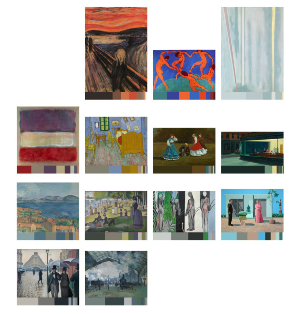
Color scheme extraction of artworks by Python. In order to make the color scheme of the web page as consistent as possible with artworks, the 8 most frequently occurring colors were crawled and used as the color scheme of the web page. At the same time, the colors were arranged in descending order of frequency, and the dominant color was naturally the most frequently appearing color.
736 Song and Chen
Figure 1: Artworks and Color schemes (Adapted from nbfox.com, 2022).
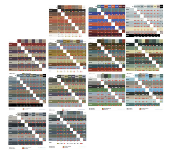
Apply Color Schemes According to the WCAG 2.0 (Caldwell, 2008) color usage recommendations, text can be read by people with low vision, without using contrast-enhancing assistive technologies, by providing sufficient contrast between text and background. The WCAG standard defines two criteria for the use of color: minimum contrast (level AA): a contrast ratio of at least 4.5:1 between back- ground and foreground; and enhanced contrast (level AAA): a contrast ratio of at least 7:1 between background and foreground. components. The color contrast is calculated using the steps recommended in the WCAG standard to obtain a color contrast result.
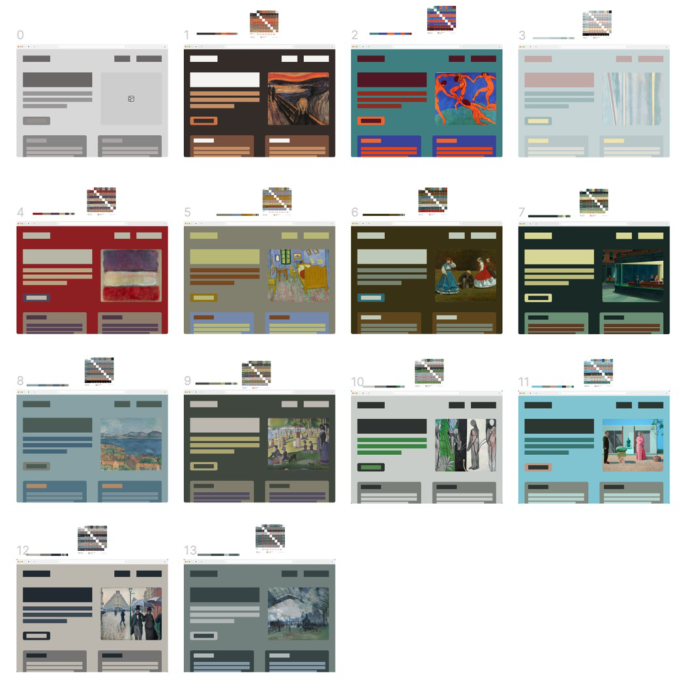
When assigning the colors in the color scheme to different components of the web page, the colors are assigned appropriately according to the freque- ncy of color appearances in the color scheme and the contrast between colors. The allocation is based on the following principles
1. the color that appears most frequently is the dominant color and is used as the background color of the web page 2. the size of web components is positively correlated with the frequency of colors. 3. the choice of text color is related to the color contrast. 4. When the color contrast is too low, black and white are added to the original color scheme.
The Possibility of Generating Color Scheme Based on Art Works for Web Design 737
Figure 2: Color contrast results.
Based on the above principles, the extracted color scheme is applied to a basic standard web design by SKETCH.
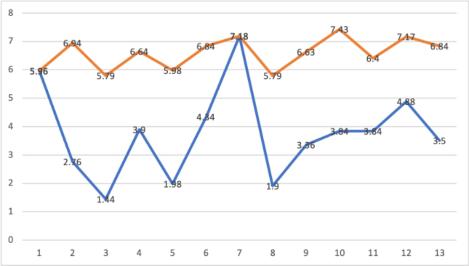
Web Readability Test Because the goal of this paper is to explore the color scheme of web design, the layout and the content and size of the text are consistent across all web pages. The readability test of the web pages was tested with the average value of color contrast of each web page, and the results were calculated as follows.
The average color contrast of the original color-matched web pages was calculated based on the color contrast between different components. The average value of web page 07 was 7.18, which met the WCAG requirement of AAA, and the average values of web page 01 and web page 12 were 5.96 and 4.88 respectively, which met the requirement of AA. Other than that, the average value of color contrast of other web pages is low and cannot meet the WCAG standard. However, when black and white are introduced in the color scheme, their color contrast averages rise significantly, and both are between AA and AAA standards.
Affective and Aesthetic Experiments for Web Pages Thirty emotional adjectives used to describe emotions were collected from the literature, and 10 of them were selected to be added to the SD Semantic Difference Method questionnaire, which included the emotional tone adje- ctives of 13 artworks. Also, adjectives about aesthetics were added to the survey in order to make a subjective assessment of the aesthetic of the web pages. Participants opened 14 web samples (including one original web page,
738 Song and Chen
Figure 3: Web design.Figure 4: The readability test of the web pages.
and 13 web pages with added color schemes) via links and browsed them one by one for 10 seconds while filling out the questionnaire, thus enabling simultaneous recording of emotions while browsing.
A total of 30 students aged 21–24 years were recruited to participate in the subjective evaluation experiment, 13 of whom were male and 17 females.
The Possibility of Generating Color Scheme Based on Art Works for Web Design 739
Figure 5: The rating of web aesthetic.Figure 6: The relevance of emotion between the web pages and the artworks.
In addition, the participation in the study was voluntary and the subjects were given the Consent Form. All participants had at least 5 years of Internet experience and accessed the Internet at least 3 hours per day on average. The results of the experiment were analyzed so as to verify whether the emotional tone between the generated web pages and the artwork correlated, as well as the beauty rating of the generated web pages.
740 Song and Chen
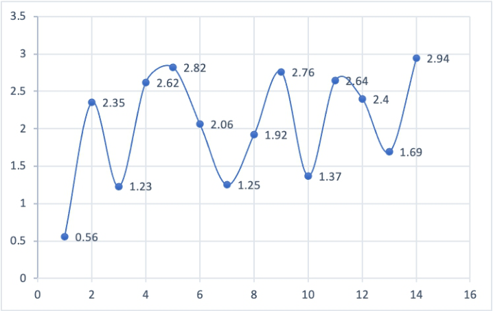
The SD semantic difference method was used to conduct the aesthetic eva- luation experiment. The results showed (Figure 5) that the subjects’ overall mean SD evaluation of the web pages was all higher than 1, with the highest score of 2.94 for web page 13. the lowest value was 1.23 for web page 3. the overall mean score was 2.15, which is a higher mean compared to 0.56 for the original web page 00. This indicates that it is practical from an aesthetic point of view to directly apply color schemes from artworks to web design.
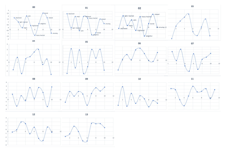
The generated web pages were emotionally evaluated by the semantic dif- ference method, and the top three adjectives of the mean SD evaluation were selected to represent the emotional impression given by the web pages. The results showed that the emotions brought by the web pages 01, 02 and 08 were basically consistent with the emotional tone of the original artwork, but it did not indicate that the generated web pages were correlated with the emotional tone of the original artwork, and the subjective evaluation of the semantic color scheme of the other web pages did not match the emotional tone of the famous painting itself and had no obvious correlation.
CONCLUSION
The color contrast test and the semantic difference method were used to conduct the experiment. The results showed that the subjects’ affective perspectives, the choice of affective adjectives to describe the samples, and the affective responses to the web pages were different from the affective tone of the original artwork. This suggests that it is risky to assume that the emoti- onal tone of the artwork itself is the tone of the color scheme. This is because firstly, the message conveyed by the artwork is relatively subjective and does not define its emotional tone exactly. Secondly, the color scheme extracted from the artwork is only an incomplete dimension of the artwork. The experi- mental results yielded no significant correlation between the themes conveyed by the color schemes and the themes of the artworks. In addition to this, the emotional characteristics of individuals can also influence the interpretation of the color scheme of a web page. However, automatic extraction of color schemes from famous paintings is still a practical approach when generating web pages by artificial intelligence. Firstly, the readability of the web pages was tested by color contrast test, which meets the requirements of WCAG. Second, a survey of the testers showed that the web pages generated based on the color scheme alone were consistent with the aesthetic level of the general public, even if they did not intentionally follow color theory.
This study had several limitations. First, the subjects selected for this paper were mostly design students, and the results of the validation experiment were not universal, and the number of respondents will be increased in the follow- up study; in addition, the color scheme of the generated web pages was only for the components of static web pages, which is not in line with today’s web design trends.
REFERENCES
A. Ionel and L. Petrescu, “Influence of Color in Web-Design,” Journal of Industrial Design & Engineering Graphics, vol. 5, no. 2, 2010.
The Possibility of Generating Color Scheme Based on Art Works for Web Design 741
B. Caldwell et al., “Web content accessibility guidelines (WCAG) 2.0,” WWW Consortium (W3C), vol. 290, pp. 1–34, 2008. D. Melcher and F. Bacci, “Perception of emotion in abstract artworks: a mul-
tidisciplinary approach,” Progress in brain research, vol. 204, pp. 191–216, 2013. F. Lyu, R. Xi, and Y. Liu, “Color design in application interfaces for children,” Color Research & Application, vol. 47, no. 2, pp. 507–517, 2022, doi: https://doi.org/10.1002/col.22726. K. Ferris and S. Zhang, “A framework for selecting and optimizing color scheme in
web design,” in 2016 49th Hawaii International Conference on System Sciences (HICSS), 2016: IEEE, pp. 532–541. L. Kuo, T. Chang, and C. C. Lai, “Visual effect and color matching of dynamic image webpage design,” Color Research & Application, vol. 46, no. 6, pp. 1321–1331, 2021. X. Yang, “The Color Scheme Applied to the Existing Third-party Mobile Payment
Applications,” presented at the Proceedings of the 2019 5th International Con- ference on E-Business and Applications, Bangkok, Thailand, 2019. [Online]. Available: https://doi.org/10.1145/3317614.3317633. Z. Gu, Z. Wu, J. Yu, and J. Lou, “A color schemer for webpage design using interactive mood board,” in International Conference on Human-Computer Interaction, 2013: Springer, pp. 555–564.
LISTED IN THE AHFE DIGITAL BOOKSTORE CATALOGUE
Explore the complete digital volume
Intelligent Human Systems Integration (IHSI 2023): Integrating People and Intelligent Systems
Read this individual research paper free through the original publisher, or explore the full digital proceedings book.
ISBN 978-1-958651-45-2
Explore this ISBN in the AHFE Bookstore ↗Listed in the July 2026 bookstore catalogue; search by ISBN to confirm current availability · Digital book purchase optional